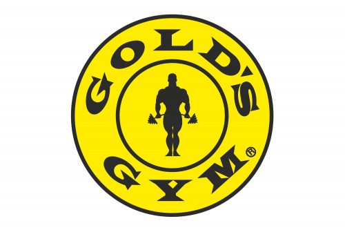
Gold’s Gym is a chain of international co-ed fitness centers. While the company’s headquarters are located in Dallas, Texas, U.S., the gyms can be found worldwide. In 2020, after having filed for bankruptcy, the brand was acquired by European fitness giant, RSG Group GmbH.
What is Gold’s Gym?
Gold’s Gym is a renowned international fitness center chain, known for its extensive range of equipment, personalized training services, and comprehensive fitness programs. Established in 1965, it has become a symbol of fitness culture, attracting both casual gym-goers and professional athletes.
Meaning and history
The most interesting thing about the Gold’s Gym logo is probably not the design itself but its history. It is told in a slightly different way in different sources. All of them, however, agree that the concept of the emblem was introduced in 1973 by professional wrestler Ric Drasin.
According to the story told in the corporate blog, this happened when Drasin was having lunch together with Schwarzenegger (who happened to be Drasin’s training partner for four years). Bodybuilder Ken Waller was having lunch with them, too. The trio started discussing what the logo of Gold’s Gym (where all of them trained) could be. Drasin, who would often doodle back then, drew a prototype on a napkin.
The prototype featured a shaved-headed bodybuilder. Soon, the emblem was printed on t-shirts. They turned very popular, so eventually, the company adopted it as its primary logo.
1965 – 1990
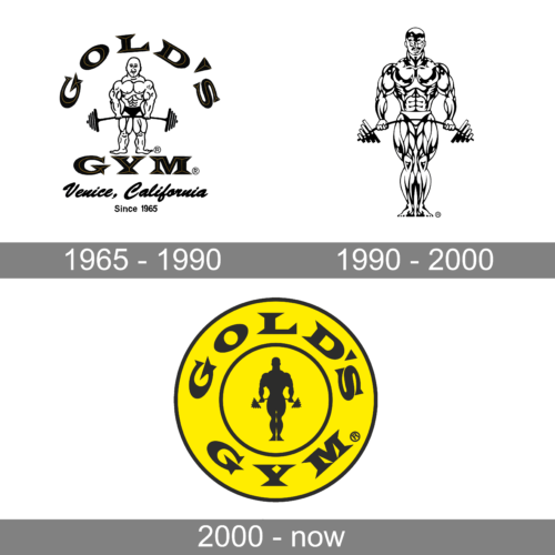
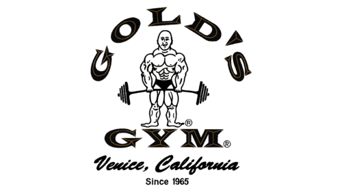
The first logo features a robust and stylized representation of a male bodybuilder, serving as the central figure. This individual is depicted standing, facing the viewer with a barbell loaded with weights resting across his upper thighs, signifying a deadlift position. The figure’s muscular definition is heavily emphasized, with detailed lines illustrating striations and shadows across the pectorals, abdominals, quadriceps, and other muscle groups, creating a powerful visual of strength and physical prowess. Above and below the bodybuilder are the words “GOLD’S GYM” in bold, stylized lettering, which has a three-dimensional effect due to the use of shading and highlights, giving the text a metallic sheen suggestive of gold. Encircling this scene is an additional text that identifies the location “Venice, California,” and the founding year “Since 1965,” both of which are integral to the brand’s identity, anchoring the logo in its storied history and geographic roots.
1990 – 2000
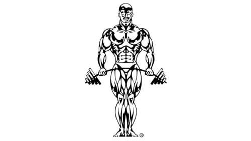
The second logo maintains the iconic bodybuilder image, further streamlined and modernized. The figure here is a highly stylized and abstracted version of the first, still prominently showcasing a well-defined musculature, but with a more graphic and less detailed approach. The bodybuilder’s pose is similar, holding the barbell across the lower hips, yet the visual treatment is more emblematic, using strong, bold lines to outline the form and muscles. The expression on the figure’s face is one of determination and confidence, with a slight smile that conveys satisfaction and accomplishment. The absence of additional elements such as text or decorative borders focuses all attention on the bodybuilder, which is a direct and powerful representation of the fitness and strength that the gym promotes. This logo serves as a modern emblem, capturing the essence of the brand’s commitment to bodybuilding and fitness culture.
2000 -Today
The emblem has been slightly transformed over time. The iconic version, which became popular around the world, showcases a rather minimalist, yet still comparatively realistic figure of a bodybuilder holding a barbell. The figure is black. It is encircled by the name of the chain. The design is placed inside a yellow circle.
Font
The name of the chain is set in an all-caps type with pronounced serifs. The glyphs combine strokes of various thicknesses, which make them look slightly old-fashioned. Also, such a type looks rather elegant, which doesn’t exactly fit the “bodybuilder” and “sports” themes – simpler sans serif fonts are more often used by organizations connected with sports.
Colors
The most prominent color is yellow. This makes the design recognizable and energetic, while the black color adds some weight and contrast providing a finishing touch.


