Crunch Fitness is a brand of a gym-chain, which was established by Dough Levine in 1989 in the USA, and today has more than 300 locations across the country, as well as in Australia and Canada.
Meaning and history
Crunch Fitness was established in the United States at the end of the 1980s, and for the first two decades, it grew slowly but confidently. The peak of its popularity was in 2016 when under the Crunch Fitness franchise there were 100 clubs opened in just a few months. Since then the company doesn’t stop, opening new locations worldwide.
The company’s corporate portfolio already includes over 400 clubs serving more than a million customers, with an annual growth rate of 40 percent.
Services at Crunch clubs include a gym with Strartrac and Hoist equipment, group programs, personal training, small groups, free subscription to online training and nutrition channels, and whirlpools. Clubs are 1,000 to 2,000 square meters in size and price.
The clubs offer many group fitness classes, including exercise bikes, Pilates, Yoga, and Zumba. All the latest trends and equipment are available in the clubs of the chain.
What is Crunch Fitness?
Crunch Fitness is one of the most famous chains of fitness clubs in North America, which also has locations in Costa Rica, Australia, and some European countries. The chain was established in 1989, and by today has turned into an international franchise with over 400 clubs worldwide.
1989 – 1990
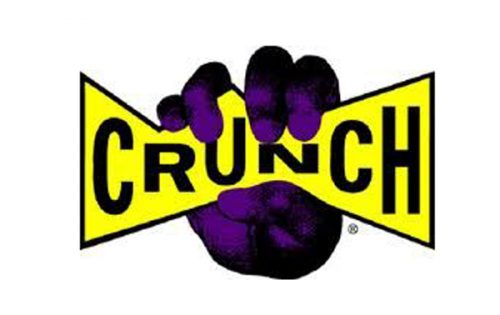
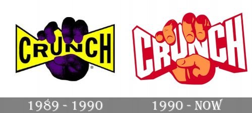
The very first badge for Crunch Fitness was designed in 1989 and only stayed active for a few months, being redrawn and redesigned already in 1990. The initial logo boasted a bright and strong purple and yellow color palette, where the sharp yellow banner with the black uppercase sans-serif “Crunch” lettering was clenched in a dark purple and black fist. It was a representation of strength, reflecting the essence of the brand.
1990 – Today
The Crunch Fitness visual identity is dynamic and masculine, it is a perfect reflection of the gym’s approach and the strong character of the brand. The Crunch Fitness logo is composed of a wordmark clenched in a fist. It is a celebration of power and energy.
The bold custom typeface of a wordmark is sharp and modern, you can hear it crunches in a strong fist. It’s white thick lettering in all-caps of the sans-serif font is outlined in blue and looks bright and confident.
The fist is colored blue, which created a good balance with the wordmark and adds freshness to the whole logo. The brand also uses an orange and red color palette for its visual identity, and it adds more energy and passion to the emblem.
The Crunch Fitness logo is aggressive and brutal yet very motivating. It shows the main value of the company — building a strong body and doing everything so that their clients could see the result fast.
Font and Color
The bright and powerful logo of the Crunch Fitness franchise has the lettering executed in a hand-drawn font with massive geometric outlines and letters featuring heavy angular shapes.
The color palette of the Crunch Fitness visual identity is composed of dark red and orange, accompanied by white, adding lightness and freshness to an energetic and powerful badge. The logo looks delightful and a little bit aggressive at the same time, making the franchise stand out on the list of competitors.


