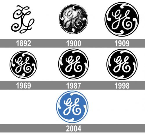
For more than 125 years of its history, the GE logo has remained basically the same. So far, there have been only subtle modifications.
Meaning and history
General Electric, or simply GE, is one of the companies, which value their roots above all, and it still uses its original logo, introduced at the end of the 19th century, with only slight modifications and a renewed color palette.
1892 — 1900
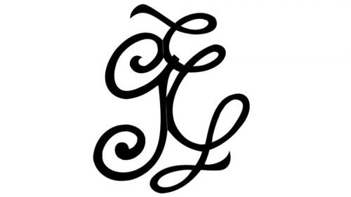
The very first badge for GE was designed in 1892 and featured a very laconic yet elegant and sleek monogram, where two ornate letters with curved tails were placed very near to each other, touching the edges and even overlapping in one point. The black and white color palette of the emblem only added to its timelessness and sophistication, accenting on professionalism and the fundamental approach of the company.
1900 — 1909
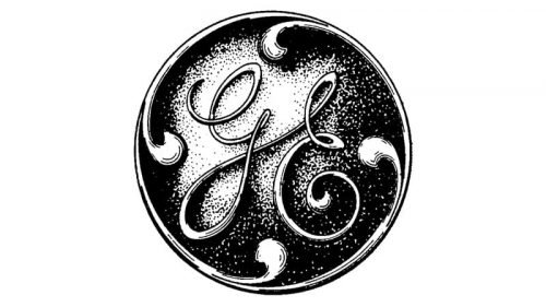
The monogram got placed inside a circular frame in 1900. The delicate lines of the framing were accompanied by some rounded and curved elements coming out of it to the center of the badge and resembling leaves. The letters on the badge got placed a bit farther from each other and gained a diagonal connection line. The emblem was still executed in monochrome but with some new gradient gray shades.
1909 — 1969
The contours of the GE medallion were refined in 1909z the gradient shades were gone along with the three-dimensional effect. The black and white badge looked strong and contrasting, evoking a sense of strength and reliability.
1969 — 1987
The redesign of 1969 strengthened and emboldened the lines of the letters on a circular GE badge. The tail of the “E” got more curls and started resembling a swirl, which spins and adds speed to the progressive and reputable company.
1987 — 1998
Some minor changes were done to the iconic logo in 1987. Though the appearance of the badge hasn’t changed much, the whole composition became more sophisticated due to the letters being drawn in a smaller size than usual.
1998 — Today
With the redesign of 1998, the refined lines of the GE logo got a bit shortened, which made the image balanced and added a sense of excellence and professionalism to the monochrome badge.
2004 — Today
The refreshed GE logo was introduced in 2004 and featured the same circular badge in an ornate yet delicate frame and two cursive letters with curled ends and smooth lines. The only difference between the new and the previous versions is the color palette but with the black switched to light blu the mood and perception of the logo changed dramatically. The blue and white badge evokes a sense of lightness, reliability, and confidence, it also started looking friendlier and more modern, showing the ability of the company to grow, change and progress without losing its essence.
Iconic symbol is born
The 1900 logo preserved the elegant cursive letters of its predecessor, while being more legible. It was placed in a circle with “loops” creating the illusion of motion.
Font
While the logo itself was drawn by hand, GE does have a set of custom corporate fonts, including GE Sans, GE Serif, and GE Inspira.


