The first Gasparilla Bowl was played in 2008. Since 2017, the annual NCAA-sanctioned post-season college football bowl game has been sponsored by Bad Boy Mowers. Taking this into consideration, it is only natural that the Gasparilla Bowl logo has been highly influenced by that of Bad Boy Mowers.
Meaning and history
The Gasparilla Bowl, originally known as the St. Petersburg Bowl, is a post-season college football bowl game that was founded in 2008. This annual event typically takes place in Tampa, Florida. ESPN Events, a division of ESPN, has been instrumental in organizing and promoting this bowl game since its inception.
Throughout its history, the Gasparilla Bowl has showcased numerous memorable matches, often featuring teams from the American Athletic Conference, Conference USA, and the Atlantic Coast Conference. Notable for its competitive matchups and festive atmosphere, it has become a significant event in the college football postseason calendar. The game’s name, derived from the legendary pirate Jose Gaspar, ties in with Tampa’s famous Gasparilla Pirate Festival, adding a unique cultural element to the event.
Currently, the Gasparilla Bowl continues to be a highlight of the college football season, drawing in large crowds and television audiences. Its success and popularity are indicative of its established position within the college football landscape, contributing significantly to the sport’s post-season excitement and fan engagement.
What is Gasparilla Bowl?
Gasparilla Bowl is the intercollegiate American football bowl game, a part of the NCAA, which is held annually since 2008. The games of the bowl are held in Florida, on the Raymond James Stadium, which is in Tampa.
2008
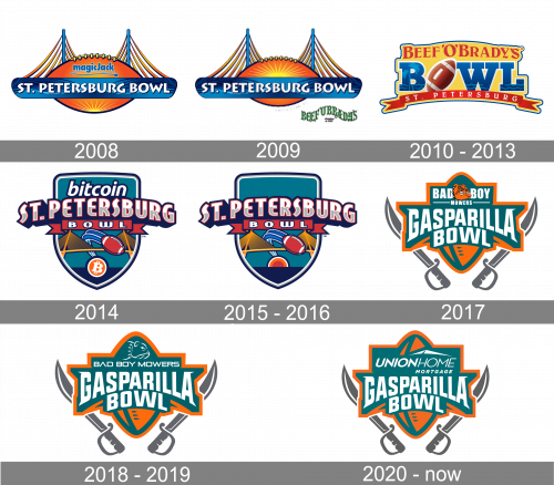
Gasparilla Bowl got its current name only in 2017, so until that all the badges of the bowl were based on its original name, the St. Petersburg Bowl. The original logo, designed in 2008, featured a gradient orange rugby ball in a black outline with the sun at the bottom having its sharp yellow rays coming out up and to the sides. The ball was crossed by a horizontally stretched blue banner stylized as a bridge. The main lettering was set on the banner in white capitals of a playful sans-serif typeface. As for the sponsor’s logotype, the MagicJack insignia in calm blue was placed on the rugby, above the bridge banner.
2009
The redesign of 2009 removed the MagicJack logotype from the emblem, and placed the yellow sun above the bridge, stretching it and elongating the rays. As for the sponsor’s logo, it was placed under the emblem, on the right, and featured a wavy green “Beef’O’Bradys” logotype with a yellow outline of the letters. It was a bright and vivid logo, which evoked a sense of eternal energy and movement, but despite its brightness and energy, the logo stayed with the bowl only for one season.
2010 – 2013
The majority of the space on the Beef’O’Brady’s Bowl logo was occupied by the word “Bowl.” While the type was pretty generic, the lettering looked unique as the “O” was replaced by a football. The name of the sponsor could be seen above. Below the word “Bowl,” there was a red banner housing the word “St. Petersburg.”
2014
In 2014 the logo of the bowl gets redesigned again. Sponsored by Bitcoin, the Bowl places both the logotype and the graphical icon of the cryptocurrency on its renewed crest. The St.Petersburg Bowl logo featured a calm dark turquoise shield with a gradient white-to-gray lettering in a red outline with a wide blue shadow. The “Bowl” part of the inscription was written on a narrow red ribbon under the main wordmark, and the “Bitcoin” logotype — above it. The graphical elements were all drawn on the bottom part of the crest and comprised a stylized image of a bridge, a flying red rugby ball with blue traces, and a Bitcoin symbol, placed on the very bottom point of the badge.
2015 – 2016
The Bitcoin logotype and icon were removed from the St. Petersburg Bowl badge in 2016. All the other elements of the logo remained untouched, but now without the sponsor’s insignia, they all became more distinct and visible. The empty top part of the crest made the whole image look more stable and professional, evoking a sense of confidence and expertise.
2017
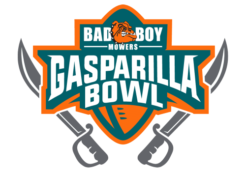
In 2017 the bowl gets its current name, and the visual identity is being completely redesigned. The new crest is executed in a turquoise-green and orange color palette with white lettering. The crest featured a shape of a vertically oriented rugby ball, with a wide banner crossing it horizontally. Two sabers were drawn on the sides of the badge in light gray. The upper part of the logo had the “Bad Boy Mowers” inscription complemented by an orange bulldog head. As for the “Gasparilla Bowl” logotype, it was written in massive white letters over a dark turquoise background in the center of the badge.
2018 – 2019
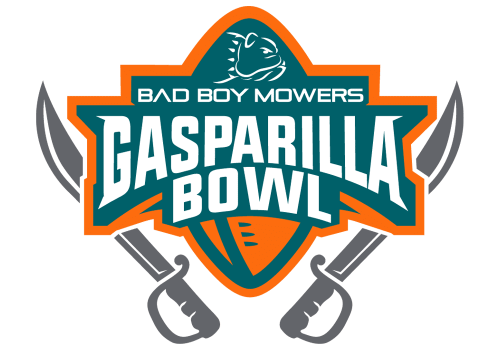
The redesign of 2018 only changes the upper part of the Gasparilla Bowl logo, keeping all other elements untouched. The “Bad Boy Mowers” inscription was now set in one line, with all capital letters executed in a modern medium-weight sans-serif typeface, with the letter “A” having its horizontal bar removed. As for the bulldog head, it was redrawn, and now the animal was set in the profile, facing to the right and contoured in smooth white lines.
2020 – Today
The elements borrowed from the Bad Boy Mowers logo include the burnt orange color, the side view of the bulldog’s muzzle, and of course, the lettering “Bad Boy Mowers,” which is given in a highly distinctive typeface. In the center, the text “Gasparilla bowls” is arched. There is a long saber on either side.


