The Frigidaire brand is synonymous to refrigerators. Its stylish clean logo shows the brand as reputable and reliable, confident and strong.
Meaning and history
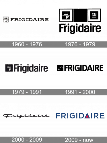
The first Frigidaire logo was introduced in 1918, when the General Motors founder William C. Durant purchased the Guardian Frigerator Company and renamed its “Frigidaire.” The logo featured a crowned letter “F.”
1960 — 1976
The crowned “F” was preserved in the 1951 logo, although it didn’t occupy a very prominent position here. In this version, the “F” was placed inside one of the three squares forming the emblem. The square next to it was black, while the third square housed the lettering “GM.”
The word “Frigidaire” in a plain sans was placed below. The letters seemed squeezed (especially in the “Fr” part).
1976 — 1979
The wordmark became the most prominent part of the logo. It was now set in a minimalist all-caps sans with classic proportions. While the breathing space between the letters wasn’t generous, it was still decent – you couldn’t feel the “squeezed” effect anymore.
While the crown was still there, it was now more abstract and not immediately recognizable. This is quite natural, taking into consideration the changing attitude to the monarchy in the world.
1979 — 1991
In 1979, they got rid of everything save the name wordmark and the black square that was on the left (the one with the crown it in). These were put side by a side, and that was it.
1991 — 2000
The Frigidaire logo, as depicted in the image, features a sleek and modern design that subtly incorporates elements of the brand’s historic identity. The logo consists of the brand name “FRIGIDAIRE” presented in a bold, black, sans-serif font, which conveys a sense of strength, reliability, and modernity. To the left of the text, there is a graphic element that, upon closer inspection, reveals itself to be a stylized, three-dimensional crown. This crown design is quite subtle and cleverly abstracted, maintaining a minimalist aesthetic while alluding to the brand’s rich heritage.
The crown graphic is designed in such a way that only the highlights of the crown shape are visible. The lower part of the graphic features a smooth, sweeping “swoosh,” representing the base of the crown. This swoosh curves elegantly, adding a sense of motion and dynamism to the logo. Above this, the upper swooshes represent the inner parts of the crown’s points, adding depth and a three-dimensional effect. This creative approach allows the logo to retain the symbolic crown, a nod to the brand’s historical iconography, while presenting it in a more dynamic and contemporary form.
2000 — 2009
This one lost the crown altogether. The plain type was replaced by an elegant cursive script. This helped to make the logo unique, and also conjured up the memories of home-cooked meals and the times, when women exchanged recipes written by hand. Yet, this script worsened the legibility, so the company eventually had to sacrifice it.
2009 — Today
The highlight of the Frigidaire logo is a triangle with red filler. It supposedly symbolizes a cozy home with a lit window. Some designers mentioned that the triangle breaks the brand name into two words, “Frigid” and “Ire”, none of which is likely to attract the products’ target audience – moms.
The wordmark in classic sans serif is accompanied by the triangle symbol replacing the letter “A”. Triangle is an emblem of creativity and stability, and in blue and red color palette it also reflects the brand’s power and energy.
Emblem colors
Blue is the main color of the Frigidaire logo and it resembles the product, the brand got its popularity for — the refrigerator and its ice.
The red element of the logo adds warmth and symbolizes a cozy home, which the brand helps to create for their customers.
Some of the colors used the colors used in the Frigidaire logo are red (PMS 199C) and grey (PMS 7545C). The background is white. You can also come across logotype versions, where the company name is given in black or dark blue.
Font
The company’s primary font is Gotham, which is the type featured in its logo.


