Eurovision is the name of the most outstanding musical competition in Europe, which was created in 1956. The main feature of the show is that is it held in different cities across Europe every year, depending on which country-winner.
Meaning and history
Being one of the most-watched annual tournaments after sports championships, Eurovision is known all over the world, not only the EU. Every year it is held in a new European city and every year it has a new logo, representing the hosting country.
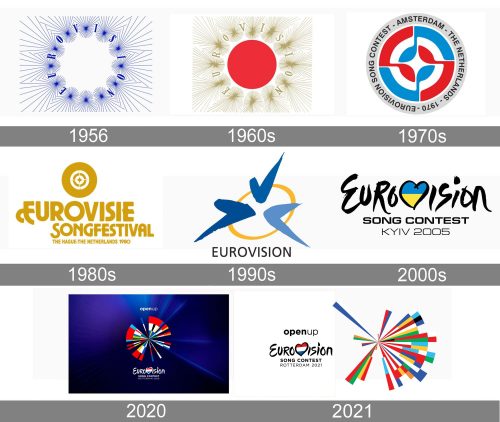
The Eurovision image chronology is one of the most colorful and interesting ever. The contest has more than 60 different logos, as many, as the years it has been on.
1956
The first Eurovision logo was designed by Timothy O’Brien, who was working for BBC. The logo consisted of 12 stars, so posed of thin lines and letters of the “Eurovision” nameplate between them. The color palette was light and bright — purple on a white background.
The Eurovision logo of that prior looks crispy and fresh, showing the creativity and variety of music styles of the contest. The emblem was in use until 1994.
The 1960s
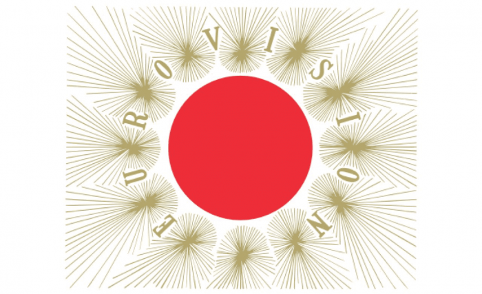 All the logos from the contests first decades were composed of an above-mentioned symbol and extra graphical details of each hosting country. They were elegant and fine, with a minimum of experiments. Most parts of the Eurovision logos of the 1960s were executed in calm traditional colors.
The 1970s
In the 1970s the annual logos became more colorful and stylish. Bold lettering and geometrical graphics were now part of the contest’s visual identity.
The 1980s
In the 1980s the Eurovision logos were mainly composed of wordmarks in custom unique typefaces. It was a typographic era of the competition’s visual identity design.
The 1990s
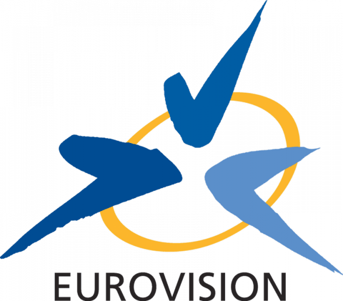
The new emblem was created in 1994 and stayed with Eurovision for another decade.
The emblem is composed of a yellow-gold circle with three ticks of different tones of blue. Symbolizing the European Union, harmony and stability.
The yearly logos of this time period are modern and stylish with a lot of abstract graphics. They are eye-catching and unique.
The 2000s
In 2004 the contest designs a new emblem. It is a black wordmark in a custom handwritten typeface with rounded and confident lines and a stylized heart, replacing the letter “V”. The heart is always colored in a flag of the hosting country, which makes the emblem bright and meaningful.
The yearly logos of the 2000s and 2010s are bold and powerful, celebrating modernity and style.
2020
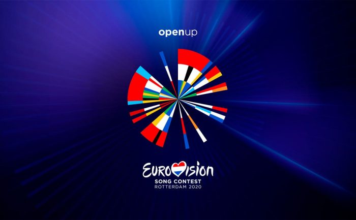
The latest Eurovision logo was created for the contest of 2020, being held in Rotterdam, Netherlands.
It features a white wordmark with the country’s tricolor I dive the heart symbol and a colorful rounded emblem. The emblem is composed of many color-blocked rays, symbolizing different countries and cultures.
It is based on the earliest circular logo, celebrating the contest’s heritage and traditions.
The intense and bright background in the gradient blue created a good contrast and makes the logo stand out. It is one of the most remarkable versions of all the Eurovision logos.


