Dettol is a brand specializing in antibacterial soaps, sprays, and wipes. The Dettol logo was inspired by the protective properties of the product, which, according to the company, “Kills 99.9% of bacteria.”
Meaning and history
Dettol, a renowned antiseptic brand, was founded by Reckitt & Sons in 1932. The company’s roots trace back to its establishment in the UK, where it initially gained recognition for its antiseptic liquid. This product, distinguished by its distinct odor and efficacy in killing bacteria and providing antiseptic protection, marked the beginning of Dettol’s journey in healthcare. Over the years, Dettol has expanded its range to include a variety of hygiene products like hand washes, soaps, and surface cleaners, gaining a global presence.
The main achievements of Dettol lie in its consistent innovation and adaptation to public health needs. During the mid-20th century, Dettol played a crucial role in hospitals, providing antiseptic solutions for cleaning and disinfection. Its effectiveness in reducing hospital-acquired infections was a significant breakthrough. In the consumer market, Dettol has been a trailblazer in promoting hygiene awareness, especially in developing countries, where it has run numerous educational campaigns on hygiene practices.
Currently, Dettol holds a strong position in the global health and hygiene industry. Its products are widely used in homes and healthcare settings across the world. The brand has maintained its reputation for quality and reliability, adapting to modern challenges like the COVID-19 pandemic by expanding its product range to include sanitizers and masks. This resilience and continuous evolution affirm Dettol’s enduring legacy in promoting health and hygiene.
What is Dettol?
Dettol is a leading antiseptic brand, known for its range of hygiene products including liquids, soaps, and cleaners. Originating as a medical antiseptic, it now plays a vital role in home and healthcare hygiene worldwide.
1950s – 1970s
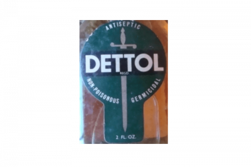
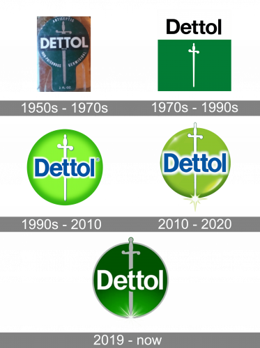
The original logo was a dark green label, shaped like a circle with a rectangular extension in the bottom. The center of said circle was occupied by a black rectangle. In it, the word ‘Dettol’ was placed in bold, capitalized letters of a simple sans-serif font. It was put over a grey picture of a sword with an elaborate, elegant hilt.
1970s – 1990s
The next logo used similar elements, but in a different layout. In particular, the centerpiece was a rectangle, colored bright green (much lighter than before). In its center, they placed a silhouette of a sword – almost identical to the one they had initially. Above this geometric figure, they placed the word ‘Dettol’. The letters are now black. The font stayed very similar, although there are now lowercase letters, as well.
1990s – 2010
They transformed the rectangle into a circle shape, whose coloring switched from darkish green to lime. They also added shading near the edges and left the white sword where it was – in the center of the figure. The name wordmark was nearly unchanged, save for the coloring (now blue with thick white borders). Instead of being above the main emblem, it was now in its center.
2010 – 2020
The older version featured the word “Dettol” in blue over a green circle. Behind the blue wordmark, a white sword can be seen. The main changes from the previous design included a swampy yellowish green instead of the lime, as before. The circle itself was now a lot smaller, which made the sword stick out from its borders. That’s also why they gave it a more prominent black outline. Where the sword’s tip left the borders, they included a small shining effect – white with yellow borders.
2019 – Today
In the updated logo, the green grows darker, while the wordmark goes white. The sword is gray. They also made the logo a lot simpler, both in coloring and forms. For instance, they introduced new borders around the circle – metal grey, like the sword in the middle. The name abandoned its thick white outline, but the font was still the same. The letters in the center also seemed to cut the break in two separate shapes. The shining effect in the bottom was supplanted by a similar, but more realistic image.
Font and color
The simple and strict Dettol logotype, executed in a custom sans-serif typeface looks professional and confident, pointing to the strongest sides of the brand and its best qualities. The inscription in the lowercase, with the “D” capitalized, is written in a font, which is pretty similar to Sequel Sans and Britannica Semi Condensed, but with some lines modified and the upper edges of the “T”s cut diagonally.
As for the color palette, the logo of the brand is drawn in gradient green and white, a combination evoking a sense of growth and success and accenting on stability and trustworthiness. The logo is framed in light gray, which is a color of professionalism and elegance.


