Clearasil is one of the most well-known acne-medications in the world. The brand was established in the 1950s in the United States and today distributes its skincare products across the globe, being a part of Reckitt Benckiser Group.
Meaning and history
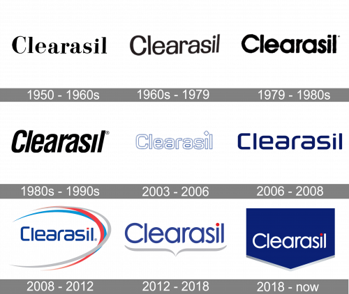
The visual identity of the famous American skincare brand has always been very constant on its basis — the name of the label has always been the main element of the logo. As for the color palette, it has been chosen in the 2000s and stays with the brand today.
1950 – 1960s
The original logo was just the name of the brand, written in black letters of a pretty typical serif font. They used bold letters with thin serifs at the ends, as well as lines of varying width all over them. There were lowercase letters in addition to the capitalized ‘C’. The word was written in one line.
1960s – 1979

The very first logo for Clearasil was introduced in the 1959s and comprised a simple title case inscription in the monochrome color palette. As there were not many competitors for the brand during that time period, the modest and simple logo didn’t affect the products’ recognizability, yet evokes a sense of professionalism and expertise.
1979 – 1980s
The following design is very similar to the one before. Except, the letters are closer together, and there is a new font. It’s a similar sans-serif style, but with a different template of letters. It’s visible particularly in the both ‘A’ characters, as well as in ‘R’. The other ones are pretty much the same.
1980s – 1990s

In the following writing, they made the letters much taller and gave them a visible lean to the right. The font changed again, and it’s once again closer to the original 50s design.
2003 – 2006
By 2003, the letters became shorter again, as well as wider. They took on more of a square proportion, but changed the font and coloring. In regards to the font, it’s still sans-serif. However, they made the forms smoother and rounder. They also look more uniform in regards to the width of their lines, and so forth. They also include a rhomb in the same style as the letters right above the ‘I’, instead of the usual dot. As for the coloring, the letters became white and took on a blue border.
2006 – 2008
The 2006 logo used many of the same decisions. The proportions and the positioning of letters were almost identical to the previous design. The font changed, becoming less round and more linear and angular. For instance, they clipped many small extremities at the ends of the letters, keeping the tips simpler and cleaner. Their coloring was also fully blue now. The shade is close to the navy blue shade.
2008 – 2012
The first major redesign was held by the brand at the beginning of the 2000s, and this is when the color was brought into the logo. The version of these years features a smooth and modern sans-serif inscription in a royal blue color, partially framed with arched lines on its right. The lines were colored blue, red, and gray, showing the brand as a powerful, reliable, and loyal. It was a pretty minimalist, yet bright image, which brilliantly suited the acne-medication and made it stand out on the shelves, evoking a sense of freshness and purity.
2012 – 2018
In the 2010s the new logo was introduced. Executed in the same typeface the letters of the inscription looked completely different, being written in white and outlined in blue. The sleek rounded contours were balanced by an overall square structure of the font, and the sharp rhombus, which was replacing the dot above the “I” only added geometry to the whole concept.
2018 – Today
The Clearasil logo we all know today is softer and friendlier than all the previous versions. It is composed of white lettering with a red dot above the “I”, placed on a blue background, which resembles an arrow, pointing down. The shape of the logo represents the purpose of the product — fighting with acne, and its effectiveness.
There is also an alternative logo version, where the inscription in blue is placed on a white background and underlined by a thick smooth gray line, looking like a curly bracket.
Font and color
The Clearasil logotype is executed in a custom sans-serif typeface, which is pretty traditional and modest, yet has a very delicate and elegant character, due to its full rounded shapes and the bottom edges of the letter lines softened and rounded at the right side.
The typeface of the inscription is pretty close to such fonts as Futura Maxi STD Book and Maxi Demi Bold, but with the cuts modified.
As for the color palette, the brand chose a timeless combination of white, blue and red, which represents purity, passion, and reliability, and with the gray accents, the palette becomes more professional and confident.


