Cif is the name of a range of household cleaning products sold in over 50 countries. It’s one of the brands owned by the British multinational consumer goods giant Unilever. In addition to being sold as Cif, it has also been marketed under other names, including Jif, Vim, Viss, and Handy Andy.
Meaning and history
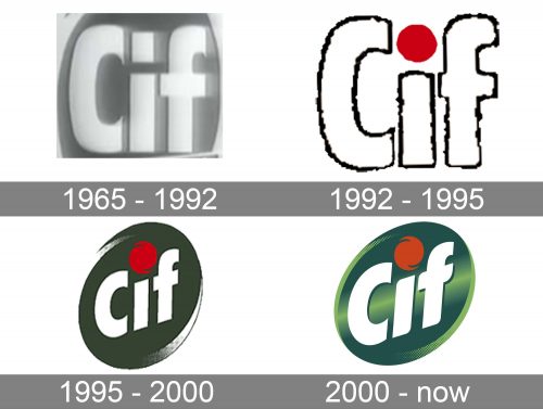
The evolution of the Cif logo can be described as a motion towards more dynamism and depth. The dynamism and active style are essential for the brand as one of its core promises is to help customers to solve their problems fast and to do all the job for the customers.
What is Cif
Cif was introduced in France in 1965 as a brand of cleaning products to be used as an alternative to scouring powders. It is marketed by Unilever, along with about 400 other brands the company owns.
1965 – 1992
One of the earliest examples of the logo already shows us that the visual brand identity of Cif has always been rather consistent. We can see the name of the brand in a rather clean sans serif typeface, light on the dark background. The initial is uppercase, while the “i” and “f” are lowercase. The lettering is placed inside a circle with subtle swooshes above and below, which are also reminiscent of the ones we can see in the current logo.
1992 – 1995
This is when the iconic red dot appeared above the “i,” which became a recognizable vivid accent. In the older version, the element above the “i” was a rectangle, and it featured the same color as all the other letters.
The ends of the glyphs were slightly softened. Both the “C” and the “f” have lost the pronounced sharp fangs on the ends, which made the lettering better merge with the circle in the background and also better fitted the red dot.
1995 – 2000
While preserving all the strengths of the previous logo, the designers responsible for the update added a couple of new ones. Firstly, they replaced the circle with an ellipse, which immediately made the design more eye-catching and dynamic. Also, they slightly rotated the wordmark counterclockwise. This contributed to the implied motion, and, in addition to this, conveyed optimism (this is how a descending orientation is typically interpreted).
The motion theme was supported by the dot, too, as the static circle was replaced by a shape with swooshy sides. The dot now looked as if it was being rotated at a high speed.
The glyphs were slightly tweaked without losing their overall shape and proportions.
2000 – present
Another update and another step forward. This time, some depth was added to the Cif logo with the help of light green nuances and the gradient. The oval now looked a bit more natural and better fitted the orientation of the wordmark.
We can’t but mention the modified letters. Some ends of the middle bar of the “f” and some of the angles on the “i” were rounded, while other ends became sharper. While the updates were very subtle, they were effectively implemented to work for the overall dynamic style.
2??? – present
At first glance, this logo may look exactly like its predecessor. However, it’s not a mere copy. If you take a closer look, you’ll notice that the shade of green is slightly different. Also, the gradient is applied in a new way. Most notably, there is no light green in the central part of the oval anymore – the color is dark here. Apparently, this helps to make the logo a bit better legible even at a small size.
Colors and font
For much of its history, the Cif logo has been based on the combination of dark green with bright red, which served as an accent color. The light green nuances have been there to add more depth. While preserving the basic shape of the glyphs, the designers have tweaked them more than once, to add motion.


