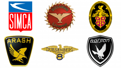
Bird symbols are often used in various logos as a sign of speed, power and status. The car brands don’t use these all that much. There are some big car companies that do so, and they usually choose an eagle, a falcon or a similar bird of prey.
What is the meaning of a Bird in car logo?
Bird is not very common to see on the badges of the cars. Although the light and elegant animal stands for speed and freedom, not many automakers can make it look confident and powerful. The Bird symbolizes peace and bliss, lightness, and good luck, it is a very powerful symbol but requires a proper surrounding for representation of the right side of the automotive industry brands.
Rossion
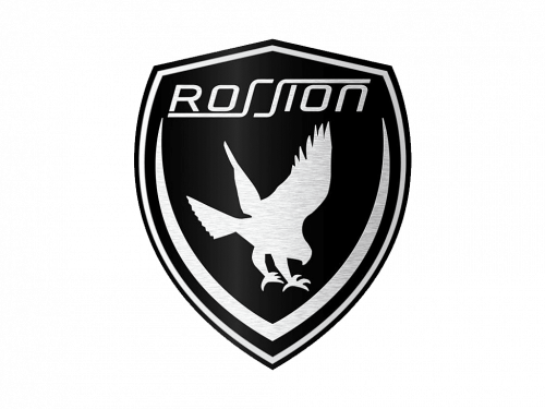
Rossion is an American carmaker, established in the early 2000s. Their flagman, Rossion Q1, is a sports car based off Noble M400. Because of the focus on powerful, striking cars, the company decided to use an eagle in their main emblem. It’s also probably driven by the fact that it is a uniquely American carmaker, and Americans like to use bald eagles all the time.
Their logo looks like a black shield with an eagle in the middle. The central plane of this shape pictures a predator bird, flying down to strike some unseen target. It’s just a black silhouette without any particular details. The wings appear outstretched on this one, same as the claws. In short, the bird was ready for a strike.
On the inside of the shield, and along the edges, they’ve put two lines that converged into one in the bottom. It’s here to outline the center of the logo, where the bird is located. These lines are also black, like the rest of the functional bits of the emblem. Their tips are pointed closer to the ends.
The brand’s name is also present. Here, it’s located in the top section of the shield. The letters are largely big sans-serif characters with rounded angles. The only special additions are the ‘S’ letters, which look like single strokes with extended tips that go below and over the rest of the word.
It’s normally used as a badge for Rossion cars, and the car scheme can change. Usually, it’s a white shield with black elements (those just described). Sometimes, they can swap the top or introduce silver in place of white. Whatever the color palette, the emblem is usually placed as a badge on the top of the car’s bonnet.
Besides that, Rossion often uses their own wordmark as a secondary logo. For instance, it appears on the steering wheels as a bolder white name, placed onto a black rectangle. The bird emblem is by far the favorite, however.
Arash
Arash Motor Company was established in Britain in 1999. For the most part, they make various sports cars. That includes two main brands: Arash and Farboud. Although now the company uses their own wordmark, there is a popular emblem they use as a car badge and for other purposes.
The main logo includes a big word ‘Arash’, written in black, futuristic words. There are lots of strict shapes in these characters, as well as cuts all over some of them. The other bits are two words ‘Motor’ & ‘Company’ written in a far more mundane font below the right half of the bigger word.
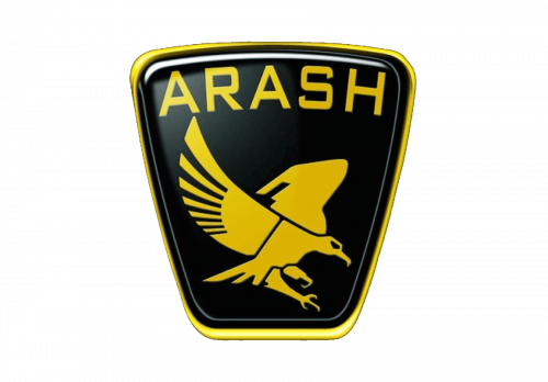
The bird emblem, for its part, uses a black shield shape with a thick golden frame around it. This mix of gold and orange is also used in other elements of the logo, like the bird in the middle or the wordmark in the logo’s upper part. On 2D images, the shield is often given an illumination effect, as well.
The bird image is actually extremely nuanced. It’s a type of eagle (or a similar bird) with a long beak. Various joints, curves and stuff like eyes are all very well-detailed. These elements are usually just black shapes and lines. And the pose itself is also not a simple, symmetric position. They made it natural and, therefore, slightly haphazard.
One leg is positioned in front of the other, posed for strike; the wings are arranged in different positions, or at least it seems so at this angle; the eye has a malicious look in it. In short, they made an effort to make this bird look as unique as possible. The bird itself is a peregrine falcon native to many places in Europe.
The other element is the company’s name, written along the top edge in big letters. The color is a blend of orange and gold, as said before. The font is a typical sans-serif style without any special quirks.
The bird emblem is usually utilized as a badge, but the two symbols can be used together freely.
Simca
Simca was a French automaker between the 30s and 70s. Thy primarily made all sorts of sedans and other passenger cars. Ultimately, the brand has been absorbed into Chrysler. For a long time, the brand used swallows as their primary symbols. These birds are considered synonym of elegance throughout Europe.
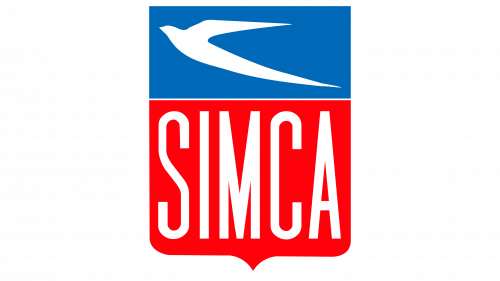
The latest logotype was of a shield shape. It was basically a rectangular form with a little protrusion in the bottom. About 2/3 of the thing was occupied by a pink section with the word ‘Simca’ inside. The rest was given over to a turquoise part with a swallow bird in it – or rather a silhouette of it.
The swallow was depicted in several ways throughout the years. The latest version is the simplest. It was just a V-like stroke with a little blob for a head. It’s instantly recognizable as a swallow because of its long, thin wings and a tail. There were also other versions, some which looked onto the bird as if from above. All of them were white, however.
Despite the differences, the Simca bird emblems were all simplistic and bereft of nuance. The latest one is literally just a pair of paint strokes arranged into something that looks like a bird. If not for a traditional depiction of these birds in various old media, it wouldn’t really be distinguishable.
The wordmark below was usually written in white, as well. The letters normally were a collection of tall sans-serif characters, stretched to fit the entirety of the section’s height. The whole thing (including the text section and the bird bit) were used as a badge for these cars. However, it was also adopted as a full-time logo.
Swallow wasn’t picked by the brand just because of its elegance. They also used the bird to symbolize their normal take on the cars. Simca vehicles were usually compact, passenger models. By definition, they were supposed to be brisk and agile, like swallows.
Bizzarrini SpA
Bizzarrini is one of the classic Italian carmakers. It’s not as big and successful as Ferrari or Lamborghini, but it’s still one of the big names in this country. It was established in 1964, and most cars produced by the brand were roadsters, racing cars and small sports cars. In short – powerful, brisk cars are their focus.
That’s one of the reasons why they decided to use a small bird as a main symbol for much of their life. A blue sparrow (likely) was usually associated with the brand, as they keep using it in their logos since late 20th century. Their contemporary logo also utilizes the bird as a centerpiece for their emblem.
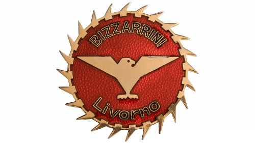
Their emblem is a red circle with what seems like golden claws arranged around it as a frame. Inside, the edges are decorated with the company’s name. The center, however, is occupied by a bird symbol. It’s not really clear what the bird is supposed to be, but it’s small, geometric and rather sharp.
It’s depicted with long-ish, outstretched wings drawn as two narrow triangles. The tail looks a lot like a short comb driven into the bird’s lower body. The rest of it is just straight lines and a little dot for a head. The coloring is really a gradient of white, blue and darker shades.
The wordmark is divided into two words: ‘Bizzarrini’ and ‘Livorno’. Both are written with thin, golden letters. The former is situated along the top edge of the circle, while the latter is placed on the opposite side.
The emblem is sometimes used as a badge for these cars, although often it’s just the name of the model put onto the bonnet or somewhere in its vicinity. The emblem is the official logo, and there isn’t any other. There are actually other badges used by the brand for their cars, there’s a variety of such emblems.
The sparrow emblem, however, is still considered the brand’s favorite.
Packard
Packard was one of the big American car companies back in the day. They operated between 1899 and the 50s, when the production was absorbed into another company. In this period, they’ve made plenty of luxury cars and typical passenger vehicles. As a logo, they used an elaborate coat of arms with a bird at its top.
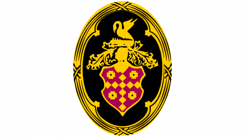
The emblem used a sort of shield with red clothing and golden ornaments all over it. It was crowned by a knight’s helmet (also golden), which was then surrounded by some golden wreaths, some other elements and, finally, a bird creature at the top. It seems to be some mythological creature with avian traits.
The bird looks like a swan with some uncharacteristic bits. It stands upright on its small legs; the body is a thick, fat thing with visible plumage on the side. There are still wings, attached to the back of the creature and raised in a threatening way. The neck is long and somewhat thin, and the head is given a malicious look. It’s actually bent towards the body, along with the neck.
Normally, all of these elements would be golden, save for burgundy clothing for a shield. There were also black outlines all over the place and shading to obviously make the image more natural. Furthermore, the entire thing would usually be put onto a black oval. That, for its part, would be framed in silver. But the emblem was the main part, obviously.
There was also a wordmark, featuring the company’s name. It used italic, hand-written letters arranged diagonally. These two could be used in tandem, but actually neither of these was used as a fully-fledged emblem. The old Packard cars used a little statue of a bird in the front. It looked like a swallow, mainly.
The wordmark and the main emblem would actually be featured together as one component in the later years of the original brand. In such cases, the wordmark would be colored red to fit the shield and some other elements of the big emblem.
Duesenberg Motors
Duesenberg is an American car brand, established in 1937. Much of their production revolved around high-performance cars. Nowadays, the original company is long-dead, and the brand isn’t doing too well itself. As for the logo, they heavily used eagles throughout their original existence.
An eagle can be interpreted as a symbol of power, speed and domination. But it’s also likely the founders borrowed the symbol from the official symbolic of Germany. Back then, a grand eagle with outstretched wings was a popular German symbol (not necessarily a Nazi symbol, however).
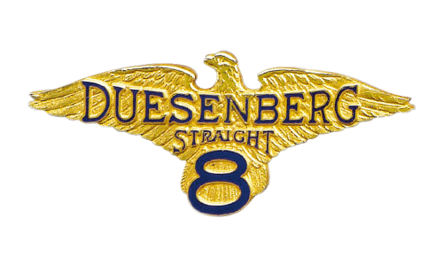
The latest logo used a golden eagle as a centerpiece. It was depicted as a full-on golden statue with the texture and nuance that should accompany it. It’s actually rather detailed, even if the eagle on the logo doesn’t necessarily look like a real eagle. It’s exaggerated. The wings are too wide and generally big, the head is given an overly-noble expression, and so forth.
Normally, the eagle would have ‘Duesenberg’ written along the eagle’s wings and ‘8’ put into the lower body. Both bits were colored dark blue and written in an official-looking way. The letters used a serif typeface. There could also be other bits of text on the emblem, like the word ‘Straight’, sandwiched between the two main bits.
This logo was actually used as a badge fairly often. The official logo is in many ways just a 2D replica of a 3D badge. The latter had various color combinations, too. The main variant used golden and dark blue. However, there were also bronze versions with lighter blue shades for the text.
This logo was used for much of the company’s history. There have been other designs, but the eagle emblem was the favorite. There were various modifications done over the years, like the additional text bits. However, the general gist remained the same throughout the decades.


