The system of companies known as the Bell System was the largest player in the telephone services sector of North America for over a century and in actuality was a monopoly. The system was nicknamed Ma Bell. Following a series of legal actions accusing it of monopolizing the industry, Bell was eventually broken into seven regional operating companies nicknamed “The Baby Bells.”
Meaning and history
The Bell System logo went through multiple modifications over its more than 100-year history. Despite this, it preserved its core, a stylized bell. It served as a straightforward visual representation of the name of the brand.
What is Bell System
The Bell System was comprised of multiple telephone companies that dominated the industry in North America from 1877 to 1983. The companies were originally led by the Bell Telephone Company, then by AT&T. The reason why the system went defunct was active antitrust actions.
1877 (1889) – 1900
The brand’s history can be traced back to 1877, when the American Bell Telephone Company opened the first telephone exchange in New Haven, Connecticut. Over the following decade, in almost all the big cities in the US, local telephone exchange companies were founded. Originally, the Bell System brand was used by these companies.
The earliest logo doesn’t even feature the name “Bell System”. Instead, the wordmark reads “Long Distance Telephone”. Back then, this service wasn’t so common, so it was essential to include the explanation in the logo. The lettering was written over a stylized bell. The bell was black and looked rather realistic. It was placed inside a black and gray rectangular frame.
1900 – 1921
The bell grew smaller. The lettering “Local and” was added inside it. Even more importantly, the wordmark “Bell System” appeared below the bell. The rectangular frame was replaced by a ring housing the following text: “American Telephone & Telegraph Co” (inside the top part of the ring), as well as “And Associated Companies” (inside the lower part of the ring).
1921 – 1939
The text inside the bell read just “Bell System”. Now that everyone knew the brand and what type of services it provided, there was no need to use the explanatory text like in the older logos.
The ring was still in place. Its upper part housed the name of the local associated company, whereas the lower part was the same for all of them and read “American Telephone & Telegraph Co”.
1939 – 1964
The design grew cleaner due to bolder rings on the bell and a bolder typeface. This also enhanced the readability of the Bell System logo – now it was possible to read the lettering on the bell even when the logo was comparatively small.
1964 – 1969
This was another step towards a cleaner design. The wordmark grew even bolder. The text inside the ring disappeared, and now it was just a solid black ring. This seemed like a wise move as anyway the text in the ring was so tiny it was barely legible at smaller sizes.
1969 – 1984
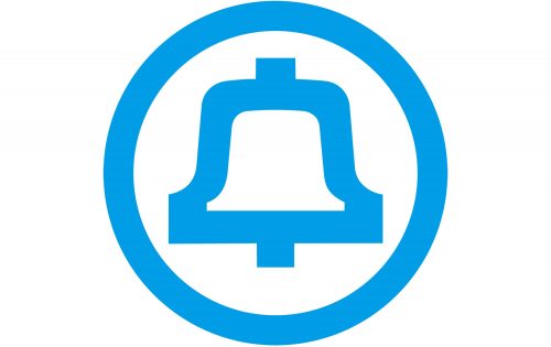
This version is the most minimalist one. It would have looked modern even today. The design was developed by Saul Bass. Although the Bell System went defunct in 1984, the logo was still used by the so-called “Baby Bell” companies spun off of AT&T/Bell System.
Colors and font
The type used in the version made by Saul Bass is Helvetica Neue. In the era, when the logo was introduced, it was an immensely popular font. It looks minimalist.
As for the palette, Bass chose a light shade of blue as the primary color for the Bell logo. However, a black-and-white version was also possible.


