Belgium might not be the biggest supplier of cars now, but historically it’s been amongst the pioneers of this industry. There have been many automotive brands in the early 20th century, and they actually helped define roadster cars in large part. Nowadays, there are a handful of prominent brands in this nation.
APAL
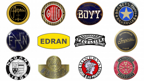
APAL is a car brand that moved to Germany in 1998. Before, it was located in the Eastern Belgium. The cars they made (and continue making) are mostly grand-touring and sports vehicles, some even featured in Formula 1. Their logo depicts the brand’s name, written in normal sans-serif letters, except for the first letter. The first ‘A’ is bigger and longer – its central line is used to underline the rest of the wordmark, while the other bars extend far below it. Often, they’ve put it inside a black circle with golden frames and other elements. The text in such cases would also be yellow.
Bovy
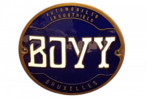
Bovy was one of the earlier Belgian car brands, established in 1902. They operated independently until 1929, mostly building light trucks and some passenger vehicles. The last Bovy trucks were produced in the 50s. The emblem depicts a dark blue circle with the word ‘Bovy’, written with white letters in the middle. Besides that, it also used brown framing and some text of this color inside the logo. That included ‘Industrial Automobiles’ above and ‘Brussels’ below.
Brossel
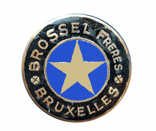
Brossel was a Belgian vehicle manufacturer, founded in 1912. The production continued until 1968, in which time they largely built buses, coaches and similar products. The brand dissolved alongside their owner, Leyland Motors. The company’s logo depicted a black circle with a blue core. Along the edges of that circle, there were several written bits that collectively said: ‘Brossel Freres Bruxelles’ (‘Brossel Brothers Brussels’). The central blue section in the middle also held a bit white star.
Edran
Edran is a carmaker from Belgium, founded in 1984. Since then, they’ve designed two functional models (as of 2021). These are small sports cars with powerful engines. Enigma in particular is their flagman, with sleek design and 800 worth of horsepower. Their logo is a yellow oval with the company name inside. The name is written in grey capital letters. The font is a typical sort of sans-serif.
Excelsior
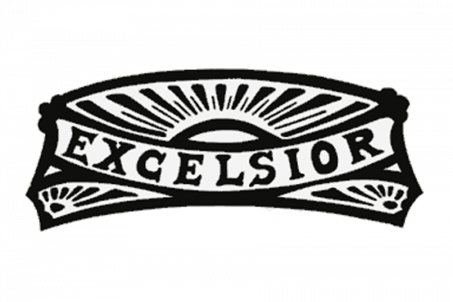
Excelsior was one of the early Belgian carmakers, active in 1903-1929. Their focus was on passenger cars, namely roadsters and other high-performance vehicles. Some of these took part in important French and Belgian races. The logo they used depicted a badge of a loosely rectangular shape. The centerpiece was occupied by a long curved line, where the name was placed. The rest of the logo was given over to the sun imagery.
FN
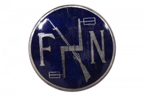
FN is a Belgian weapons manufacturer, but they had also tried building cars before. In 1900-30s, the company produced a number of passenger cars. FN models produced in this time were either sports cars or premium vehicles with minor success. The current FN logo depicts these two letters written in a Gothic style inside a circle shape. Back then, they didn’t have a proper emblem. Their automotive business in particular relied on plaques of text, describing their name, trade (arms maker) and location.
Gillet
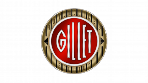
Gillet was a motorcycle and automotive company from Belgium. They operated between 1919 and 1959. Besides creating a myriad of motorcycles, they’ve also built a 3-wheel automobile in late 20s. Their logo was just their name, written in red letters. The font was a sort of hand-written italic style with twists and turns all over. It was also arranged diagonally for an even higher degree of elegance.
Imperia
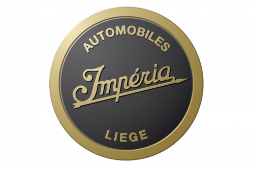
Imperia was a Belgian carmaker, founded in 1904. The brand was dissolved in 1958, but until then they’ve manufactured a number of passenger cars. They primarily build sports cars, but also some expensive models. The brand’s logo depicted a black circle with various bronze-colored elements. That included a frame around the figure, as well as text inside. The very center of the circle was occupied by the word ‘Imperia’, written in bronze, italic letters.
Metallurgique
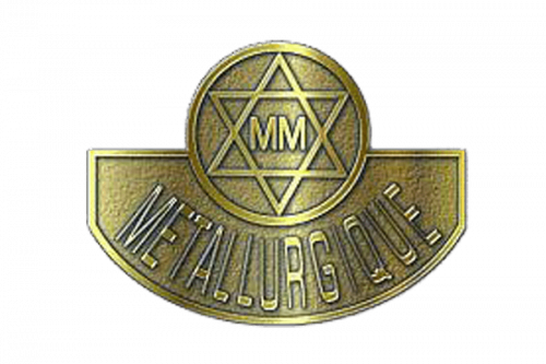
Metallurgique was a Belgian carmaker in 1898-1928. Their focus was on high-performance vehicles, such as roadsters and high-performance passenger cars in general. It was amongst the earliest manufacturers in the country. The logo is a curved blue badge with the company’s name written on it in golden letters. There’s also an oval shape lodged into the curve. Inside of that, there’s a golden Star of David with the ‘MM’ letters in its middle.
Minerva
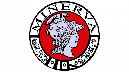
Minerva was a carmaker from Antwerp, Northern Belgium. Their debut was in 1900, and the company remained active until 1956. Initially, they made motorcycles and bicycles. Eventually, the production shifted to sedan cars until the focus fell on off-road cars and early crossovers. Their logo depicted the head of the Roman goddess Minerva, the goddess of wisdom and manual craft. It was drawn in grey and placed in the center of a red circle. After that, the thing was given a white frame with the company’s name in the top.
Nagant
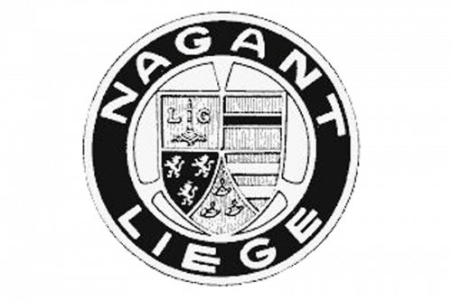
Nagant was a Belgian firm and originally a weapons manufacturer, founded in 1850s. Since 1900, they also started making cars. These were typical passenger cars of the day, in addition to some roadsters and premium cars. The famous Nagant emblem depicted a coat of arms, imposed onto a shield. It was almost identical to the crest of Liege province, where the firm was located. The other element was a circle frame that surrounded the main component. There, they’ve written ‘Nagant Liege’ in big letter along the edges.
Vivinus
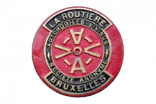
Vivinus was amongst the first Belgian car manufacturers. Founded in 1890, the business initially sold German cars. Not long thereafter, they started designing original Belgian vehicles. The production was discontinued in 1912. Their logo was a complex image based on a red circle. There were black elements that accommodated the company’s name and other written details on it. The center of the figure was, however, occupied by 4 letters: 2 Vs and 2 As – all aligned towards the center.


