The Bahamas Bowl is classified as an NCAA Division I FBS college football bowl game. It has been held annually since 2014 in Nassau, Bahamas.
Meaning and history
One of the most popular football games of the NCAA, the Bahamas Bowl was established in 2014 and to this day still gathers hundreds of thousands of fans to watch it. The bowl takes place at Thomas Robinson Stadium, Nassau, Bahamas, and gathers 15 thousand people at the stadium, and much more at the tv screens. The very first Bahamas Bowl game was won by Western Kentucky, a team from Central Michigan
And if you think that only major leagues matter, you are very wrong, as today all eyes are on collegiate sports. The NCAA is a U.S. college sports league in which athletes try to make their way into professional sports by playing for their university.
The student competitions we can see on TV, with 20,000-seat stands featuring future NBA, NFL, NHL, etc. players, are just the tip of the iceberg of college sports. – is just the tip of the iceberg of college sports. There are thousands of colleges and universities in the U.S., and not every university has a dollar budget and has future world-class athletes in its ranks.
Today, the association has more than a thousand colleges and other educational institutions. They represent each of the nation’s 50 states and the District of Columbia metropolitan area, as well as several clubs from Puerto Rico and Canada.
The NCAA directorate covers 90 tournaments in 24 sports. In total, more than half a million students are involved in them. All disciplines are organized into three seasons of competition.
What is the Bahamas Bowl?
Bahamas Bowl is the intercollegiate football bowl game, which was established in 2014. The game is held annually at the Thomas Robinson Stadium in Nassau, Bahamas. The Bahamas Bowl is a part of the NCAA Division I.
2014 – 2016
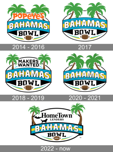
The Bahamas Bowl logo, created in 2014, stayed with the league for almost two years and featured a very bright and funny image, with two green palms coming up from the crest with three lines of lettering. The upper line was taken by the sponsor — the orange “Popeyes” had its letters jumping between two palms and above the arched blue and yellow banner with the whole “Bahamas” inscription in it. The bottom part of the badge contained the black serif “Bowl” lettering set above the brown horizontally placed rugby ball.
2017
The redesign of 2017 removed the “Popeyes” orange logotype from the Bahamas Bowl badge, but keeper all other elements untouched. Now the color palette became calmer and was only based on white, black, green and brown, with the blue and yellow flag elements. The logo was light and fresh and brilliantly represented the summer spirit and playful and happy character of the teams taking part in the competition.
2018 – 2019
So far, the Bahamas Bowl logo has been pretty consistent in its core, although there have been quite a few subtle modifications. The design has always featured two palm trees on the top and the stylized national flag of the Bahamas in the middle. The lettering “Bahamas” in white is written across the flag.
Below, there is a brown football paired with the word “Bowl.”
The position of the palm trees has changed over time, which can be partly explained by the need to squeeze the name of the sponsor in between.
2020 – 2021
The redesign of 2020 removed the “Makers Wanted” part from the upper part of the badge, which made the logo more balanced and cool. The solid green palm now started looking brighter and representing that special island mood and vibe. Another change was about the “Bahamas” lettering, which got a new shade — s light-gray gradient, which made the letters look more voluminous and sleek.
2022 – Today
The Bahamas Bowl logo redesign, held in 2022, has added the sponsor’s insignia to the top part of the badge. It is a black two-leveled “HomeTown Lenders” inscription in a fancy and traditional serif font, with the top title case level enlarged, and the bottom one — in small capitals. The lettering is accompanied by the company’s emblem — a black silhouette of a dog, placed under the hammock with a man in it, set on the left from the wordmark, with its left part attached to the palm, and the right — to the bar of the “H”.


