Ansaldo STS is an Italian automotive manufacturer specializing in the production of railway and mass transit systems. It is owned by Hitachi, a global conglomerate based in Japan. Ansaldo STS is renowned for its expertise in providing advanced signaling and control systems for railways, metro networks, and tramways. The company operates globally, with projects and installations spanning various countries and continents. Its innovative solutions contribute to the efficient and safe transportation of people and goods, ensuring smooth operations and enhancing the overall transit experience.
Meaning and history
Ansaldo STS is an Italian manufacturer of railway signaling and transportation systems. It was founded in 1853 by Giovanni Ansaldo. Over the years, Ansaldo STS has achieved significant milestones in the industry. They developed innovative signaling technologies that ensure safe and efficient train operations, including automatic train control systems and advanced signaling solutions.
Ansaldo STS has successfully implemented numerous projects worldwide, contributing to the modernization of railway networks. They have been involved in the construction of high-speed rail lines, metro systems, and urban transit networks, delivering cutting-edge signaling and communication systems.
Today, Ansaldo STS continues to be a prominent player in the railway industry. They have expanded their operations globally and established partnerships with leading transportation companies. With a strong focus on research and development, Ansaldo STS strives to offer state-of-the-art solutions for rail transportation, addressing the evolving needs of the industry and enhancing passenger safety and comfort.
As of now, Ansaldo STS remains at the forefront of railway signaling technology, delivering advanced systems for both domestic and international projects. Their commitment to innovation and expertise positions them as a trusted provider in the global transportation sector.
What is Ansaldo STS?
Ansaldo STS is a global transportation technology company specializing in the design and implementation of signaling and control systems for railways and urban transportation. With a strong focus on innovation, Ansaldo STS provides cutting-edge solutions to enhance safety, efficiency, and sustainability in the transportation industry.
1912 – 1917
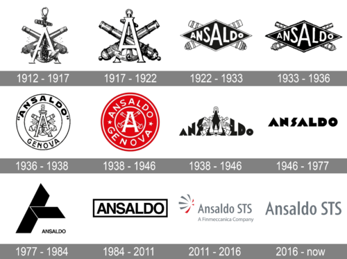
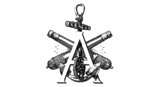
The first letter of the Ansoldo company was placed in the center and decorated with several elements. Two 19th-century canons created an “X” behind the initial. The logo also featured an anchor and a gear. All the elements were excellently drawn. They pointed to the specification and focus of the company. The logo was done in black and white shading.
1917 – 1919
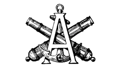
All the components of the logo were refined. The anchor was not sticking out above the “A” as much. The logo looked more balanced and the company’s initial took a more key position. The gear was made a lot smaller and placed at the very bottom of the gear, so it was barely noticeable.
1919 – 1922
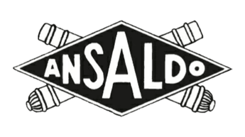
This is an abstract version of the earlier versions. The designer preserved only the two 19th-century cannons. They were white with black lines used to create the shape of the cannon. A large black rhomb stretched out in front of the cannons. Besides a thin black and white border, the rhomb had the company name printed using a basic, sans-serif font in white. The characters filled the shape, so the second “A” was placed in the center and was the largest. This created a connection to the other logos with the “A” being the center of the emblem.
1922 – 1933
The logo did not look much different, but there were a few modifications. First of all, the designers added a bit more shading to the cannons, which made them look more like the ones in the original logo. The black line in the border got thicker, creating a more defined outline.
1933 – 1936
In this logo, we see an abstract, simplified drawing of the original emblem placed in a circle. The circle had a wide border that held “Ansaldo” printed in quotation marks using a bold, sans-serif typeface. At the bottom of the border, the emblem had “Genova” written using the same font only featuring smaller and not bold characters. It was a great way to preserve the company’s roots while introducing something new.
1936 – 1938
A bright red color made the whole emblem look very different from what everyone got used to seeing. At the same time, it featured multiple elements that were used in the other emblems. Besides the round shape with the name and location at the bottom, the logo had a familiar “A” with two cannons. It is clear that the designers have worked on the logo to create a better representation of a strong company.
1938 – 1946
This is a very unordinary logo that presents the company from a completely different side. It is daring and confident thanks to a bold typeface choice that featured angular, pointed ends and characters that created an arch. The second “A” was decorated by gear, cannons, and anchor as in some of the previous logos.
1946 – 1977
The logo of the brand introduced in 1946 left no symbolism used in earlier versions of the company’s logos. There was one element that made the logo recognizable. The company used the same font as in the previous logo to print its name. However, this time it was printed in a straight line with all the letters having the same height. This logo looks very modern despite being created in the middle of the last century.
1977 – 1984
The logo of the company is a perfect reflection of the company’s highly advanced approach to every single part of its activities. It designed a minimalistic, black and white emblem with two bold strokes standing for “A” and a small “Ansaldo” inscription in the bottom right corner. The full name was done using a sans-serif font with all uppercase letters and minimal spacing between the characters.
1984 – 2011
This logo version continues the company’s simple yet sophisticated and remarkable logo trend. The name of the company was taken into a rectangular frame. The name was printed using a bold, sans-serif font similar to Europa Grotesk SB Med or Helvetica Bold. The clean lines and close spacing of the characters created an image of a stable and serious company.
2011 – 2016
The light gray, which is the main color in this logo, reflects the strength, stability, and modern technology the company is strongly associated with. The red touches enhance the powerful appearance. The logo consists of the name “Ansaldo STS” and an inscription underneath that says “A Finmeccanica Company”. Both lines have the same length, color, and font. On the left, the emblem had an illustration that resembled a firework.
2016 – now
The company decided to keep only the name portion of the previous logo. It became a simple and modern emblem with a full focus on the name of the company. “Ansaldo STS” was printed using a clean, refined font that resembled LCT Picon Condensed Medium or Madera Condensed Medium but with the “A” having a pointed end.


