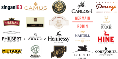
In brandy production, a field steeped in tradition and craftsmanship, logos hold significant meaning. They embody the brand’s rich history, artisanal skill, distinctive character, and the nuanced complexity of the spirit. As we delve into the intriguing realm of brandy brand logos, we explore the development, design components, and the narratives they convey, from the warmth of spices and floral notes to the rich aromas of apple brandies and the aged perfection found in XO (Extra Old) and VSOP (Very Superior Old Pale) categories.
Known for its layered complexity, brandy is distilled from wine or fruit juice, often incorporating the essences of apples, apricots, and pears, alongside spices like cinnamon and black pepper. Brandy producers’ logos often mirror these attributes, incorporating elements that signify their origins, product quality, legacy in brandy crafting, and the unique experiences offered through each new bottle of brandy. These logos, ranging from traditional to modern, silently communicate excellence, tradition, and sometimes a sense of origin, hinting at the spirit’s diverse nature through symbols of copper pot stills or the youngest brandy in their selection.
This exploration reveals how some logos have endured time, staying mostly unchanged for decades or centuries, reflecting the brands like Louis XIII’s commitment to perfection or Thomas Hine’s rich character. Such logos typically feature heraldic icons, family emblems, or typography reflecting the brand’s founding, symbolizing continuity and lasting quality. Conversely, some brandy makers have adopted modern logos, presenting streamlined designs that honor their heritage while appealing to contemporary consumers looking for new favorites for their home bar or special occasions.
Each logo in the brandy sector narrates a tale, combining art, history, and branding strategy. These logos are more than trademarks; they are emblems of a brandy-making legacy, capturing the essence of aromas from citrus to caramel, the comeback of traditional eaux-de-vie, and the distillation methods that define their offerings. Examining these logos uncovers their history, craftsmanship, and vision, from the spirit’s rich amber tones to the intricate designs of the logo, every element highlights the brand’s dedication to excellence and the unique experience of enjoying a sidecar cocktail with notes of vanilla, banana, or the special touch of floral notes.
This article examines some of the brandy industry’s most iconic and intriguing logos, revealing hidden meanings, design evolution, and the marketing ingenuity behind these visual gems, showcasing the journey from traditional copper pot stills to the labels of new bottles that invite consumers into a world of unique flavors and heritage.
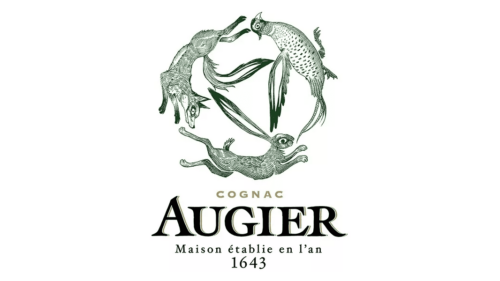
Augier
In the world of cognac, Augier stands out with its unique approach since its inception in 1643. This brand takes pride in producing single-cru cognacs, a method that accentuates the distinct flavors of grapes from specific estates. At the heart of Augier’s visual identity is a logo featuring an imaginative ensemble of animals, arranged in a circle reminiscent of classical bestiary art. This intricate design includes a wolf, hare, and bird resembling a pheasant, each portrayed with fine details and subtle lines, creating a sense of orchestrated movement. The name “AUGIER”, along with the phrase “Maison établie en l’an 1643”, is elegantly displayed below in a classic serif typeface, adding a sense of heritage and longevity to the brand.
Bertoux
With its roots in California, Bertoux Brandy brings a contemporary touch to the brandy world. Despite not being a mezcal producer, Bertoux specializes in a modern brandy that’s perfect for mixing into cocktails. This brand blends pot-distilled brandies aged in both American and French oak barrels. Its logo, a striking geometric design, features the name “BERTOUX” on a dark, ribbon-like banner that cuts across a shield or crest shape. The serrated edges of the banner provide a textured contrast to the smooth, golden letters, creating a design that speaks of tradition and prestige in a monochrome palette, ensuring its timelessness.
Camus
Since 1863, Camus has been a distinguished name in the family-owned cognac industry, known for its extraordinary smoothness and aromatic richness. These qualities stem from a meticulous production process in the Borderies region. The logo of Camus is a masterpiece of minimalism, with the brand name “CAMUS” in large, elegant, serif characters, all bathed in a gentle golden glow. A four-leafed emblem, suggesting a stylized cross or clover, sits above the name, also in a golden tone. The logo is anchored by the phrase “INDEPENDENT SINCE 1863”, highlighting the brand’s long-standing independence and rich heritage. The use of gold and the focus on tradition narrate a story of luxury and time-honored craftsmanship.
Carlos I
Carlos I, a Spanish brandy of premium quality, is celebrated for its elegant and complex flavor profile. This distinctive taste is achieved through traditional solera aging in the famed sherry region of Jerez. The logo of Carlos I showcases a stylized, regal knight mounted on a spirited horse, lance at the ready. The bold silhouette of the knight conveys a sense of chivalry and heroism from a past era. Below this figure, the brand’s name “CARLOS I” is displayed in a substantial serif typeface, blending tradition with strength and stability.
Cognac Park
Recognized for its commitment to organic production, the brand Cognac Park stands as a bastion of purity and elegance in the art of cognac craftsmanship, deeply rooted in the Cognac region of France. This brand prides itself on focusing on the natural essence of the Ugni Blanc grape, along with the distinctive terroir that contributes to the spirit’s diverse nature and the creation of different eaux-de-vie, each with its unique profile.
Its logo presents an impressive stag’s head, adorned with a full set of antlers, symbolizing strength and the natural beauty of the region. Encased within a gracefully curving ribbon banner, the emblem carries the weight of tradition and a connection to the land. The banner bears the Latin inscription “PROVIDENTIAE ME COMMITTO”, translating to a reliance on foresight or providence, a nod to the meticulous care and forward-thinking that goes into producing their distinguished cognacs.
Positioned over the brand name “COGNAC PARK” in a serif font, the emblem exudes elegance and authority, inviting connoisseurs to delve into the rich tapestry of flavors offered by this esteemed brand. The contrast between the gold of the stag and banner and the black text embodies sophistication and refinement, mirroring the brand’s dedication to producing cognacs of unparalleled quality that reflect the rich heritage and complex nature of spirits crafted in the Cognac region of France.
Courvoisier
With roots in the early 19th century, Courvoisier is a globally celebrated cognac house known for its luxurious, aromatic, and exquisitely crafted cognacs. Its logo combines tradition and contrast, showcasing “COURVOISIER” in striking black serif letters. Hovering above is a shadowy figure, hat and cloak clad, subtly referencing Napoleon. This is underscored by the script “Le Cognac de Napoleon” beneath, adding a historical dimension. The logo’s minimalist design, paired with the flowing script, evokes a mysterious and historic aura around the brand.
Darroze Armagnac
Darroze Armagnac, a family-run brand, is acclaimed for its singular collection of single-estate vintage Armagnacs, each a testament to the unique Gascony region’s terroir and heritage. Its logo features “Darroze” in a dynamic, handwritten style, akin to a personal signature. Above it, “ARMAGNAC” appears in structured capital serif letters, offering a visual anchor to the lively brand name. The statement “ARTISAN D’EXCELLENCE” below reinforces the brand’s dedication to artisanal quality and excellence. The palette of rich browns and oranges in the logo reflects the earthiness and warmth of the spirit.
DEAU Cognac
DEAU Cognac, notable for its pioneering blending methods, crafts a variety of sophisticated cognacs. Each product is derived from grapes of the Grande Champagne region, known for depth and complexity. The logo features a mythical griffin, poised and majestic, with wings unfurled and head turned nobly. Set against a white backdrop, this black silhouette rests above a stylized hill or globe, symbolizing both protection and international presence. “DEAU COGNAC” is written below in strong, capital serif letters, portraying a sense of solidity and enduring tradition. The design masterfully blends fantasy with dignified grace.
Germain-Robin
In the realm of craft brandy distillation, the Californian brand Germain-Robin is recognized for its exceptional blend of traditional French distillation methods and rare grape varieties from California. Its logo adopts a modernist style, showcasing the name “GERMAIN ROBIN” in a crisp, sans-serif font, neatly divided into two segments by a bold horizontal line. The coral red hue of the text radiates warmth and approachability. This logo’s minimalist design and effective use of negative space reflect a modern confidence and a straightforward, uncluttered aesthetic, giving the brand a distinctive and polished identity.
Hennessy
Established in 1765, the world-renowned cognac house Hennessy is synonymous with superior quality and expert craftsmanship, a reputation bolstered by the exquisite Hennessy XO, a symbol of the brand’s mastery over the art of cognac production. Hennessy’s cognacs, known for their richness and complexity, have gained international acclaim, with Hennessy XO standing as a pinnacle of their offering, embodying the brand’s commitment to excellence.
The logo is a testament to this prestige, featuring the prominent Hennessy name in an elegant, bold serif font. Atop the “H”, an iconic arm and axe emblem stands, symbolizing strength and tradition, qualities that are echoed in every bottle of Hennessy XO. The phrase “Maison Fondée en 1765” sits above the emblem in a classic script, reinforcing the brand’s rich history and deep-rooted heritage in the cognac-making tradition.
Hennessy XO, with its luxurious and complex flavor profile, serves not just as a beverage but as a beacon of Hennessy’s enduring legacy. It is a testament to the brand’s ability to blend centuries-old tradition with innovation, resulting in cognacs that are cherished across the globe. The logo, with its elegant design and historical elements, invites connoisseurs to explore the depth and breadth of flavors that Hennessy, especially through its XO expression, brings to the world of spirits.
Hine
Dating back to 1763, Hine Cognac is distinguished by its meticulous aging process in France’s Cognac region, yielding cognacs celebrated for their refined elegance and floral undertones. The brand’s logo features the name “HINE” in bold, red block letters, capturing immediate attention. A detailed deer silhouette, representing grace and agility, sits above the name. The use of red in both the text and the emblem draws the eye, while the inscription “MAISON FONDÉE EN 1763” under the deer provides a nod to the brand’s historical lineage in a straightforward, unembellished font.
Jean Luc Pasquet
Jean Luc Pasquet, a boutique, family-owned estate in the Cognac region, specializes in organic, artisanal cognacs. These cognacs mirror the unique character of their single-estate grapes, offering an authentic taste of the terroir. The logo of the brand is a blend of boldness and classic elegance. It features the initials “JLP” for Jean Luc Pasquet in an elegant serif font, with the full name written below in a traditional style. “L’ORGANIC” is prominently displayed underneath, emphasizing the brand’s commitment to organic production. The overall design is clean and straightforward, conveying clarity and a meticulous focus on quality.
Lepanto
In the Jerez region of Spain, the premium brandy Lepanto is meticulously crafted, gaining acclaim for its complex and nuanced flavors born from an intricate solera aging process. The brand’s logo features a deep navy oval, gracefully bordered by a detailed gold filigree frame. Central to the design is the brand name “LEPANTO”, elegantly positioned beneath the royal Spanish crown. The words “BRANDY DE JEREZ” appear just below, with “12 AÑOS” indicating the brandy’s age. A banner at the bottom announces “SOLERA GRAN RESERVA González Byass”, signifying the esteemed solera aging technique and its prestigious producer.
Marks & Spencer
The well-known British retailer Marks & Spencer offers an extensive array of high-quality products, including a carefully selected collection of wines and spirits. This range includes their own brand of brandies, catering to a diverse palate. Their logo is a study in minimalism and iconic design, displaying the initials “M&S”, which stand for Marks & Spencer. Utilizing a bold, black, sans-serif font, the logo is modern and straightforward. The “M” and “S” are uniquely designed, with the “&” symbol connecting them, reflecting the integration of the two names. Below this, “EST. 1884” is prominently displayed, providing a nod to the brand’s long-standing heritage.
Martell
Martell, established in 1715, holds the distinction of being one of the oldest cognac houses. Known for its smooth and rich cognacs, particularly those from the Borderies region, Martell’s products possess a distinct character. The logo displays the name “MARTELL” in an elegant navy blue serif font, exuding sophistication. Above the name, a golden swift in flight symbolizes elegance and swiftness. Below, “COGNAC” is neatly placed, and “FONDÉE EN 1715” is encased in a decorative golden shield, emphasizing the brand’s historic legacy in the world of cognac.
Metaxa
Founded in 1888 in Greece, Metaxa is celebrated for its distinctive spirit, a blend of brandy, wine, and Mediterranean botanicals. This amber-hued drink is both aromatic and flavorful. The logo for Metaxa features the brand name in bold, capitalized letters with a striking black fill and a yellow outline, radiating energy and vibrancy. Below the name, “THE GREEK SPIRIT” is inscribed, hinting at both the geographical origin and the lively essence of the beverage.
Osocalis
Located in California, the small and artisanal Osocalis distillery is renowned for its fusion of traditional European distillation methods and California’s rich fruit varieties. This unique approach results in brandies of exceptional quality and distinct character. The brand’s logo features “OSOCALIS” written in an elegant serif typeface on a dark backdrop, conveying a sense of tradition and premium craftsmanship. Above the name, a small square holds a detailed, Celtic-inspired knot design, symbolizing complexity and perhaps a tribute to ancient distilling practices. The logo’s composition against a creamy background exudes an air of exclusivity and artisanal finesse.
Philbert
In the heart of the Cognac region, Philbert Brandy stands out with its groundbreaking aging technique. This process involves partially aging their spirits in oak barrels submerged in cognac cellars, enriching the brandy with added complexity and depth. The “PHILBERT” logo is a model of simplicity and modernity, rendered in a clean, modern serif font. It is complemented by the phrase “CRAFTED AT THE DISTILLERIES IN ETRIAC & TOUZAC, FRANCE”. Below, “SMALL BATCH COGNAC” highlights the brand’s commitment to exclusive, handcrafted production. “The Single Estate” beneath the brand name emphasizes the unique origin and quality of their cognac. The logo’s monochromatic color scheme melds contemporary style with traditional craft.
Singani
Singani, hailing from Bolivia, represents a unique category of brandy with over 500 years of history. It is exclusively produced using the aromatic Muscat of Alexandria grapes, cultivated at high altitudes in the Andes mountains. The brand’s logo, “singani63”, is presented in a bold, modern sans-serif font. The name “singani” appears in black, while “63” stands out in contrasting red, creating a visually striking effect. The numbers may represent a significant year or a specific recipe, adding a layer of historical or unique significance to the brand.
Soberano
González Byass, a distinguished name in Spanish brandy production, brings us Soberano, crafted in the renowned Jerez region. Known for its rich, smooth flavor and traditional solera aging process, Soberano enjoys popularity both in Spain and internationally. The logo of Soberano showcases the brand name in a timeless serif font, against a backdrop of deep maroon with a golden border, signifying the brand’s commitment to tradition and quality. A royal crown adorns the top of the logo, symbolizing the brand’s esteemed status and commanding presence in the brandy market.
Vecchia Romagna
Vecchia Romagna, a revered name in Italian brandy, is lauded for its meticulous distillation using Trebbiano grapes and aging in oak barrels, which imparts a distinct, rich, and nuanced flavor profile. Its logo encircles the bold, capitalized letters of “VECCHIA ROMAGNA”, framing a classical depiction of a face entwined with grapevines and leaves, invoking imagery of Bacchus, the Roman deity of wine. Below, the phrase “BRANDY ETICHETTA NERA” hints at a special black label edition. The striking contrast of gold on a black background gives an air of distinction, reflecting a legacy of high-quality and rich heritage.
WV Baker & C
WV Baker & Co. is a dedicated producer of small-batch, high-quality brandies, capturing the spirit’s diverse nature through their focus on traditional distillation methods and the selection of premium ingredients. Their commitment results in spirits that are both distinctive and memorable, appealing to connoisseurs across the entire world.
The brand’s logo is a circular, crest-like emblem featuring “WV BAKER & Co.” At its heart is an intricately etched knight in armor, mounted on a horse, symbolizing nobility and valor—a reflection of the brand’s dedication to the art and craft of brandy production. The knight and horse appear in a dynamic pose, perhaps depicting a moment of triumph, resonating with the triumphant experience of savoring their meticulously distilled spirits.
Encircling this central image is a series of concentric circles with a textured pattern, adding a sense of depth and intricacy to the design, much like the layered complexity found in their brandies. Rendered in sepia or earth tones, the logo evokes a feeling of antiquity and tradition, paying homage to the age-old distillation techniques that define their products. The shield-like shape, with a unique notch on the left side, enhances the heraldic quality of the design, signifying the brand’s commitment to excellence and its storied heritage.
This emblem not only represents WV Baker & Co.’s dedication to quality but also serves as a beacon to those who appreciate the nuanced art of brandy making, inviting them to explore the rich tapestry of flavors and aromas crafted by their traditional distillation method. It is a testament to the brand’s role in bringing the diverse nature of spirits to aficionados around the entire world, honoring the legacy of brandy production while forging a path forward with innovation and passion.


