The world’s largest cosmetic company, L’Oréal S.A. is based in the northwestern suburb of Paris, called Clichy. Some of the fields the company works in are hair color, skin care, make-up, fragrances, as well as tissue engineering and biopharmaceutical research.
Meaning and history
The history of L’Oréal group dates back to 1909, when the young chemist Eugène Schueller offered Parisian hairdressers a hair dye he had created on his own. The name of the dye was Auréale. So, from its very first steps, the company has been moving in the direction that is true to it even now: use research and innovation to create beauty.
The company was registered only ten years later. At the time, the staff included only four chemists (including the founder) while by 1951 there were over 100 employees. As of 2017, over 20,000 people worked for L’Oréal. The group owns over 500 brands.
What is L’Oreal?
L’Oreal is the name of the world’s largest cosmetic corporation, which was established in France in 1909, and today owns dozens of brands in different price segments, with the products distributed all over the globe.
1909 – 1910
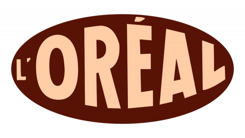
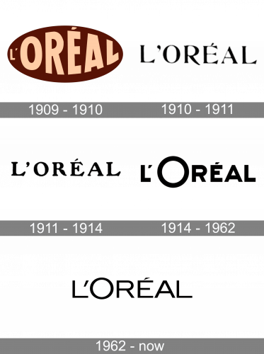
The brand’s original logo refers to a signboard, made by L’Oreal designers when the company appeared. It was a large dark brown oval with a ‘L’Oreal’ inscription on it. The word had a sans serif type colored rose. The feature of this font was that the first ‘L’ character was small, while the following letters were enlarged as if you look at them through a loop.
1910 – 1911
Then, they put just a nameplate without background. The font used for the lettering had a thin serif style. The characters were black.
1911 – 1914
A bit sooner, that name was enlarged. It also got a bolder typeface.
1914 – 1962
The wording was renovated again in 1914. Now it had a fat black sans serif typeface with the larger ‘O’ character. This version was so successful so it stayed with the brand for the years to come.
1962 – Today
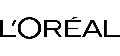
The 1962 wordmark depicts the ‘L’Oreal’ inscription made in a slim sans serif with straight lines. The ‘O’ letter is enlarged on other characters’ background, though not like it was in the previous logotype.
Symbol
In fact, the LOreal logo is not an image or a symbol, but just a wordmark. That’s why the very type and the way each character is given are essential for the overall visual effect. Each letter in the name of the company is capitalized. Interestingly enough, they are given in two sizes: “L” and “O” are bigger, while the “real” inscription is given in smaller letters. So, although all the characters are capitalized, the designers managed to stay within the boundaries of grammar rules.
The story behind the phrase in the emblem
The phrase “Because I’m Worth It” first appeared in a L’Oreal advertisement in 1973. It was written by a 23-year-old copywriter Ilon Specht with McCann Erickson. The phrase turned out to be very popular, and the New Yorker even devoted an article to it in 1999.
Font
The type chosen for the LOreal wordmark is highly readable and clear. We can’t notice any notable unique features: every character looks the way it would have looked in a blog or a magazine article. Due to the simple and minimalistic font the insignia stays highly recognizable and doesn’t leave you in doubt as to who it belongs to.
Color
L’Oreal logo is basically given as a combination of white and black. The corporate emblem features black as a background, while the wordmark itself is given in white (negative). However, the reverse is also acceptable. This elegant and classic combination symbolizes the inborn sense of style, as well as purity (white) and mystery (black).
It is also worth mentioning that the emblem may be given in various other colors, depending on the visual context. Most often, it features shades of golden, sometimes with the 3D effect.


