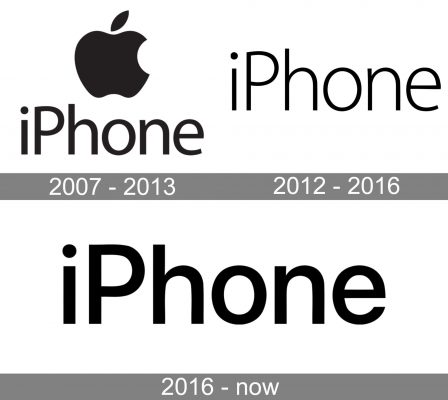
iPhone is a series of smartphones developed and manufactured by Apple Inc. Since the release of the first iPhone in 2007, Apple’s iconic smartphone has captivated the world. Today, the iPhone remains one of the most popular and recognizable devices on the market. And it’s all thanks to its super modern design and user-friendly interface. Every time the announcement of a new iPhone causes a frenzy of excitement, and the queues for its purchase have long been measured not by dozens, but by hundreds of people. What we refer to as the iPhone logo is either the ‘iPhone’ wordmark or an image of an apple with a bite paired with the wordmark.
Meaning and history
The history of the Apple logo started in 1976, and it has changed only three times since then. The first change – the most radical one – took place about a year after its inception, and it came as no surprise. The image of a bitten apple alludes to the story of Adam and Eve who picked the apple from the tree of knowledge and bit on it. Also, Rob Janoff, who designed the logo, said that the bite was to distinguish apple from any other fruit or vegetable. Finally, the word ‘bite’ puns with ‘byte’ – a unit of digital data.
What we now refer to as the iPhone logo originated in 1976. The very first logo was introduced by Ronald Wayne, and it looked like an art gallery masterpiece rather than a logo. That was a picture of Isaac Newton with a book sitting under an apple tree with an apple hanging right above his head. The picture and the landscape depicted in this so called logo pretty much reflected the meaning of the sentence on the frame about the “mind voyaging through strange seas of thought…”
It was pretty clear that the first iPhone logo would not last a lifetime, as there had to be a simpler and more modern variant. Steve Jobs hired Rob Janoff, a graphic designer, who eventually came up with the apple mark, which was introduced in 1976. This logo is still there, and it has come through decades unchanged except for colors. The first version was a rainbow-colored apple, which continued until 1997. The rainbow palette was to ‘humanize’ It should be noted that the colors were arranged in a pattern different from rainbow. Most likely, that was to emphasize the company’s eternal search for something new and go-against-the-grain philosophy.
2007 — 2013
The first logo of the iPhone itself featured the bitten apple in black above the word “iPhone” (also in black). The lettering was set in a simple sans with classic proportions. The widths of the strokes varied slightly, which added an elegant touch.
2012 — 2016

The updated version was lighter than the original and featured a type, where the strokes had equal widths. The apple wasn’t there anymore.
2016 — Today
This version was almost as bold as the original one, yet there was no apple. The shape of the glyphs was slightly different from the original 2007 logo (note, for instance, the end of the “e”).
App logo
The rainbow-colored iPhone logo was replaced by a monochromatic version. It happened when Steve Jobs returned to the company, which was going through a period of financial instability. Steve believed, that a new iPhone logo design could put things right. Monochromatic logos looked better on iPhone casings. To make the logo more prominent, Steve pressed for a larger size. The monochromatic logo boasts greater flexibility with changing iPhone designs, and it comes in different colors.
Symbol
Steve Jobs chose the apple mark after a visit to an apple farm when he was sticking to a fruitarian diet.
Emblem
The iPhone logo comes with the ‘iPhone’ wordmark on all products of the kind.


