Allstate is a famous American company, which specializes in providing insurance services. The company was established in 1931 and today is considered to be one of the largest in North America with its operatic offices across the USA and Canada. The corporation has more than 40 thousand employees and annual revenue of around 45 billion USD.
Meaning and history
The Allstate visual identity is a graphical representation of love and care, which looks professional and reliable. The company’s logo is composed of a clean simple wordmark with a delicate and timeless emblem on its left.
The company has been using one and the same symbol since the first years of its existence, only slightly remodeling and refining it. Same with the nameplate — it was only simplified and modernized throughout the years, but the original mood of the logo and the company’s character and essence are still reflected in the visual identity.
What is Allstate?
Allstate is the name of an American insurance services provider, which was established at the beginning of the 1930s, and by today has grown into one of the largest companies in the United States in its segment, offering the full spectrum of insurance products to the population.
1931 – 1955
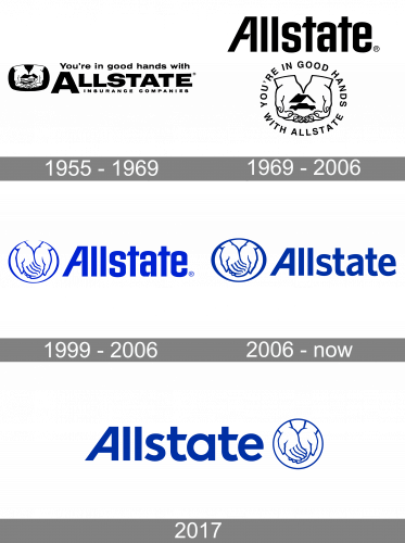
The original Allstate logo was designed in 1932 and stayed with the famous insurance provider for more than 30 years. It was a monochrome visual identity, composed of a wordmark with an enlarged letter “A”, a tagline “Insurance Companies” in all capitals and a company’s motto “You’re in good hands with” placed above the nameplate.
The simple sans-serif typeface of the inscription showed the firm as a confident and stable one, evoking a sense of reliability and protection.
The company’s emblem depicted two hands holding a small house. The posture was placed inside a rectangle with rounded corners and reflected the caring company, which values its customers’ life and comfort.
1955 – 1969
The additional version of the company’s visual identity was created in 1966 and is the only one among all the brand’s designs, which was a completely different shape and style. Two hands are still the main part of the logo, but now they hold a car with a roof of the house above it. The “You’re in good hands with Allstate” inscription in all capitals is placed around the perimeter of the image, forming a horizontal oval. The emblem was executed in a monochrome palette and looked light and contemporary.
1969 – 2006
The redesign of 1969 simplified the shapes of the logo, making it look stronger and more modern. The new visual identity was composed of a custom wordmark executed in a sans-serif typeface and a clean emblem, depicting two hands in an oval frame. All the additional lettering was removed and the color scheme was changed to blue and white.
The new color palette of the company’s logo is a reflection of safety and reliability, as well as professionalism and a fundamental approach to the services the company provides. At some point, the company started using a logotype without any graphics and the color varied from blue to black, but the original concept won and the emblem came back to the logo.
1999 – 2006

The 1999 redesign was a strict and strong company name with the cuts in both capital and small characters ‘A’, as well as the oval emblem with a hand gesture from the previous design. The whole logo was drawn in a blue color scheme.
2006 – 2017
The current Allstate visual identity was created in 2006 and is fully based on the previous versions. The logo, composed of a wordmark and an emblem on its left is just a refined logo from 1969, with a modernized inscription and the emblem, which is left untouched.
There are two alternative versions today — with a flash deep blue on white design and a three-dimensional emblem with a lighter shade of blue as the main color.
2017
There was one more logo created in 2017, but it only stayed with the company for less than a year. The only difference between the version of 2017 and the one from 2016 was the shape of the emblem. In the experimental version, it was a circle, but the company decided to switch back to the traditional oval shape.
Font
The custom wordmark of the firm’s logo is executed in a bold and neat sans-serif typeface, which is very close to FF Real Head Pro Demibold don’t, but with its “A” modified. The first letter of the inscription features its right bar straight and left — diagonal, which adds dynamics and energy to the whole visual identity.
The traditional lines and straight distinct cuts of the letters evoke a sense of professionalism and strength, showing a confident and stable company.
Color
The combination of blue and white has been featured on the Allstate logo since 2006. Back then it was a different shade of blue, while the current dark blue color was adopted in 2017.
Review
Allstate Insurance Company is the second-biggest property and casualty insurance company in the United States. It controls about 12% of the American home and auto insurance market, second only to State Farm Insurance Companies.
The company serves more than 20 million customers through Allstate Protection, Service Businesses, Allstate Life, and Allstate Benefits segments. The Life Insurance Company offers life, annuity, and pension products, and its Business Insurance offers select coverages for small and medium-sized businesses.
The group sells its products and services through its operating offices and wholesale partners, as well as brokers and individual specialists. The company also has a website and a mobile application, which have all the necessary information on all the insurance plans available.
The company, operating all over the United States and Canada is the largest publicity held insurance business in North America.


