Allianz is a German insurance company, which also provides financial and consulting services. The company was established in 1890 and today is one of the largest representatives of its segment in the world and the biggest in Europe with almost 150 thousand employees in its operating offices across the globe and annual revenue of almost 150 billion USD.
Meaning and history
The company’s visual identity is minimalist and stylish. Its logo, composed of a wordmark and an elegant yet strong emblem is instantly recognizable across the globe and evokes a sense of a highly-professional approach and attention to detail.
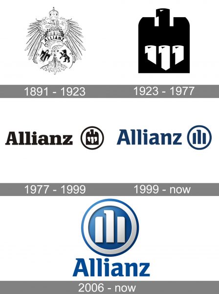
The Allianz logo had only three major redesigns throughout its long history, but the main idea was kept in all the versions. The company’s visual identity is a tribute to its roots, heritage, and traditions.
1891 – 1923
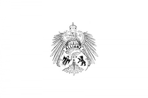
The very first logo of the company was created in 1891 and depicted an ornate coat of arms with a detailed picture of an eagle, whose head was turned left and had a crown above it. The wordmark was placed on an arched ribbon, placed over the bird’s body.
The emblem also featured two small shields, located under the eagle’s wings. One with a monk and another one — with a bear.
This heraldic insignia stayed with the company for more than 30 years and is the most traditional and royal of all the Allianz visual identity designs.
1923 – 1977
In 1924 the company got a completely different emblem, which was strong, modern and minimalist in comparison to the previous one.
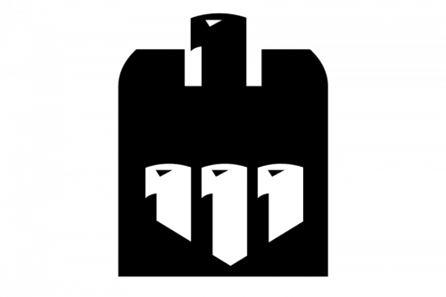
The new insignia, designed by Karl Schulpig, depicted a stylized image of an Eagle, which was composed of a solid b
lack silhouette with a clean distinct contour. There were three vertical lines on the bird’s body, which had their upper parts curved to the left and their bottoms’ cuts triangular.
It was a powerful emblem, which boasted a German Imperial Eagle, a symbol of strength and courage.
1977 – 1999
The logo was slightly modified in 1977 by Hans Jorg Dorschel, who enclosed the Eagle in a circle and added a wordmark above it. The monochrome color palette and the iconic imperial bird were kept untouched, while the circle of the emblem softened the sharp and strict silhouette, and the lettering added a sense of professionalism and traditional approach.
Later the company started using a blue and white color combination, as a reflection of the brand’s reliability and trustworthiness.
The logotype was executed in a bold serif typeface, which is very similar to the Schadow font family, created in 1938 by Georg Trump.
1999 – Today
The current Allianz logo was designed in 1999. It is a modernized and simplified version of the previous one, where the imperial eagle is replaced by a graphical interpretation, consisting of three vertical lines, where the middle one has its upper part turned left, like the iconic eagle, and two other lines are placed lower and have their tops rounded, representing wings.
The typeface of the wordmark was also refined and gained a more modern and sleek look, representing a powerful reputable company.
The color palette remains blue and white,
which is a perfect symbol of reliability and protection, as well as the firm’s expertise and authority.
2006 – Today
Another version of the logo was created in 2006 by Gerard Unger and features the same wordmark and emblem but in a three-dimensional refined design. This version features a lighter shade of blue and a silver-tone of white. The circle has a thick white outline, which makes the brand’s symbol contemporary and strong.
Both emblems are being used by the company today, depending on the placement — whether flat or 3D.
Shape and colors
The current logo was introduced in 2006. It boasts a simple yet iconic word-picture design, which is highly recognizable worldwide.
Font
The Allianz elegant and classy wordmark is executed in a custom typeface, created by Gerard Unger. It features straight neat lines and delicate serifs, which are placed only on the upper parts of the letters, except for “A”.
The custom typeface of the company’s visual identity is pretty close to Rotis Semi Serif Bold 65 or Jotia Bold fonts, but with the softened lines.
Review
Established by Wilhelm Finck and Carl Thieme in 1890 in Berlin, Allianz Group is an international leader in insurance and financial services, which operates in over 70 countries worldwide, through more than 700 subsidiaries and offices.
The company offers insurance and financial services, operating in three core business areas: property and casualty insurance, life and health insurance, and asset management and banking.
The Property & Casualty segment includes personal accidents insurance, general liability, fire, legal expense, credit, and travel plans. The Life & Health area consists of annuities; endowment and term insurance; unit-linked and investment-oriented products; private and supplemental health; and long-term care insurance. The Asset Management segment provides institutional and retail asset management products and services and has over 1.1 trillion EUR under its management in its newest sector. The Corporate & Other department includes treasury and alternative investment activities.
The company established as a German business has grown into one of the most influential financial and insurance services provider in the world, which has a perfect reputation and is known for its reliability and professionalism.


