The logo of the Chinese tech company Xiaomi reflects its global ambitions and interest in innovations.
Meaning and history
The history of Xiaomi begins on April 6, 2010, when Lei Jun, along with seven co-founders, officially registered the company Xiaomi Tech. Already on August 18, they released the first version of MIUI shell, which was based on Android 2.2.
Initially, the creators of Xiaomi did not want to create their system with Google service analogs for the Chinese market, but eventually, they outgrew this goal and became the world’s second-largest smartphone manufacturer.
Exactly one year after the release of the first OS version, the company released its first phone Xiaomi Mi1. The first really popular model was Xiaomi Mi2, presented on August 16, 2012, exactly 2 years after the launch of MIUI. The first batch of 50 thousand smartphones was sold out in 3 minutes, and in two years more than 25 million Mi2 phones were sold.
What is Xiaomi?
Xiaomi is the name of a Chinese consumer electronics manufacturer, which was established in 2010, and by today has grown into the world’s second-largest producer of smartphones, after Samsung. Apart from mobile phones Xiaomi also manufactures various gadgets, computer accessories, and small domestic appliances.
2010
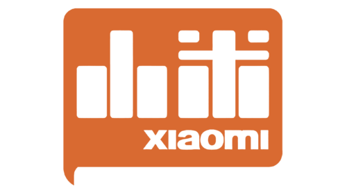 Xiaomi was started in 2010. The word “xiaomi” was already widely used in China, it seemed an appropriate company name – pronunciation mistakes, at least, were impossible.
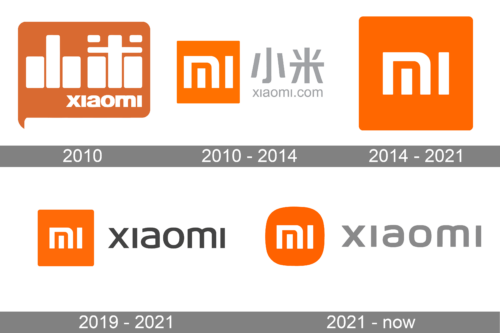
The original Xiaomi logo showcased the name in Chinese hieroglyphs paired with the English version. The letters and the hieroglyphs were placed inside an orange shape looking like the word bubble in the comics.
2010 — 2014
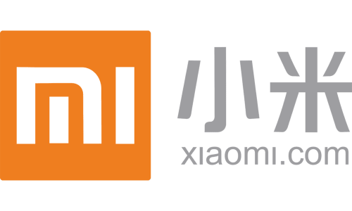
As the project crossed the borders of other Asian countries and then entered other parts of the world, the need for a simpler name became urgent. This name was “MI.”
The logo became different, too. There was an orange box housing stylized “mi.” The “m” looked very unusual because its middle was just a vertical line. The Chinese name and the website address could be seen in gray next to the emblem.
2014 — 2021
The Xiaomi logo features stylized letters “MI” in white placed inside an orange rectangle with rounded corners. Due to their unusual design, the letters bear a subtle resemblance to Chinese hieroglyphs. The middle line of the “M” is separated from the rest of the glyph, while the “i” doesn’t have the dot.
What does the emblem stand for?
According to the official explanation given by the company, “MI” is the abbreviation for “Mobile Internet.” However, Xiaomi also mentioned that the abbreviation can be explained as “Mission Impossible” referring to all the challenges the company faced in its early days. The “Mission Impossible” explanation may also remind of how difficult it was to get the MI trademark, as for that the company had to purchase the Mi(.)com website.
2019 – 2021
The emblem used for the past several years was also presented as a version with the full name next to it. The latter was printed in black and featured all lowercase sans-serif letters of the same height. The inscription was about half the height of the square, which created a very balanced image and kept the square an important element of the modified emblem.
2021 — Today
The redesign of 2021 kept the iconic Xiaomi logo almost untouched — the elements and colors remained the same, but everything got elevated. This, the orange and white emblem with the monogram got its angles rounded, and the logotype, placed on the right from the bright element, changed its gray shade to a lighter and more elegant one.
The typeface of the lowercase logotype was also slightly changed — the lines and angles became smoother, complementing the new shape of the emblem.
As for the most recognizable element — the Xiaomi monogram it remained the same, but with the orange background getting one shade darker, the white lines of the letters started looking more distinct and sharp.
Colors
The bright and joyful combination of orange and white is used not only for the MI logo but also as the core of the corporate color palette.
Font and Color
The modern lowercase lettering from the primary badge of the Xiaomi brand is set in a bold futuristic typeface with stylized custom contours of the characters. The closest fonts to the one, used in this insignia, are, probably, Geon Expanded Extra Bold, or COBE Bold, but with some modifications of the letters.
As for the color palette of Xiaomi’s visual identity, it is based on a combination of orange and light gray with white accents, adding a touch of reliability and loyalty. Orange is a symbol of happiness, and positive energy, while gray stands for professionalism and confidence, representing the brand as a serious and stable one.


