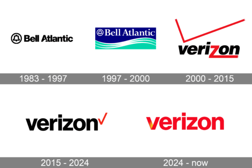
The Verizon logo appeared in 2000, when the company received its current name. The previous versions were completely different and featured the old name of the corporation.
Meaning and history
The earliest logotype reflected the original name of the company, Bell Atlantic Corporation, and was adopted around the time when the company was created (1984). The logo consisted of two parts: a stylized depiction of a bell inside a circle shape and a wordmark next to it.
The text would have looked pretty plain if not for the unique letter “A”, which contained an unusual element resembling an ocean wave. In this way, the author of the emblem introduced the “Atlantic” theme to the logo. The emblem could be given in black or blue against the white background.
The second version put even more emphasis on the marine theme. Although the stylized wave disappeared from the wordmark, a more prominent one appeared below it. In addition to this, the “Atlantic” idea was accentuated by the choice of colors: dark blue and aqua, with white letters and lines, bringing to mind the sea foam. Instead of the bold sans-serif font of the first logo, a simple serif one was used. The logotype itself acquired a square shape.
What is Verizon’s brand?
Verizon is the name of the American brand of telecommunication company, which provides its customers with such services as mobile phones, cable television, digital media, landline, broadband, and a few others. Today Verizon is the largest mobile phone operator in the United States.
1983 – 1997

The company was originally known as Bell Atlantic. This logo belonged to that former phase. Besides an image of a bell set inside a black ring, there was also a black wordmark. The letters were usual sans-serif characters, although they also removed space in the shape of a wave in the bottom of ‘A’.
1997 – 2000

The 1997 logo uses elements from the previous design, except the letters took on a new, serif style. They were also repainted white and put in the top of a blue rectangle. Opposite to it, there was also a turquoise wave illustration.
2000 – 2015

In 2000, Bell Atlantic acquired the telephone company GTE and changed its name to Verizon Communications. With the new name, the need for a completely new logo became obvious.
The San Francisco-based design agency Landor Associates developed a wordmark consisting of the name of the company topped off with an oversized red checkmark with gradient. The italicized lowercased font featured a zooming “z” with gradient. The checkmark and the letter “z” were red, while all the other letters where black. The background was white.
Also, other color combinations with two of these colors could be used (black and white, red and white). The logo was criticized by many designers and even named among the worst logotypes ever made.
2015 – 2024
In this version of the Verizon logo, the checkmark has diminished in size, while the gradient disappeared. The first logo update in 15 years was made by the design firm Pentagram.
It was actually more of a refresh than a completely new logo. Michael Bierut, Pentagram’s representative, mentioned that the logotype was not meant to be clever or flashy. Their aim was to establish the brand’s identity without creating visual noise.
One of the positive features of the new Verizon logo is that it can be easily zoomed and reproduced. On the whole, it looks cleaner, neater than the previous one. However, it has also been criticized a lot for its simplicity.
2024 – Today
The Verizon logo is a striking and straightforward representation of the brand’s identity. The logo features the company name “Verizon” in a bold, modern typeface, colored in a vibrant red. This choice of color is significant as red often symbolizes energy, power, and determination, reflecting Verizon’s dynamic presence in the telecommunications industry. The typeface is sans-serif, which gives the logo a clean, contemporary appearance, enhancing its readability and making it easily recognizable.
A unique aspect of this logo is the subtle yet impactful gradient effect seen on the left side of the “V”. This gradient transitions from a deeper red to a lighter, almost orange hue, adding a sense of depth and dimension to the logo. This effect not only captures attention but also suggests a forward-thinking and innovative approach, aligning with Verizon’s commitment to leading-edge technology and connectivity solutions. The simplicity of the design, devoid of any additional symbols or graphical elements, underscores the brand’s confidence and established market presence, relying solely on the power of its name.
Overall, the Verizon logo is a masterclass in minimalistic design. It communicates the brand’s identity effectively through its bold color choice, modern typography, and subtle gradient detail. This combination ensures that the logo remains memorable and impactful across various mediums, from digital platforms to physical signage. The straightforward design reflects Verizon’s focus on reliability and clarity, key attributes that resonate with its customer base. By keeping the design elements minimal yet effective, Verizon reinforces its image as a robust, dependable, and forward-looking telecommunications giant.
Font

While the previous and the current fonts may look rather similar, in fact they are two independent types. The old logo featured a modified Helvetica Black type, while the name of the new typeface is Neue Haas Grotesk. In fact, it looks very close to Helvetica. The Neue Haas Grotesk typeface was created by Christian Schwartz from the New York and London-based type foundry Commercial Type. Schwartz is a partner in the company and heads its New York office. He is the author of quite a few typefaces used by corporations all over the world. Christian Schwartz also published typefaces with such well-known independent foundries as Font Bureau and House Industries.
Color
Since 2000, the Verizon logo has featured the combination of the black wordmark with red accents. In the current version, the red is reduced to a single checkmark, while the previous logo used the color more generously. In both cases, the background has been white.
Prior to this, the palette included the blue and aqua colors both fitting the old name of the company (Bell Atlantic) and the marine emblem perfectly.
Does Verizon have a new logo?
Verizon got its new logo in 2015, with the redesign, which followed the acquisition of AOL. The refined badge kept the red and black color palette of the previous version, but simplified the concept of the badge and minimized the appearance of red elements. The new version is based on a bold lowercase inscription in black with the small red tick placed on the right of the wordmark.
When did Verizon change its logo?
Verizon has changed its logo several times throughout the years, with the last redesign held in 2015. The first two versions of the badge were created, when the company’s name was Bell Atlantic. As for the Verizon brand, it got its first logo introduced in 2000, and kept it for 15 years, with the minimalistic black and red wordmark with a small graphical element created in 2015.


