TracFone is a pay-before-use cell phone firm in the US. It lets you buy cell phones or use ones that work with it. You can add call minutes, text, and web time with different pay plans. TracFone sells plans both for individuals and for families and has lots of phones, from simple ones to smart ones. It has grown to be a big deal in the US pre-paid mobile sphere, keeping up with new tech and what users want. Its good prices and plan choices attract those who want the convenience of flexibility.
Meaning and History
The firm was started in 1996 by F. J. “Tracy” R. R. McCoy, first as a part of a firm called American Wireless. In 2000, TracFone grew by making deals with big carriers, giving service all over the nation. They began to sell more phones, simple ones and then smart ones. In 2006, a big company from Mexico, America Movil, bought it. In the 2010s, TracFone brought in more options and plans without limits. As the phone world changed, the competition got tougher. At the end of 2021, Verizon Communications took over TracFone Wireless.
What is TracFone?
TracFone provides wireless communication services without the need for long-term contracts or monthly bills. The company is known for its affordability and flexibility, making it a popular choice for those looking for budget-friendly mobile solutions.
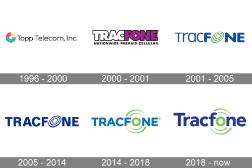
1996 – 2000
This logo reflects the original company name, Topp Telecom, Inc., along with a colorful graphic element. The name is printed in black using a serif font. To the left, there is a disk that is split into four colors and has a white grid on it. It is an eye-catching element that could represent the flexibility and versatility of the phone plans. The overall design creates a professional and even trustworthy brand image.
2000 – 2001
This version introduces the new company name. It is printed using a bold font and is split in half using color. The characters are placed very closely together, which is underlined by adding an outline that runs only on the outer edge of the inscription. The name is accompanied by a tagline “Nationwide Prepaid Cellular” printed in black using a sans-serif font and all caps. The new color palette, which consists of black, white, and purple, creates a very unique brand image and shows that it takes pride in its achievements.
2001 – 2005
This year marks the time when the company acquired the unique image it will be recognized by for years. The logo only has the brand name, which is split into two by different stroke thicknesses. The first half is printed using a regular font, while the “Fone” part is done using the bold version of the same font. A wireless connection symbol consisting of three green rings has replaced the “O” in the name. This became its signature element, reflecting the company’s focus on mobile phones and prepaid wireless services.
2005 – 2014, 2014 – Today (secondary)
The TracFone logo features a simple yet distinctive design that includes the brand name “TracFone” in bold, modern typography. The logo also includes a stylized graphic, as seen in the earlier version, that represents communication or connectivity. The logo is done in one color, a deep blue that evokes a sense of trust and reliability.
2014 – 2018
The company returned to a more rounded font, which reminded of a logo created back in 2001. The letters, though, are printed using the same thickness. The signature wireless connection rings have been redrawn to have a round shape. The green color for the “O” has also been brought back, giving the logo a unique touch.
2018 – Today
The updated logo looks very similar to the previous version thanks to the same color palette and the green rings. There were a few changes, though. First of all, the font has been changed to feature straight cuts. In addition, the designer used sentence case for the inscription instead of all caps. No new elements have been added to the logo.
Font and Color
The original logo features a serif font with clean, straight lines. It was later replaced by a bold, sans-serif typeface that had a black outline. When the company finally figured out what its brand image would look like in 2001, they used VAG Rounded font. It was later replaced by Helvetica Bold. During the 2014 – 2018 period, it returned to a rounded font but this time, it was Gotham Rounded Bold. Since 2018, the logo used Effra Bold font, while marketing materials feature Josefin Sans.
The original color palette incorporates bright colors, such as red, green, or yellow, along with black to convey a sense of accessibility and clarity. For a short period, the logo had a purple, white, and black color palette. The color purple is generally associated with independence, pride, power, and ambition. Since 2001, the recognizable blue and green shades with a white background have appeared. The company aims to communicate trust and reliability in its services.


