

Every one launching a restaurant wonders how to make his her style outstanding. It is not only the concept, but also the presentation of the brand’s ‘keyword’ that matters. There are no general rules that would guarantee a positive response. However, to get a general idea, it is advisable to check the styles of leading brands. We have collected the world’s top 20 restaurant logos, so that you could see a potentially successful trend.
Pipes Burger (Georgia)
![]()
Simple and laconic, this concept has attracted both local residents and guests from abroad, who have fallen in for this country for warm hospitality. Although Pipes Burger wouldn’t have succeeded without its decent menu and service the role of their signature logo should not be underestimated either.
KFC (The USA)
![]()
Who does not know Mr. Harland Sanders? Although the name sounds pretty common, a brief glance at the best chicken fast food restaurant makes things pretty clear right away.
Yakitoria (Russia)
![]()
This logo is spellbindingly elegant. Even a first-time brief look from a distance makes it clear that the restaurant presents Japanese cuisine. Great job!
Planeta Sushi / IL Patio (Russia)
![]()
A nice combination of colors – the contained red (for Japanese cuisine) and black (for Italian cuisine). This logo makes you want to have a snack and walk into the restaurant. One of the best in the Russian market.
Vapiano (Italy)
![]()
This logo style gives little idea of what it is. However, this Italian network of pasta restaurants is now popular and recognized worldwide.
Noma (Denmark)
![]()
New and laconic – this is a new design trend in Europe.
Eleven Madison Park (The USA)
![]()
These four components symbolize fortune and comfort. The logo makes the restaurant easy to recognize.
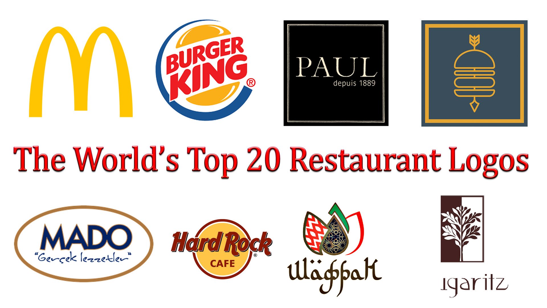
Mugaritz (Spain)
![]()
Same old European laconicism: not unlikely, this is a new word in style.
Narisawa (Japan)
![]()
The Japanese are uniformly concise and elegant.
Le Bernardin (The USA)
![]()
The USA has chosen to inherit the simple and laconic style.
Azurmendi (Spain)
![]()
There is something Oriental about this style. Plus the same old European simplicity.
The Lozhka-Vilka (Russia)
![]()
This style is very funny, cute and appetizing. This logo says that you are about to visit a comfortable restaurant with a delicious menu.
Hard Rock Cafe (Great Britain)
![]()
This is one of the world’s most recognizable brands. It is hardly possible to imagine the restaurant and logo not going hand in hand. Anyway, everyone is familiar with this classic color palette and font.
Shaphran (Russia)
![]()
The Middle East elegance and a nice color combination. The logo designer team has hit the mark.
The Shokoladnitsa (Russia)
![]()
This is another Russia’s most famous café-type restaurants. The network has expanded thanks to sweet coffee and desserts and attractive style.
Mado (Turkey)
![]()
A network of Turkish restaurants. This logo makes it hardly possible to mix it up with another brand.
Sbarro (Italy)
![]()
The Italian flag used as part of restaurant logo. This approach makes many restaurant owners want to do something like that.
Paul (France)
![]()
This is a French network of bakehouses. Now it is known worldwide as a European restaurant network presenting exquisite French bakery.
Burger King (The USA)
![]()
This is the world’s number-two fast food restaurant network. Is there a person who does not know or love these attractive burger-style letters?
McDonald’s (The USA)
![]()
Finally, the top one. So far, nobody knows it’s secret. Some believe it is the color palette, others think that it is the lining that makes the style. In any event, the McDonald’s fast food network is the champion!
Conclusion
In conclusion, navigating through the world of restaurant logo design is akin to embarking on a culinary journey, where the essence of a brand is captured not just in the flavors on the restaurant menu but also in the visual feast presented through its logo. The top 20 restaurant logos we’ve explored serve as a testament to the power of a well-crafted symbol, capable of whetting taste buds and drawing potential customers with just a glance. Each logo, from the iconic Chick-fil-A to the elegant representation of a wine bottle, demonstrates how simplicity, such as the use of a sans-serif typeface, or the creative incorporation of kitchen elements like a knife and spoon, can convey the vibe of the establishment and promise a memorable dining experience.
These logos are not just artistic expressions but strategic tools for building brand recognition. They encapsulate the essence of the restaurant business, turning abstract ideas into tangible experiences that resonate with diners long before and after their meals. The perfect restaurant logo, therefore, is more than just an eye-catching logo; it’s a professional logo that encapsulates the identity and ethos of the eatery, ensuring that the logotype aligns seamlessly with the brand’s narrative.
Crafting the perfect logo requires a blend of creativity, strategy, and an understanding of the restaurant’s core values and target audience. It’s about translating restaurant logo ideas into a visual language that speaks directly to the hearts (and stomachs) of those it seeks to serve. From food packaging to digital presence, every touchpoint is an opportunity to reinforce the restaurant’s brand and its commitment to quality and innovation.
In essence, the journey to designing the perfect restaurant logo is intricate, demanding a deep dive into the brand’s soul and a creative exploration of elements that will make the logo stand out. The top 20 restaurant logos remind us that at the intersection of art and business, there’s an opportunity to create something truly remarkable—a logo that not only captures the attention of onlookers but also encapsulates the unique flavor and spirit of the restaurant it represents.


