The history of Swisscom AG can be traced back to 1851, when a set of laws was issued allowing the Swiss government to take control over the creation and spread of the country’s telegraph network. Back then, Swisscom was part of the PTT, together with the Swiss Post.
Meaning and history
For most of its history, the Swisscom logo was centered around the Swiss cross paired with a post horn but it later moved to more modern themes.
What is Swisscom
Swisscom AG is a major Swiss telecommunications provider. 51% belongs to the Swiss government. The company claims to hold 60% of the market for mobile services and 67% for broadband.
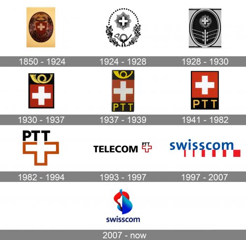
1850 – 1924 – PTT
This version already presents the two elements mentioned above. The post horn was very realistic, with its golden color and highlights. You could also see a five-pointed star and a laurel leaf. All these were placed inside an oval (or an egg) filled with highly detailed, intricate drawings.
1924 – 1928
This is a simplified version of the previous logo. Many details were gone. The cross and the horn were still there, combined with a botanic pattern. The cross had a halo.
1928 – 1930
In the new version, the post horn was replaced by a modern symbol – a telegraph pole with wires stretching out of it. The botanic pattern was gone. There was also a version with a post horn.
1930 – 1937
The logo adopted a more minimalist and geometric look.
The cross was pure white inside a red box (like on the flag of Switzerland). Both the flag and the horn above were placed inside a larger black rectangle. The horn still had black highlights, which slightly cluttered the logo and didn’t fit its overall simple style.
We should also point out that the logo described above was used by the post, while the telegraphy/telephony division used a version with the telegraph pole.
1937 – 1939
The post horn lost the highlights and some of the details. As a result, it better fitted the minimalist style of the logo now.
Also, the lettering “PTT” (Post, Telegraphy, and Telephony) appeared below the emblem.
1941 – 1982
The post horn was dropped. That’s because the abbreviated name of the company was well enough to make it clear who the logo belonged to.
1982 – 1994
This was a huge step towards a more modern, easier-to-grasp design. This version of the Swisscom logo was created by Martin Altenburger and Adrian Frutiger.
The black and red boxes were dropped. Instead, you could now see a white cross with a thick red border. The top part of the cross was formed by the two letters “T” from the company name.
In this version, the wordmark and the emblem perfectly merged into a single entity. There was also a variant with a bright yellow background.
1993 – 1997 – Telecom PTT
PTT was divided into two companies, one of them being Telecom PTT (which later was renamed Swisscom). The “Cross and PTT” emblem was made smaller and was placed next to the lettering “Telecom”. This word was set in the Frutiger typeface.
1997 – 2007- Swisscom
Having been renamed Swisscom, the company adopted a dramatically different emblem. The new name was set in blue and sported a lowercase sans. There was a set of red rectangles and a square, which created a dynamic pattern.
The transition to a new color scheme (blue plus red) emphasized the independence from the postal service company.
2007 – present
The updated Swisscom logo preserved the palette (with only a slight shift) but introduced a new emblem. It looked by far more intricate. The brand explained that it wasn’t a problem as the majority of communication services were now accessed on-screen.
On a more positive note, the new emblem looked dynamic and also incorporated a futuristic rendition of the flag of Switzerland. It was also more “human” as the shapes somehow seemed to have been inspired by a scheme of the cardiovascular system.
The design was created by the agency Moving Brands.


