Not all Korean companies managed to stay afloat after all sorts of persecutions and sweeps. Samsung has not only survived but has also become a major concern with a global reputation. It will come as a surprise to many to learn that the firm, founded in 1938 by entrepreneur Lee Byung-Chul and named after his three sons, Samsung Trading Company (as “Samsung” is translated from Korean as the “Three Stars”), produced beer and rice vodka. And for most of the company’s history, the three-star pattern has been the main element of the Samsung logo. However, with global progress and growth, the company changed to minimalism and stability.
Meaning and history
Founded in 1938 by Lee Byung-chul, Samsung began its journey in Manchuria, initially engaging in the trade of groceries and noodles, emblematic of the company’s humble beginnings. This era not only marked the inception of a global conglomerate but also laid the groundwork for Samsung’s diversified ventures, spanning from food to electronics, showcasing an impressive scope of application. The name Samsung, meaning “three stars,” symbolized longevity and brilliance, akin to an English brand name that aspires to universal recognition.
Samsung’s transition from its early endeavors into electronics during the 1960s signified a pivotal shift in its business strategy, underscored by the launch of Samsung-Sanyo Electronics. This move was not merely a change in direction but a bold step towards fulfilling the company’s ambition to innovate and dominate in new realms. The introduction of Samsung’s first logo, with its simple yet impactful design of lettermark and brand colours, marked the beginning of its identity as a tech pioneer. The era was characterized by significant achievements, including the production of Samsung’s first black-and-white TV, which underscored the company’s commitment to technological advancement.
The leadership of Lee Kun-Hee, who took the helm in the late 1980s, heralded a new era of global expansion and innovation. Under his guidance, Samsung sharpened its focus on electronics, leading to the creation of iconic products that blended advanced technology with sharpened looks. The development of the Galaxy series, with its intuitive design and innovative features, showcased Samsung’s prowess in mobile communications. Furthermore, Samsung’s advancements in semiconductor technology cemented its position as a global leader in the industry.
Today, Samsung’s legacy is evident in its vast array of products and services that cater to a wide range of consumer needs and preferences. From the intuitive search form on its website that helps customers find the right serial number or model of their product, to the personalized recommendations and inventory alerts that enhance the shopping experience, Samsung integrates technology with consumer-centric solutions. The company’s use of cookies and marketing communications, including newsletters and service announcements, ensures that users are informed about new product launches and special offers, fostering a connection with its audience.
Samsung’s journey from trading noodles in Manchuria to becoming a tech behemoth is a testament to its enduring vision and relentless pursuit of innovation. With a history rich in transitions and achievements, Samsung continues to lead the way in the digital era, driven by a commitment to quality, performance, and exceeding consumer expectations. The meaning of the Samsung logo, with its emphasis on stars, reflects the company’s aspiration to maintain a stellar presence in the tech universe, guided by the principles of innovation, quality, and a deep understanding of its customers’ needs.
Where is Samsung made?
Samsung is one of the largest South Korean companies, and its main production facilities are located there. Though with the huge volumes of the company’s sales, it is necessary to have its plants in other regions, this is why Samsung also has its factories in Brazil and Indonesia.
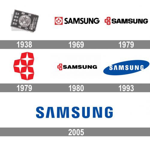
The Samsung logo introduced in the 1980s looked more up-to-date. The lines became sharper; the negative space was successfully used.
1938
The original logo was pretty cluttered and bore nothing in common with the current Samsung logo. You could see three stars, three stripes, and wheat plants inside a circle.
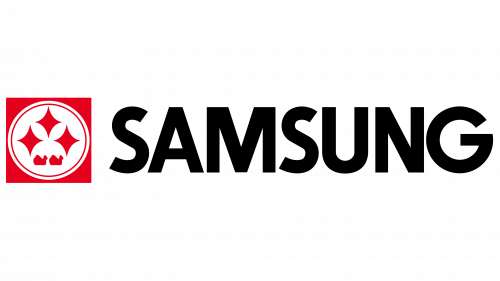
1969
The stars adopted a more refined and unique shape. The emblem now looked more abstract and less cluttered. Next to it, the lettering “Samsung” in black was placed.
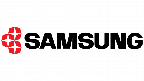
1979
The circle and the square, in which the stars had been placed on the previous emblem, disappeared. There were now only the stars and the brand name, which was given in shorter letters.
1979
The star design was also used as a standalone emblem. In this case, the symbol was enlarged so that every detail could be clearly seen.
1980
The emblem featuring the three stars remained unchanged, while the wordmark was slightly modified. In comparison with the previous one, it looked somewhat bolder and shorter.
1993
This is the year when the current Samsung logo was born. You can see the now-familiar bold sans serif letters inside a blue ellipse. What is most important, the iconic “A” without the horizontal bar appears on this version.
2005
The design team decided to dismiss the ellipse. Today, both the ellipse logo and the logo without the ellipse are used. One of them is a primary logo, while the other is a secondary one.
Who owns Samsung?
The brand Samsung is owned by Samsung Group, a company, which was established in 1938 by Lee Byung-chul. Today it is a privately-owned group, with Lee Jae-yong as the chairman.
Galaxy logo
 The logotype of the Samsung Galaxy range including several types of mobile computing devices has undergone several updates since it was first introduced in 2009. The current Samsung Galaxy logo features the company wordmark given in the same typeface as on any other Samsung’s appliance or device, while the word “Galaxy” features a different font.
The Samsung logo, which keeps the “three stars” of success and prosperity, has its roots hidden in the title. In translation from Korean Sam means “3” (extra-digital meaning is “greatness” and “multiplicity”). Sung is translated as “stars” (“success”, “diversity”). Indeed, before becoming the world’s technological leader, Samsung used to sell products, insurance services, and it also processed food products.
Audio emblem
Samsung is one of the companies that, in addition to a visual logotype, have an audio logo. The author of the melody is an Austrian composer Walter Werzowa. It was recorded by the Los Angeles-based music and sound design production company Musikvergnuegen. The audio logo comprises the notes E♭, A♭, D♭, E♭.
What is a Samsung One UI Home?
Samsung One UI Home is the name of software, which is installed in all Samsung devices. The software works as a launcher for all the gadgets working on Android OS, and can not be deleted from the device.
Icon
Over the last few years, Samsung has embraced the evolution of its iconic symbol, transitioning from a complex emblem to a sleek lettermark logo that epitomizes minimalism and contemporary look. The current design of the lettermark has shed the ellipse icon in favor of a more streamlined approach, showcasing the company name in white against a backdrop of Samsung blue—a color that encapsulates the essence of the brand, offering visual harmony and a sense of calm luxury. This iteration of the logo, with its precise adjustments and even distribution of letters, not only enhances the logo’s visibility but also signifies Samsung’s dedication to innovation and excellence.
Font
The typography of the Samsung wordmark features a unique font, which seems to be a hybrid of Helvetica Black and DDT Cond SemiBold, tailored for a modern and sharpened look. A standout characteristic is the stylized “A”, devoid of its horizontal bar, embodying the company’s ambition for constant innovation. This design choice, a result of refinements in the lettermark’s design, offers clear space around the letters, facilitating easy registration and recognition by the human eye, thus contributing to the overall visual balancing of the brand identity.
Color
Samsung’s brand colors have evolved to a simple yet profound palette. The primary hue, a deep and meaningful Samsung blue, has been a constant in Samsung’s logo design since the 1960s, symbolizing reliability and the brand’s rich heritage in South Korea. This color, along with white, creates a visual cue that draws attention and ensures the height of our lettermark stands out in any application. The selection of colors reflects the brand’s commitment to providing human-driven experiences, from Samsung home appliances to AI technologies, demonstrating how visual elements and corporate identity converge to communicate the global brand’s values and scope of application.
What is a Samsung Push Service?
Samsung Push Service is the name of one of the applications, available for the gadgets of the South Korean brand. The software’s main function is sending notifications to come related to all the updates and changes in Samsung applications. On some of the devices, Samsung Push Service is installed by default.
What is a Samsung Pay?
Samsung Pay is the name of the official mobile payment system of the South Korean brand. The application also works like an e-wallet and allowed keeping your electronic money and proceeding with various transactions.
What is a Samsung Flow?
Samsung Flow is the name of the official Samsung software’s which was designed to provide a connection between the mobile phones, tablets, and computers of a user. The app allows easily move and browse media files and documents from your smartphone on your PC or vice versa.
What is a Samsung+?
Samsung+ is the name of the official Samsung application, which is installed on all the mobile gadgets of the brand by default. The software was designed to help Samsung users with diagnostics and support issues.


