Due to the saturated colors, the Poinsettia Bowl logo looked cheerful and bright.
Meaning and history
In the middle of the emblem, there was a red banner featuring the lettering “Poinsettia Bowl.” Below, you could see a blue field housing three red flowers with five petals. One of flowers was the largest, while the other two were smaller.
Above the banner, you could see the lettering “San Diego County Credit Union,” which reminded what the game’s last sponsor was.
The Poinsettia Bowl was played in San Diego, California, from 2005 to 2016. It was a post-season NCAA-sanctioned FBS college bowl game.
What is Poinsettia Bowl?
Poinsettia Bowl was the intercollegiate American football bowl game, which was established in San Diego in 2005. A part of the NCAA, the bowl game was played annually on the SDCCU Stadium until its last season in 2016.
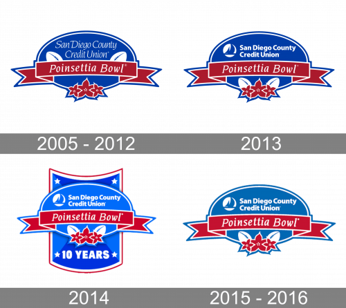
2005 – 2012
The initial logo of Poinsettia Bowl was an example of the elegance and sophistication of sport-related emblems. It was a smooth horizontally stretched banner in deep blue, with a double blue and white outline, red poinsettia flowers at the bottom, and a red ribbon, crossing the badge in the middle. The white cursive “Poinsettia Bowl” inscription was set on the ribbon, while the “San Diego County Credit Union” in thinner and smaller letters of the same style was written above it. The red ribbon was decorated with two white rugby balls, set on the sides.
2013
The redesign of 2013 moved the white rugby balls to the three red flowers composition at the bottom of the logo. The ribbon with the main logotype remained untouched, but the “San Diego County Credit Union” lettering changed its typeface to a simple yet bold sans-serif one and placed a white and blue circular emblem on the left from it.
2014
To celebrate the 10th anniversary of the Bowl, the new logo was introduced in 2014. It was the same badge, as the previous one, but in a lighter shade of blue, with some smooth gradients, and now it was placed on a bigger vertically stretched crest, executed in the same style. The bigger crest was outlined in white and red and had a solid white five-pointed star in each of its corners. The ExtraBold “10 years” in a modern sans-serif typeface was written in white under the primary badge of the Poinsettia Bowl.
2015 – 2016
For its last season, Poinsettia Bowl brought back the badge, designed in 2013, but slightly changed its color palette, making the shade of blue smoother and calmer. In this combination the badge started looking more professional, evoking a sense of confidence and expertise.


