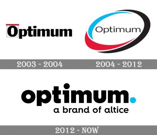
The logo of the telecommunications brand Optimum has a fresh and innovative touch due to the combination of the palette and typography.
Meaning and history
Optimum was founded by Charles Dolan in the 1970s as a cable television service under Cablevision, initially offering a 30-channel system using copper cable technology.
Over the years, Optimum expanded its services to include high-speed internet and digital voice offerings, pioneering innovations like fiber-optic networks and interactive digital cable services.
In 2016, Altice USA acquired Cablevision, integrating Optimum into its portfolio. Today, Optimum serves approximately 4.9 million residential and business customers across 21 U.S. states, making it the fourth-largest cable provider in the country.
2003
The earlier Optimum logo looked as heavy as the current one, yet it was more elongated. The initial letter was placed inside a rectangle with the red top side. The widths of the strokes forming the glyphs varied a little.
2004
While the updated emblem was inspired by the original one, it had a completely different style and mood. The name of the brand grew much lighter and was now placed inside a dynamic whirl. The whirl combined black, red, and blue elements. The first two colors were borrowed from the previous design.
2012
The majority of the space of the Optimum logo is occupied by the very name of the brand. And yet, it is not the word “Optimum” that catches your eye but the fluorescent blue dot after it.
In addition to making the design easier to notice, this small element has a deep meaning. It promises that once you have found the brand, you do not need to look any further. In other words, this dot is a full stop in your search for the best product.
Font
The type does not strike you as utterly unusual, and yet, it has a couple of distinctive details. For instance, you can notice the seemingly unnecessary horizontal stroke on the “i” or the lack of one of the vertical strokes on the “u.” The letter “u” introduces an illusion of symmetry to the second half of the design.
Company overview
Optimum is one of the brands operated by Altice USA, Inc., a US cable television provider based in New York City. While Altice was based in 2016, the number of customers using its pay television, Internet access, telephone services, and original television content already reaches 4.9 million.
Earlier, Optimum belonged to Cablevision Systems Corporation, which was acquired by Altice in 2016.


