The name of the company that is known to customers under the commercial brand O2 is Telefónica UK Limited. The trading name is stylized as O2 and used in the brand identity to make it look more memorable.
Meaning and history
The logo history of one of the largest providers of telecommunications services in the UK, a subsidiary of the Spanish Telefónica, is inseparably connected with the history of the company itself and reflects it.
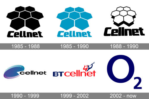
1985 – 1988
The brand O2 started as Cellnet in 1985. It was BT Group and Securicor’s joint venture. Their first logo was a cluster of seven hexahedrons that formed some cell structure resembling a flower with the wordmark “Cellnet” below it, everything in black.
1985 – 1990

Along with the black and white version, the company used a muted light blue color version. Blue has always been associated with reliability, safety, and trustworthiness. This color is often used by companies in the communication industry.
1988 – 1990
Three years later the company altered their mark. They made the hexahedrons white, added some kind of shadow to them and slightly modified the font.
The Cellnet logo was first redesigned in 1988. The concept remained the same, but the blue and white color palette was switched to a stricter and more traditional black-and-white one. The honeycomb emblem got smaller and was drawn in white, with the black outline of the cells. The black shadow was added to the image. As for the logotype, it was now drawn in black, using the same typeface as the previous version, but with smaller letters, placed a bit closer to each other.
1990 – 1999
In 1990 the brand identity was modernized. Now it was a stylized symbol with an image that resembled a dish antenna and the name of the company next to it. The color palette was blue and black.
1999 – 2002
The cool and memorable new BTCellnet logo was introduced in 1999. It was a smooth rounded sans-serif lettering in blue and red (with the “BT” part in a bit bigger and bolder lines, in blue, and a red “Cellnet” in all capitals of the same typeface, but its lighter version), with an emblem in the same palette, placed above the last three letters of the logotype.
2002 – Today
The next renaming was in 2002. A new holding company was formed ‒ mmO2 plc, and the BT Cellnet consumer brand became O2.
Despite being extremely laconic, the emblem attracts attention and sticks in the mind. What makes it so memorable is that the company makes use of the chemical symbol known to everybody ‒ O2, the symbol for an oxygen molecule, especially when it is accompanied by the slogan “It’s your O2”. The idea behind O2 is based on the fact that for consumers mobile phones are “indispensable for life”, just like oxygen.
The logo does not accentuate that it is a mobile phone company but lays stress on what customers can do. It has turned out to be motivating, judging by the fact that the key performance metrics of the company have improved.
Color
The logo appears either in blue color on no background or in white on the blue background. The choice of the color seems natural as oxygen is envisaged as something blue. And it is really blue in liquid and solid forms.


