The NHS logo, also known as the lozenge, has several versions varying in the typeface and color palette. They are used in different parts of the UK.
Meaning and history
The history of the current lozenge logo started in the early 1990s. Prior to it, a variety of emblems was used, including even a red cross.
Although the lozenge logo emerged in the early 1990s, it did not have the status of the only official NHS logotype until 1999, when new brand guidelines were published, which ensured that the emblem is strictly uniform and universally recognized.
Symbol
The blue lozenge logo is used only by NHS in England. The symbol comprises the name of the organization in an italic all-cap font placed inside a blue parallelepiped.
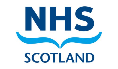
The NHS in Scotland has a different logo, in which a blue symbol somewhat similar to a seagull is placed below the letters “NHS”.
In Wales, a more complicated logo is used featuring an intricate emblem and a gold-and-navy color palette.
2017 emblem controversy
In early 2017, the NHS identity managers made quite a bizarre move. Every hospital in England was ordered to rework all their publicity materials changing the position of the NHS logo: it was to be placed above the name of each hospital, instead of beside it. Because of this, the NHS identity team faced a lot of criticism.
Font
The current typeface is called Frutiger Bold Italic. It is a clear, classic sans serif typeface boasting excellent legibility. The letters are 2.4 times as wide as high.
Color
The version of the NHS logo used in England combines blue with white. The brand guidelines permit only the shade of blue that goes under the code 300 in the Pantone system.


