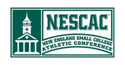
The logo of the New England Small College Athletic Conference (NESCAC) looks somewhat unusual and even controversial. The style of the typography seems to slightly contradict the pictorial part.
Meaning and history
On the one hand, the abbreviation “NESCAC” is given in a slab serif type that is quite common for athletic emblems. It is pretty heavy and static, and there is hardly anything elegant in it. On the other hand, the building depicted to the left of the abbreviation looks elegant and light. It has been drawn using thin lines and is a bit too refined in comparison with the text.
However, as the New England Small College Athletic Conference logo uses a single color, it helps to merge the two parts together.
What is NESCAC?
NESCAC stands for New England Small College Athletic Conference. It is an intercollegiate athletic conference comprising 11 liberal arts colleges in the New England region of the United States. The conference promotes athletic competition among its member schools while emphasizing academic excellence and the student-athlete experience.


