Taiwanese information technology corporation Micro-Star International has gone through four distinctive logos throughout its more than 30-year history. The latest version is the most minimalistic one.
Meaning and history
Micro-Star International was founded in 1986 by five former Sony employees. It opened a plant in Jung-He city in 1997 and went public a year later. In 2000, another plant in Jung-He city started work. By 2008, the company was already among the Top 20 Taiwan Global Brands. MSI is known for its eSports team sponsorship program.
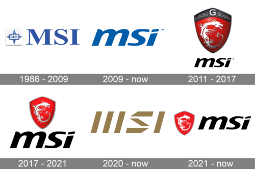
1986 – 2009

The original MSI logo was based on a four-pointed star resembling a wind rose. The name of the company in a square was superimposed on the star. The emblem was black and white. According to the company, the design symbolized its ambition to become a superstar in the microcomputer industry.
The following logo, which was released in 1997, stayed basically the same in terms of the shapes but adopted a new color scheme. Now, the design was blue, while the background was white. The more vivid shade was supposed to represent “modernity,” “vitality,” and “innovative technology.”
2009 – now

A much simpler logo features the text “msi” in italicized lowercase letters. According to MSI, the emblem symbolizes “envelope-pushing technology and innovation.”
2011 – 2017
For several years, the company also used an alternative logo with a red shield. The shield housed a silver dragon and had silver trim. The name of the company was given below in the same type as in the main 2009 logo.
2017 – 2021
Here, the shield is placed to the left of the company’s name.
2020 – now
A futuristic, stylish logo was introduced. The letter “M” was formed by three parallel diagonal lines. The “S” was also formed by three lines, but its shape was closer to the traditional one. The “I” was just the traditional “I” without the dot.
2021 – Today
The MSI logo is immediately striking, with its bold, stylized lettering and vividly colored emblem. The three letters “MSI,” an abbreviation for Micro-Star International, are presented in a sleek, sans-serif font that suggests modernity and innovation. The font is weighty and substantial, which helps convey a sense of robustness and reliability—qualities that are essential in the technology and computer hardware industry where MSI operates.
Prominently displayed to the left of the company name is a stylized dragon encased within a shield. The dragon is depicted in a dynamic, fluid form, rendered in a stark white silhouette against a passionate red background. This creates a high contrast that draws the eye, symbolizing power, ferocity, and agility. The shield shape reinforces the notion of protection and strength, suggesting that the brand is a guardian of quality and performance in its field.
The red and white color scheme of the emblem is not only attention-grabbing but also imbues the logo with a certain energy and passion. Red is often associated with excitement and action, which fits well with the company’s profile in the fast-paced world of gaming and computer technology. The overall design of the MSI logo effectively communicates the company’s dedication to leading-edge technology and high-performance products, aiming to empower users and gamers with superior hardware.
Colors
Since 1997, when the MSI logo went blue for the first time, there’ve been only subtle shifts in the shade of blue without changing the basic color. The current palette combines golden with the white background.


