Minolta is a brand of Japanese camera manufacturer, which merged with Konica Corporation and formed Konica Minolta in 2003. Minolta creates the first autofocus in a 35 mm SLR camera.
Meaning and history
The history of Minolta in Japan began in 1928. Kazuo Tashima is considered the founding father of Minolta. In November 1928, Tashima established the company Nichi-Doku Shashinki Shoten, which translates as “Japanese-German Photography Shop”. In 1929, the first Nifcarette camera was produced. The first half of the camera name “Nifca” is derived from Ni chidoku F to Ca Mera. The second half was taken by analogy with the names of some German cameras of that time, such as Icarette, Cocarette, and Rollette.
A few years later the company was renamed Minolta, and under that name, it produced some of the best cameras based on the latest technology for decades. For a long time, the company was one of the world’s largest manufacturers of photo equipment, printers, scanners, scientific instruments, and other precision equipment. In 2003, to maintain its market position, the company merged with Konica to form the Konica Minolta Group. Since 2004, the holding company has been called Konica Minolta Holdings, Inc., and has become one of the world leaders in digital technology.
What is Minolta?
Minolta is the name of a former Japanese manufacturer of photo cameras and lenses, which was established in 1928, and merged with Konica in 2003, forming a large globally famous Konica Minolta company. Minolta was the first to introduce a 35 mm
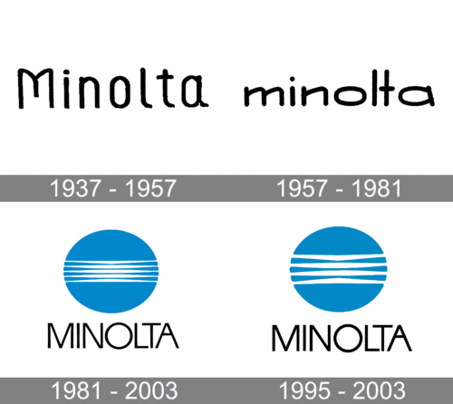
1937 – 1957
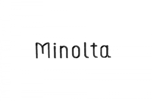
The original Minolta logo included only the name of the brand in black. It was set in block letters that had handwritten style. The first letter was capitalized, while all the other letters were lowercase.
1957 – 1981
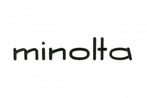
This was also just a black wordmark, but the style was slightly different, simpler, laconic. The “M” was lowercase, while the rounded ends of the “l,” “t,” and “a” disappeared.
1981 – 2003

This is when the blue circle made its debut. Like in the following logos, the circle was placed above the name of the brand. Here, it was given already in a dramatically different (although still minimalist) typeface.
1995 – 2003
The last Minolta logo, which was introduced in 1981, is a visualization of the brand value. It consists of the globe mark symbol and logotype.
The graphic icon represents the Earth, expressing the infinite expansion of the brand and the offering of innovative value to customers throughout the world. The five lines on the globe mark represent light beams and express the company’s wide-ranging technological expertise in the field of imaging.
The blue color scheme of the logo symbolizes creative innovation and the main color is called Konica Minolta Blue.
The custom typeface of the wordmark, executed in black, expresses brand’s precision and quality.
Font and Color
The simple yet elegant uppercase lettering from the primary Minolta badge is set in a clean and traditional sans-serif font with distinctive contours and medium-weight bars of the characters. The closest fonts to the one, used in this insignia, are, probably, OL Round Gothic Bold or Osande Light, with the straight and stable contours of the characters.
As for the color palette of Minolta’s visual identity, it is based on a professional and fresh combination of blue and white, with black for the lettering, adding confidence and stability, and balancing the airy scheme of the emblem.


