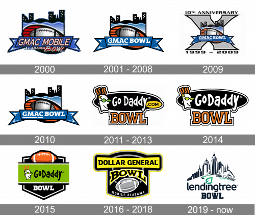
The postseason Division I FBS college football bowl game that is currently known as the Mobile Alabama Bowl has gone through more than one name and logo change since 1999 when it was played for the first time. The list of old names includes the GMAC Bowl, the GoDaddy Bowl, and the Dollar General Bowl.
Meaning and history
The Mobile Alabama Bowl logo introduced for the 2019 season features muted tones and a lot of details. You can recognize the local urban landscape depicted in a refined and elegant style. Below, there is the name of the event given in navy blue. On the top, there are two stylized flags.
What is LendingTree Bowl?
LendingTree Bowl is the intercollegiate postseason football game, which was first held in 1999. The bowl is affiliated with the National Collegiate Athletic Association and has its games played annually at the Hancock Whitney Stadium in Mobile, Alabama.
2000
The original name of the Bowl was GMac Mobile, so the first few logos were all based on that name. The original badge was introduced in 2000 and featured a blue, red, and gray color palette with the gradient gray rugby ball in a black outline overlapped by the blue ribbon with the white and red uppercase logotype. The top part of the badge featured a stylized blue and black city landscape with some waves at the bottom.
2001 – 2008
The redesign of 2001 refined the colors and contours of the badge, making all of its elements cleaned and bolder. All extra details were removed, and now the whole badge looked more professional and confident, even though everything remained in its place and its original style. The logo stayed unchanged for seven seasons.
2009
In 2009 the tenth-anniversary badge of the Bowl was designed. It was the same logo, but in a smaller size, placed in the center of a light gray enlarged “X” in a thin black outline, with the black “10th Anniversary” written above it, and “1999 — 2009” datemark — at the bottom.
2010

In 2010 the bowl comes back to its badge created in 2001, without any changes. The blue, gray, and black badge with orange and black stripes around the gradient rugby ball was kept in its original state, and stayed like that for another season, till the Bowl got renamed.
2011 – 2013
From 2011 to 2016 the bowl was sponsored by the GoDaddy web portal, so all the logos were designed according to the company’s corporate style. The badge, designed in 2011 featured a horizontally oriented oval in black, with a white outline and the logotype in a handwritten typeface. The funny caricature of a man wearing green sunglasses was set on the left of the inscription, and the “Bowl” in the uppercase of a square serif font in orange and black was set at the bottom of the badge.
2014

The redesign of 2014 made the “GoDaddy” lettering bolder and larger, and removed the small yellow oval with the “.com”. All other elements remained in their places, being just a bit cleaned and strengthened. This logo stayed with the Bowl for just one season.
2015
In 2015 the logo changed its composition and now the lettering with the sponsor’s name was set in black on a bright green rectangle; crossing the geometric crest in black with a double black-and-white outline. The portrait of a man in green sunglasses was set on a green background on the left from the black “GoDaddy” inscription, and the “Bowl” was now set in the uppercase of extra-thick serif font; in white. The top part of the crest was decorated with an orange rugby ball, set horizontally, and drawn in an angular manner.
2016 – 2018
The bowl got a new sponsor in 2016, so the logo was redesigned again. It was a yellow and black badge with some white and gray elements on it. The gradient gray rugby ball was enlarged and placed on a black crest, with the arched “Bowl” above it and the white sand-serif “Mobile, Alabama” under it. The “Dollar General” logotype was written in black over a smooth yellow banner, stretched horizontally on the top part of the logo.
2020 – Today
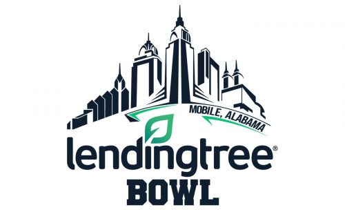
The bowl got renamed LendingTree in 2020, and the badge was redrawn again. Now it is a fancy and sleek black-and-white badge with the stylized city landscape on top, the lowercase sponsor’s logotype under it, and the heavy square serif “Bowl” at the very bottom. The dot above the letter “I” in the logotype is replaced by a gradient green leaf, and the same shade of green is used for a partial underline of the graphical part of the badge, on its right side.


