KPN is the largest provider of telecommunications and information technology services among those based in the Netherlands. As of late 2020, the number of customers using their mobile network exceeded 3,585 million, broadband network: 3,235 million, fixed-mobile: 1,400 million.
Meaning and history

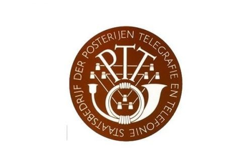
The company’s origins can be traced to a postal service called the Statenpost, which was established in 1752. In 1893, the Dutch postal system and telegraph and telephone services merged into a single institution named the Staatsbedrijf der Posterijen, Telegrafie en Telefonie (PPT).
We will start the history of the KPN logo with its predecessor, PPT, sacrificing all of it before 1935.
1935 – 1950
This logo showcased the abbreviated name of the company inside a dark brown ring. In the background, a square standing on one of its angles could be seen.
1950 – 1957
The design was redrawn. It now featured multiple pictorial elements representing the objects used by the company’s employees daily. The objects stole the limelight from the name of the brand.
1957 – 1981
The designers resolved the main issue of the previous emblem by removing all the objects except one (the horn) and drawing it in a minimalist style. The letters grew bolder and simpler, which also boosted their legibility.
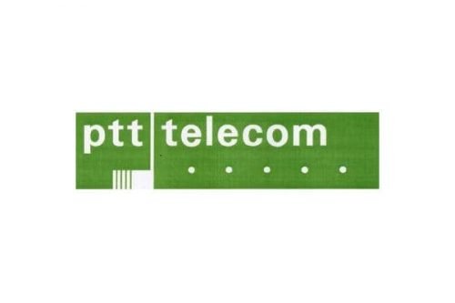
1981 – 1989
The horn idea already looked dated and was replaced by five identical dots and a stylized rectangle, which better represented the media used for communication in that era. The new color looked brighter and friendlier.
1989 – 1999
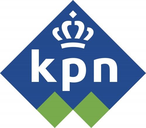
As the company became private and was renamed Koninklijke PTT Nederland (KPN), a new brand identity was introduced. It was apparently inspired by the previous logos but looked fresh.
There was the square with one of its angles looking up (like on the 1935 logo), the lowercase letters, and the grassy-green color (like on the 1981 logo). These elements were combined in an unusual way and decorated with a crown.
1999 – 2006
While on the previous KPN logo, the crown was placed above the square, this time, it could be seen inside.
2006 – 2022

The solid shapes transformed into abstract colored droplets, which better represented the modern idea of telecommunication.
2022 – Today
The logo a company has been using for a little more than 15 years has been updated. Bright green, blue, and golden, were used by the company since 1989. Now, the emblem featured a classic, more formal black and white color. It had only an abstract outline of the three rounded shapes. The familiar crown, which stayed in the center of this emblem, was also done in black. The company initials are also done in black, but the font has been preserved the same. Overall, it was just a black-and-white version of the previous logo, which made the logo look more modern and stylish.


