

![]() Chennai Super Kings Logo PNG
Chennai Super Kings Logo PNG
Chennai Super Kings is one of the ten teams of the Indian Premier League, the main cricket tournament in India since 2008. Super Kings are one of the strongest teams in IPL, with five overall and two Champions League wins as of 2023.
Meaning and history
The Indian Premier Cricket League (IPL) is a globally popular tournament. Its matches are held annually in April and May, with teams representing various cities across the country. The Indian Premier League is the most attended cricket league in the world and ranks sixth among all sports leagues in the world in terms of attendance. In 2010, it became the first sporting event in the world to be streamed live on YouTube.
Cricket is a very popular game in India. It’s kind of like baseball. Its stars become national heroes and earn huge sums of money. Boys from all over India dream of becoming players – it’s a quick social elevator. Cricket teams are idols of millions and one of them is Chennai Super Kings from Chennai, Tamil Nadu. The team was founded in 2008, the same year as the Indian Premier League, and as of 2023 is the champion and one of the most titled teams in the league.
The team has appeared in ten finals of the IPL, which is the record. However, Super Kings had to skip two seasons (2015 — 2017), because of the scandal, where the owners of the club were involved.
What is Chennai Super Kings?
Chennai Super Kings is the name of a professional Indian cricket team, which was founded in 2008. Based in Chennai, Tamil Nadu, Super Kings are one of the members of the Indian Premier League, where they have won five times (as of 2024).
In terms of visual identity, Chennai Super Kings are local to its original emblem, which was created in 2008, and for those times the logo looked very strong and progressive, so today it is still actual and stylish.
2008 – 2015, 2018 – Today
![]()
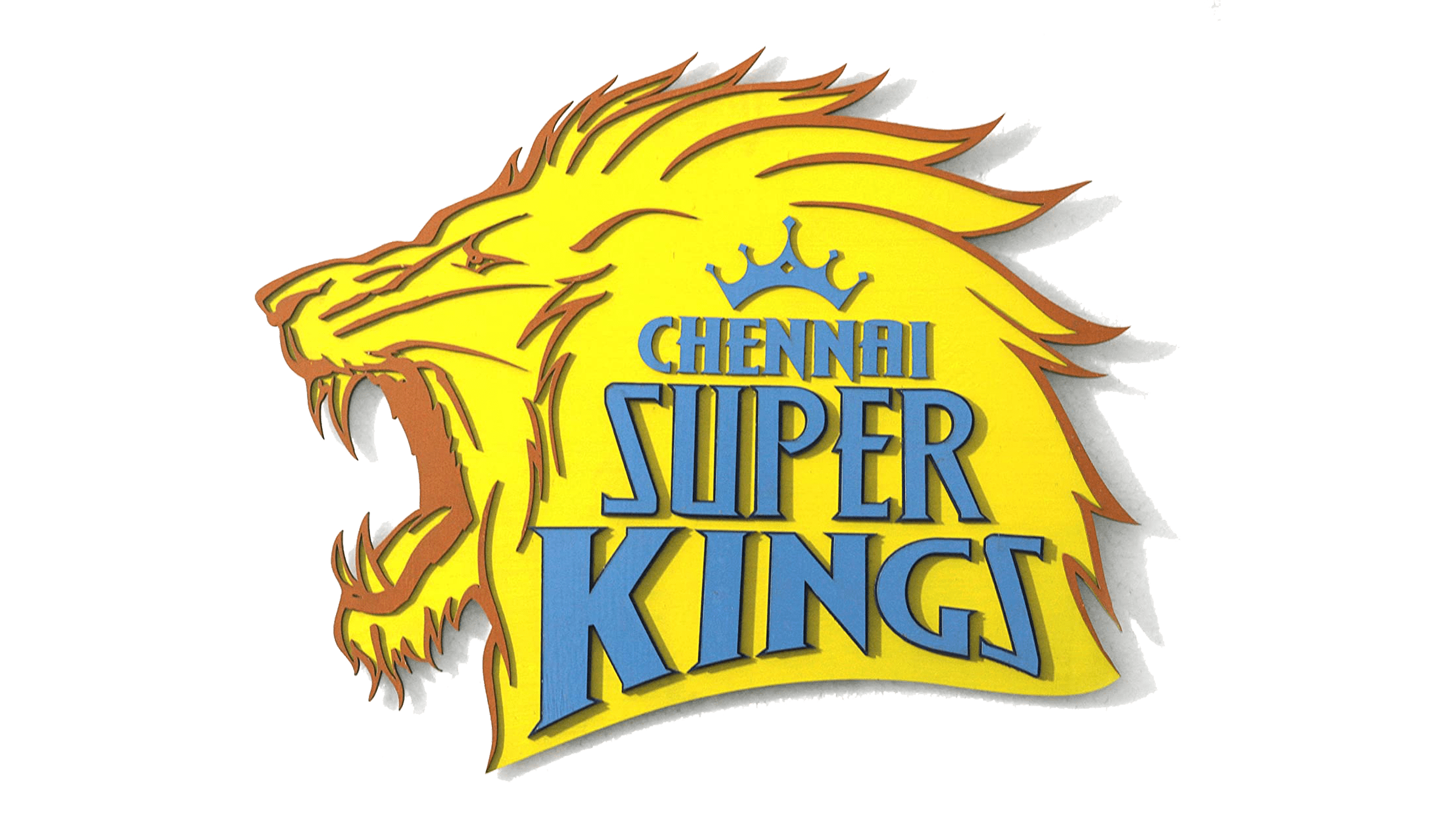
The Chennai Super Kings logo, introduced in 2008, is a combination of a bright powerful graphical emblem and a gradient stylized wordmark. The emblem is a contour of a lion’s head, drawn in profile facing to the left, with an open mouth and a belligerent expression. The three-level lettering with the name of the club is set on the right part of the emblem and accompanied by a solid blue crown above it. The inscription is set in gradient blue and uses a custom serif font with sharp elements and bold bars of the uppercase characters.
Font and color
The designer uppercase lettering from the primary logo of the Chennai Super Kings cricket club is set in a modern and sharp serif typeface, which looks somewhat close to such commercial fonts as Harmoniquetrade or Counte, but with significant modifications of the characters’ contours.
As for the color palette of the Chennai Super Kings visual identity, it is based on the combination of orange and blue, with vivid and bright gradients. Orange here symbolizes determination, energy, and power, while blue stands for professionalism, confidence, and strength.


