Dove is a shower and body-care cosmetics brand, which was established in the United States in 1955. Today the brand is owned by Unilever and sells its soaps, moisturizers, and deodorants across the globe, being one of the most popular affordable personal care cosmetics labels.
Meaning and history
The visual identity of the well-known brand of toiletries has always been tender and elegant. The logo, composed of fine lettering and an emblem was first designed in the 1950s, when the company was just founded and hasn’t changed much by today, keeping the style, symbol and color palette of the original version.
What is Dove?
Dove is one of the Unilever brands, which was established in the United States in the middle of the 1950s, and today is considered to be one of the world’s most popular producers of soap and shower products.
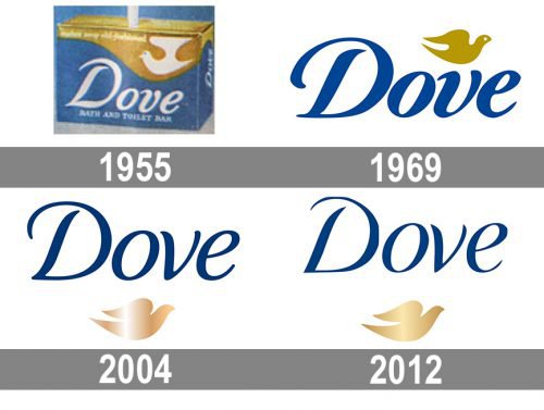
1955 — 1969
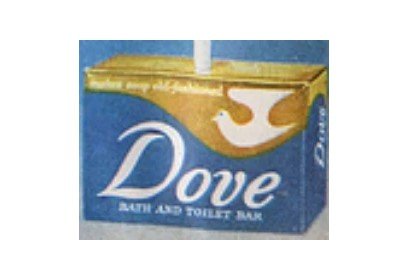
The very first Dove logo, created in 1955, featured a calm blue background with white cursive lettering and a delicate tagline. The upper part of the logo was colored in gold and had a stylized white dove bird in its right corner. The bird had its smooth abstract wings spread upwards and was facing left. This logo stayed with the brand for almost 15 years and became a prototype for the iconic logo we all know today.
1969 — 2004
The logo was redesigned in 1969, keeping the mood and elegance of the original version, it was executed in the same color palette, but the parts of the composition switched their shades.
Now the blue inscription and a golden dove were placed on a plain white background. The bird was redrawn in a more sophisticated way and was now flying to the right, representing growth and movement.
As for the lettering, it featured exactly the same typeface as the previous logotype, but in blue color is gained more confidence and distinction.
This was the most long-standing logo of the brand, staying with the famous toiletries for 35 years.
2004 — 2012
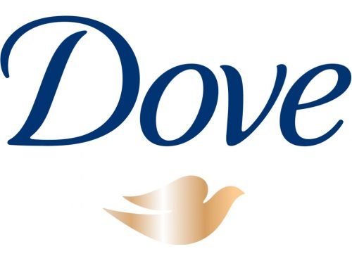
The next redesign was held by the company in 2004, in order to celebrate the new century and the constant development of the brand. The color palette remained untouched, though the golden bird was now executed in gradient shades, including white, in order to get some volume and to make them look more vivid and dynamic.
The placement of the symbol was also changed. It moved from the upper part of the logo to the bottom, being located under the nameplate, is its middle point.
The lettering was also refined. New typeface of the inscription boasted finer and smoother lines with clean and neat contours. The letter “V” was completely changed, being drawn in a more modern and luxurious way now.
2012 — Today
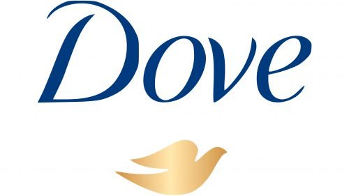
The current Dive logo was created in 2012 and is fully based on the previous design. The bird under the wordmark, placed on a white background. There were no major changes, just the more intense gold shade of the dove and modified typeface of the wordmark.
Letter “D” now features a shorter curved line, which makes the whole logo look contemporary and strong, while the thin smooth “E” adds elegance and finesse.
The blue-white and gold color palette of the logo is a representation of tenderness, clarity, and luxury, which the brand tends to give to their customers, along with love and care.
As mentioned above, the Dove symbol was created by Ian Brignell. Brignell is known as the author of quite a few logotypes, from Budweiser to Smirnoff, from Coors Banquet to Western. He specializes in lettering, logo, and font design.
Font and color
The tender and elegant lettering from the primary Dove badge is set in a custom cursive typeface, which looks very delicate and smooth. The closest fonts to the one, used for the Dove insignia, are, probably, Elicit Script SemiBold and Australis Pro Swash Italic.
As for the color palette of the Dive visual identity, it is based on a combination of plain and dark shades of blue, and bright gradient rose-gold. Blue is here as a symbol of professionalism and excellence, while golden hues evoke a sense of elegance and add a feminine note to the composition.


