The Docker company was started in France in 2010, but the Docker software was released as open source only in March 2013. In its official blog, the company states that the original logotype was “put together quickly”, so they decided to upgrade the logo and visual style shortly after.
Meaning and history
Docker is a platform for developing, delivering, and running applications in containers. Containers in Docker provide isolation of applications and their dependencies from the environment, making applications portable and easy to deploy on different systems. An application packaged in a container is isolated from the operating system and other applications.
Docker was developed in 2008. It was originally an internal project of dotCloud, which was later renamed Docker Inc. In 2013, dotCloud opened up the Docker source code to the community. Docker founder Solomon Hykes saw a need for a tool that would allow developers to package applications with all dependencies into a single integrity and run them in any environment. The platform hit the mainstream on the wave of popularity of DevOps, rapid delivery pipelines, and automation.
Of course, there were other virtualization technologies before Docker, but they were cumbersome and required large computing resources. So when Docker introduced the concept of containers in 2013, based on Linux container technology (LXC), which allowed applications and their dependencies to be packaged into a single container for more efficient deployment, it became a real resolution. After all, in addition to making it easier to build, deliver, and run applications, Docker also made containers as easy as possible for developers to use.
What is Docker?
Docker is the set of PaaS products, created by Solomon Hykes in 2013. The software was built to make the building and managing processes of applications easier and faster.
2013 – 2015
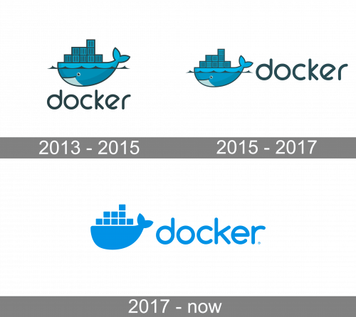
The current Docker logo was introduced in June 2013. With the help of the freelancer community 99designs the company received 84 logo prototypes. The winner was the whale emblem created by Ricky Asamanis, a graphic designer from Indonesia.
The whale carrying a stack of containers symbolizes the company’s four core values: expedition, automation, encapsulation, and simplification.
2015 – 2017
In 2015, they simply moved the wordmark from beneath the emblem to its right, and that’s all.
2017 – Today
The word for the 2017 emblem is minimalism. They basically turned the emblem into a shape of a whale with several squares piled up on it – all colored a deep blue color. The wordmark also adopted this color, although the letters were also marginally changed in some places.
Font and color
The lowercase Docker logotype looks playful and friendly, using a rounded sans-serif typeface with rounded shapes of the letters. The font, closest to the one used in the inscription from the software’s insignia is, probably, Modulus Pro Semi Bold, but with the shape of the letter “R” modified.
Like many other companies, connected to the IT and tech industry, Docker chooses a bright and vivid shade of blue for its logo, to represent professionalism and reliability. The blue also makes sense in connection to the sea-themed emblem of the brand.


