Although the Cure Bowl logo has changed more than once during its comparatively short history, it has always featured the pink ribbon, an international symbol of breast cancer awareness. Not only the design but also the very name of the bowl emphasizes that it promotes awareness and research of breast cancer.
Meaning and history

Cure Bowl is the American football bowl game, which is played between collegiate football teams. The game was founded in 2015, and since then in held every December in Orlando, Florida.
Since the establishment of this bowl game, it has already changed its name several times. The very first was Auto Nation Cure Bowl, which switched to FBC Mortgage Cure Howl in 2019, and Tailgreeter Cure Bowl in 2021.
What is Cure Bowl?
Cure Bowl is the intercollegiate football bowl game, affiliated with the National Collegiate Athletic Association. The bowl had its first game played in 2015 at the Camping World Stadium in Orlando, Florida, and today all the games are held on the Exploria Stadium.
2015 – 2016
The first game took place in late 2015. Both the original logo and the ones that have followed are dominated by shades of pink with white and black nuances. The word “Cure” appears to be formed out of a pink ribbon. The same approach has been used for the “O” in the word “Bowl.” Another signature design element is the two palm trees below.
2017 – 2018
The redesign of 2017 was all about the lettering, located on the bottom part of the light pink crest of the Cure Bowl emblem. The black “Florida Hospital” logo was replaced by the “Benefiting BCRF”, which was also set in black, but with thinner lines and airier and cleaner shapes of the letters. The insignia was accompanied by the black ribbon, making up a loop, which was set diagonally and drawn with its loop narrower and longer than the one in the letter “O” of the “Bowl”.
2019
For the first game of the Cure Bowl, the logo was created in 2015 and stayed unchanged until 2017, although even after the redesign it remained more than recognizable, as not much was refined. It was a fancy pink and black crest with the sponsor’s, FBC Mortgage” lowercase logotype set on the top part. The body of the elegant crest featured a ray-like pattern in two shades of pink and stylized lettering in the center. The lettering was set in three levels — the bold and enlarged “Cure” in smooth cursive, written in pink and outlined in black, the white medium-weight “Bowl” in an extended serif font with the letter “O” stylized as the ribbon having its tails elongated, and the black uppercase “Orlando” written over the right tail of the pink ribbon, forming the “O”. Under the inscription there was a solid black image with two palms.
2020

In 2020 both sponsors’ inscriptions were replaced by new ones. The upper one now featured the “FBC Mortgage” in the lowercase, set in white sans-serif letters with a bold black outline and accompanied by an enlarged circle in gradient pink, which was also outlined in black. As for the bottom part of the badge, it now featured the black “Orlando Sports” logotype with a circular emblem, depicting two palms enclosed into a thick black frame, formed by several equal fragments.
2021
The redesign of 2021 changed the colors of the circle near the FBC mortgage logotype, and now it was solid black with a delicate pink outline. As for the bottom part, the lettering was completely removed, and now only two enlarged black palm trees were drawn over a light pink background with a pattern made up of thin white stripes, coming from the center of the crest as the rays.
2022 – Today
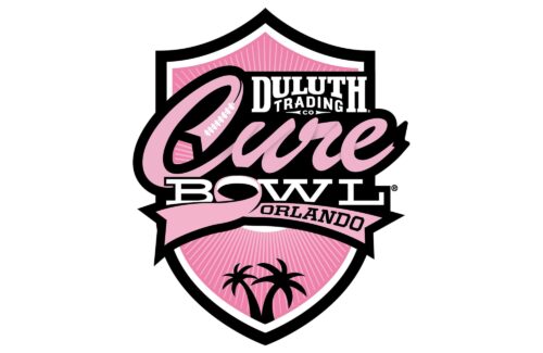
The redesign of 2022 has kept the iconic recognizable Cure Bowl badge, set in a light-pink, white, and black color palette, with just the sponsorship part, changed, compared to the previous version. The new sponsor of the bowl is Duluth Trading, hence the inscription on the logo repeats it, arching “Duluth” in bold serif capitals above the uppercase “Trading” in sans-serif, and underlined by a small “Co” enclosed between two sharp horizontally-oriented arrowheads.


