Captain Underpants is the name of one of the most popular book series for kids, which was created by Dav Pilkey and first published in 1997. Telling the story of two boys, the novels became incredibly popular across the globe and by today there have been 12 books released.
Meaning and history

The first Captain Underpants novel was published in 1997 and gained fans all over the world. Later, this novel was turned into an animated movie. It tells a story about two students who are trying to learn hypnosis. For a long time, they read hundreds of books and tried to find the answer about how to put people into a state of hypnosis. Thanks to their stubbornness, the heroes were able to learn everything they wanted. In order to consolidate their knowledge, these teenagers did not find a better candidate than the principal. In just a few minutes, he turned from a strict man into a real superhero who helps all students deal with their own problems.
1997 – 2002

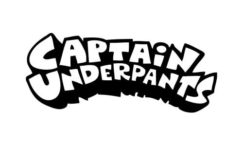
The logo of one of the world’s most famous books for children has always been very consistent and hasn’t changed much since the date of its creation in 1997. Executed in a black-and-white color palette it is timeless and cool, and its thick lines and contours look playful and make the books stand out on the shelves.
The Captain Underpants logo is composed of a wordmark, which is set in two levels, with the lower one slightly arched to top. The upper “Captain” inscription is executed in white and features a distinct black outline, while the bottom “Underpants” main feature is its thick black shadow.
This graffiti-style nameplate looks like something each kid has seen on the street, on buildings’ walls, and makes the books closer to its readers. Mother Captain Un-derpants logo is very simple yet recognizable and memorable, as it has a special mood and spirits which is very inviting and intriguing. It makes the reader want to know the end of the story, and switch his imagination to create its continuation.
The black and white color palette of the emblem allows placing it on any color of the background, making it a perfect accompaniment to bright images and covers.
2002 – 2015

The updated version of the logo looks very similar to the original one. However, there is noticeably more black. This effect was achieved by making the white portion of the letters slightly smaller and replacing it with a thicker black outline. The logo turned out very impressive and has more depth to it than earlier. At the same time, it preserved that playful and memorable feel.


