Canon Logo PNG
Canon is a Japanese manufacturer of high-tech products, which include cameras, printers, photocopiers, etc. The company appeared in 1937, and now it is headquartered in Ota, Tokyo.
What is the symbol of Canon?
The symbol of Canon is its logotype, executed in a custom sans-serif typeface, designed for the company by a famous Italian designer Gio Fuga. The sharp elongated lines of some letters and the bright red shade of the logo represent the company better than any graphical emblem, showing its professional and innovative approach, and attention to small details.
Meaning and history
The visual identity of a famous brand today is based on the earlier version of the logo, introduced by Canon in 1935, and it was the third emblem of the company, which was founded under the name Kwanon.
What is Canon?
Canon is the name of a Japanese brand, established in 1937, and mostly known for its photography and optical products, which are considered to be one of the best n the world. Today the cameras and photo accessories of the company are available for sale all over the globe.
1934 — 1937
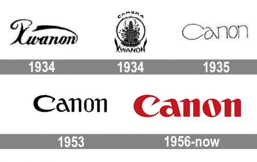
The very first logo for the Japanese company was introduced in 1934 and featured a circular badge with a Buddhist god image in the middle and two inscriptions set around it: the “Camera” in all capitals, arched above the emblem and executed in a bold stylized typeface resembling the Japanese hieroglyphs, and the name of the brand, “Kwanon” written under the circular frame with its letter lines drawn and flames.
1934 — 1945
Later in the same year, the second version of the logo was created. This was a more traditional emblem with a script written logotype, where the tail of the last letter “N” was elongated and curved up and left. Above the first stylized “K” there was a smooth curved line arched to the top. The logo was executed in a monochrome color palette.
1935 — 1953
With the change of the company’s name to Canon in 1935, the new logo was designed. A lightweight inscription in a custom recognizable typeface was written in a title case with its letters in thin lines with modern shapes. The monochrome palette made the logotype look stylish and confident and its wide contours and a fancy letter “A”, inclined to the left, made the whole minimalist image remarkable and exclusive.
1953 — 1956
The lines of the logotype were thickened and refined in 1953x this was when the first letter of the nameplate, “C”, gained its upper part elongated and sharpened, which added strength to the brand’s visual identity. The contours of both “N” were narrowed, and it gave more space for the unique “A”. The color palette of the logo was still black and white.
1956 — Today
The Canon emblem we all know today was adopted by the brand in the middle of the 1950s and stays unchanged since then. The bold and chic logotype is available in two color variations, with red and white as the primary option and monochrome as the secondary one.
The Canon logo is based on the two previous versions but executed in bolder lines, which makes the whole image more stable and powerful. The tails of all letters are elongated and sharpened, standing for movement and progress, and the letter “O” has its inner white space slightly inclined to the left, making a parallel with the vertical bar of the “A”, balancing it and creating an artsy and cool mood.
When was the current symbol introduced?
From the point of view of the shape, the Canon logo has stayed the same since 1955. Moreover, the 1955 version was nothing but a modified variant of the wordmark created in 1935 by a graphic designer specializing in advertising. The most distinctive glyph was the “C” with the top end curved inward and a sharp element on its end.
Shape
The current Canon logo is just the company name. The designer chose the red color. This is just another example of the effectiveness of the typographic approach in logo design.
Colors
The red color symbolizes responsibility, laboriousness, purposefulness, energy, and determination.
Font
The logo is written in its signature typerface. The exclusive logo font was introduced by a graphic designer – Gio Fuga.


