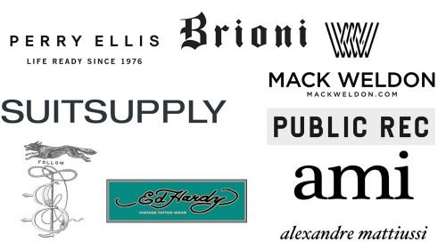
If you compare men’s fashion logos with those of women’s brands, you will see only subtle (if any) gender differences. The list of visual elements more associated with men’s logos includes:
- straight lines
- angles (especially acute ones)
- few decorations (minimalist design)
- few (if any) curves
- wider elements (which can symbolize dependability as one of the features historically associated more with males than females and also represent the fact that men typically have wider bones).
And yet, some men’s brands specializing in luxury clothes, suits, and ties, often use elaborate and rich in details logotypes.
Perry Ellis
The brand opted for a minimalist sans like most fashion houses, no matter whether they sell clothes for men, women or both. The “P” emblem is also absolutely simple: just the white letter in the same type inside a black circle.
Brioni
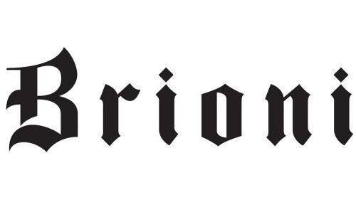
The logo of the Italian fashion house is more elaborate than a regular men’s fashion logo. The word “Brioni” is given in an artistic script and looks as if it has been written by hand by a person who is an expert in calligraphy. The decorative script is a good way of representing the company’s core product range (it has been best known for its made-to-measure men’s suits and sartorial ready-to-wear collections).
Ed Hardy
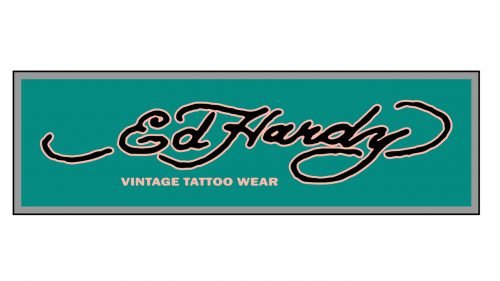
This one has a creative, artistic style. Each of the three letters of the “ED H” monogram has been drawn by hand and does not belong to any of the existing typefaces.
We should also mention the older logo featuring the full name of the designer. It was curvier than the current one.
Public Rec
The wordmark features the words “Public Rec” in a generic, highly legible sans without any additional elements. The “P” symbol has a unique touch. The letter seems to be formed by a road twisting and going on two levels.
Mack Weldon
The main logo can be broken down into the “MW” emblem and the lettering “Mack Weldon” below. The emblem is rather intricate in comparison with the majority of men’s fashion logos. While it is supposed to be the interlacing initials, in fact, there are several additional lines. It looks edgy and angular enough for a traditional men’s logo.
The typography of the wordmark does not even try to be unique – legibility is its main advantage.
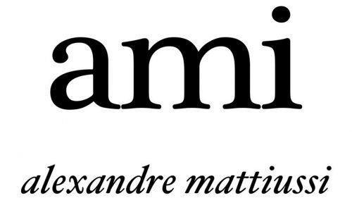
Ami (Alexandre Mattiuss)
The core products blur the boundaries between casual and chic. We can say that the “chic” part is clearly represented in the logo. The type featured in the word “Ami” is a serif one, with nice curves. Both features are not too often used in menswear logos. The words “Alexandre Mattiuss” are even more picturesque. They imitate calligraphic handwriting (although there are gaps between the letters).
E. Tautz
There is nothing but the name of the brand in a minimalist sans. There is generous breathing space between the letters. The lines forming the glyphs are not bold so the design looks rather light.
Suitsupply
At first glance, the logo looks very much like a hundred modern logos based on Helvetica and other unpretentious sans serif typefaces. And yet, if you take a closer look, you will certainly feel there is something elegant and refined. This is partly a result of the varying width of the strokes. The “utilitarian” elegance, if we can coin a phrase, seems to go well with the brand identity of the company specializing in men’s suits, ties, and shoes.
The letters stand pretty close to each other, which can be explained by the designer’s wish to make the long name look somewhat shorter.


