

Green is a natural and natural color. It is considered one of the 3 main colors along with red and blue. There are a huge number of shades of green in the world.
This palette evokes associations associated with the forest, grass, glades, meadows, and tranquility – something that surrounds humans everywhere. Most plants are colored green because they contain the photosynthetic pigment, chlorophyll.
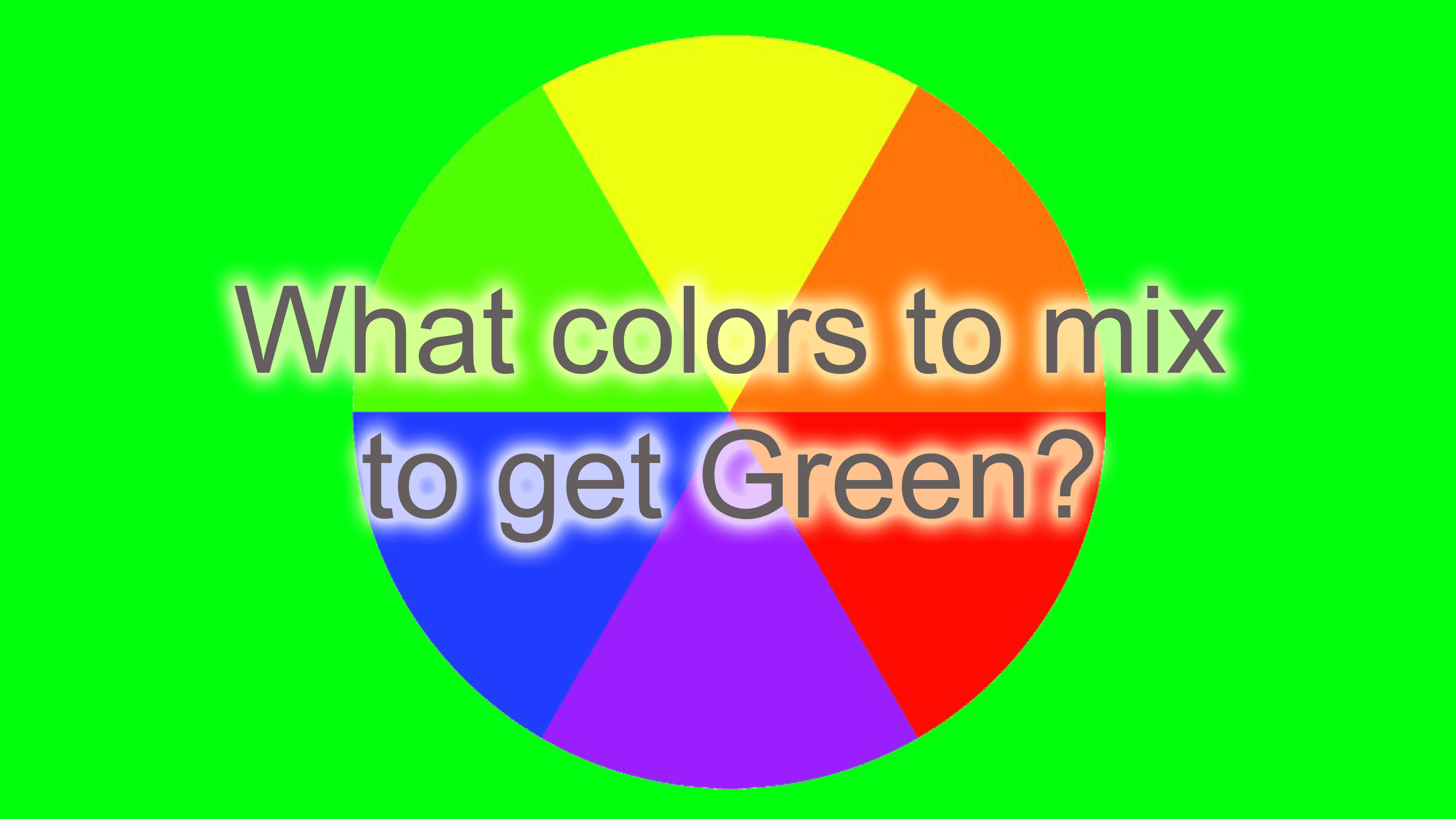
It is one of the most optimistic and calming tones in the color palette. And today we want to talk about how to get green by mixing colors of different shades to achieve maximum expressiveness in painting or interior decor. But first, a little bit about the meaning and history of the color green.
The Color Green
Experts have long paid attention to the fact that color can strongly influence a person’s mood. For example, red evokes passion or aggression, soft pink is suitable for frivolous pastimes, and orange adds energy and positivity.
As for the green, then much depends on its brightness and saturation. Lighter shades allow you to relax and rest pleasantly after a hard day’s work, and rich emerald shades or lettuce will give vivacity. At the same time, dark colors make the interior more serious. But all the psychologists agree that green is the most relaxing and tranquil of all colors.
For the ancient Egyptians, green tones were associated with the god Osiris, the patron saint of growth, rebirth, and the realm of the dead. In ancient Rome, greenery symbolized fertility, nature, and life, and was related to the goddess of love, Venus.
In Christianity, a similar palette symbolizes eternal life, but for Muslims represents paradise. The human eye is good at distinguishing shades of green. They have the following qualities:
- have a positive effect on eyesight;
- have a positive effect on people who are in tense or stressful situations, calm the central nervous system, help relax;
- at the subconscious level they are associated with freshness, renewal;
- improve concentration and reduce mental fatigue in the workplace;
- used in many cultures as a symbol of wealth and prosperity;
- long considered a sign of joy and happiness, harmony and satisfaction, luck and prosperity;
- used in the fight against claustrophobia.
Psychology of the Green Color
According to one theory of psychology, by the tone that a person prefers, you can draw some conclusions about his character:
- People who prefer bright greens are sociable and friendly, try to look for compromises, and do not worry long about failures.
- Dark-tone greens are chosen by people with a penchant for self-development and reflection.
- The cold palette of this palette likes responsible personalities.
- Warm colors are appealing to open-minded people who are often the object of interest of other people.
- Blue-green shades are preferred by an emotional group that wants to please everyone around them.
History of the Green Color
The first attempts to get a green tone by mixing colors were made by artists back in the 12th and 13th centuries. They used clay, malachite, or plant substances such as iris or leek juice.
The greatest artists of the Renaissance – Raphael, Michelangelo, Leonardo da Vinci – used ready-made paint rather than obtaining it by mixing others.
In the seventeenth century, Newton, in the course of his experiments, succeeded in splitting a light beam into a series of colored ones. This revealed to the world an unusual arrangement of colors, in which green took its position – between blue and yellow. That’s when it became clear that the combination of these two tones yielded the necessary green.
Classic Green
To get the classic color, you need to mix yellow and blue in a 50/50 percentage. This shade blends with any neutral and looks harmonious, and calm.
Green is created by mixing the two main colors, yellow and blue. Interesting fact: Yellow can vary from cadmium lemon to burnt umber. The same is true of blue. And depending on the shade and amount of yellow and blue, the shade of green changes as well.
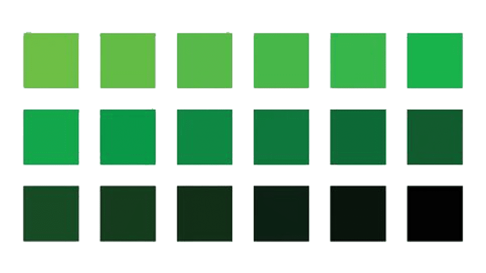
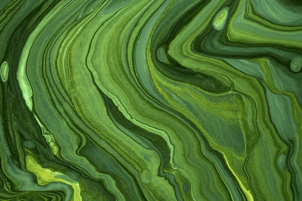
Shades of Green
To get the color green, you have to mix blue and yellow. This is the combination that gives the color of grass, which is the classic tone. But any color has many shades that vary in saturation, depth, and intensity. The range of green colors is very diverse.
There are about 15 basic shades of green, from light (pale) to turquoise (blue-green). But there are more than 110 other tones, very similar to the basic, but with some nuances. For example, introducing a drop of blue into the base gives the effect of “cooling,” and this color can be found in paintings in winter landscapes. On the contrary, adding a bright yellow color to the base makes the basic tone warmer, it turns out lettuce, bright and spring-like.

There are 376 shades of green in the Pantone palette. They come in light and dark, bright and dull, cool and warm, with different undertones. Plant names are used to designate common colors: ash, pistachio, wet aloe, moss, dark ivy, and dill. Less commonly used are mineral names: smoky jade, jasper-green, granite-green.
The hue is influenced by the proportion of yellow and blue colors mixed, as well as the addition of third-party tones. By varying the percentage of the main components of the greens, you can get a huge number of tones.
Most green shades are considered “warm” colors, and in this case, it is quite easy to create these shades: you only need to add a warm yellow and, in rare cases, the rarest drop of red. “Cold” shades are more difficult to create, and they are less common in nature. They can be found in a set of colors, the most common being emerald and light green (Phthalo and Winsor green).
Getting the Perfect Green
Everyone now knows how to get the color green, but there are many ways to create its shades. That’s what we’ll talk about below. The wide range of shades of green depends on the proportions of mixing the primary colors, as well as the introduction of additional darkening or brightening tones: white and black. In addition, olive shades and khaki colors are the product of mixing yellow, blue, black, and brown.
The intensity of the color depends on the quality of the dyes, as well as the number of mixed colors: the more shades involved in the formation of the tone, the duller the color will eventually turn out.
How to get a medium green color

To get a medium green, you’ll need yellow and blue, usually in a 1-to-1 or 1-to-1.5 ratio towards yellow. The blue can be replaced with blue if you have it, then the shade of green will be lighter.
The brightness of the resulting color will depend on the purity (saturation) of the main tones: yellow and blue. The more intense they are, the brighter the green will be.
How to get yellow-green

Yellow-green can be obtained by mixing green with yellow. Depending on the proportion, you can get light and medium shades of yellow-green.
How to get blue-green (emerald)

Blue-green, emerald, and malachite shades are cool tones of green with a predominance of blue. You can get them by adding blue to green, or by mixing yellow and blue with an increase in the latter ingredient, depending on how dark and going blue-green you want the color to be.
This category of colors is obtained by taking blue paint as the base and mixing a small amount of yellow with it. Emerald shades are rich, and noble, like the gem from which they take their name.
How to get dark green

By mixing the basic colors that makeup green, we get a medium to slightly darker tone if there is enough blue in it. But sometimes you need a deep, almost black green that will portray forest or grass shadows. To do this, black is added to the resulting main shade.
If we add black to the medium green, we get a warm, darker gamut. By increasing the amount of black, you can achieve a very dark, barely distinguishable black color. If you add black to the blue-green, you get a dark, cold range, going to black-green.
How to get olive and khaki colors
To get soft pastel pale greens, a little blue plus white is added to the yellow. It is a tone of peace and tranquility. That’s why it is often used to decorate medical specialties.
When mixing green with the addition of yellow to produce olive colors, colors of different intensities and saturations are used. A lighter shade is produced by blending a less saturated green.
A huge layer of complex olive shades can be obtained in several ways. The first way is to mix medium green and brown. In this case, the tones will turn out muted, and dusty with a swampy undertone. This is the sum of several colors (yellow, blue, red), so all tones will have a gray, dull cast.
The second way is to mix yellow with black. The resulting paint will have a golden hue, it will be brighter because it is the sum of the primary hues.
How to get gray-green
Gray-green is most often thought of as a cool shade of green, so we will be making it from an already mixed blue-green color. That is, as a secondary color, we mix a cool green with a complex, secondary brown and get a dusty gray-green tone. This will minimally shade the hue, compared to adding black or gray.
How to get a light green
Medium-light green is obtained by mixing the resulting green paint with white. In doing so, a considerable amount of white should be taken. You can add fury to the shade by adding yellow, but then the tone will be closer to yellow-green. You can correct the tone with a drop of blue.
How to get a minty green
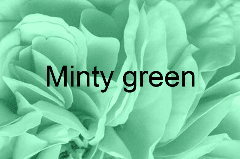
Mint is a light, cool green and so it should be mixed from a blue-green and white tone, where the white will be a significant amount. So with small amounts of white, the tone will be jade, and a strong dilution will create a menthol effect.
How to get Bottle Green
Bottle green is a mixed yellow and blue, with yellow as the base color. It is a shade that requires a measured attitude. More often it is used for accents and contrasts. Perfectly combined with lighter tones.
How to get Coniferous Green
If you take the green, add yellow and a little black to it, you can get coniferous colors. Like bottle green, it is used in combination with pastel shades of lighter tones to create a harmonious contrast.
How to Get Green Fern
To get the color of the green fern, you need to mix the colors: green, black, and white. As a basis, white paint is taken. This is a transitional shade from lighter tones to richly dark. The tolerance of this shade makes it possible to apply it widely in various spheres: advertising, interior design, in the fashion industry.
How to get the Forest Green
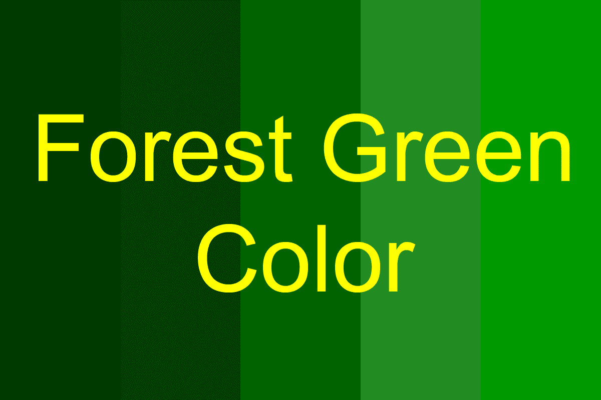
It is possible to make a color like a forest green by adding black to green. The resulting shade is a symbol of a revived nature. It refreshes and energizes the space where it is used. The color forest green is recommended for children’s rooms, as it stimulates creativity. It is also used to combat depression.
How to get Lettuce-Green
Using yellow with the addition of white and green paints, the tone of the lettuce is born. The resulting color is characterized by optimism and activity. That is why it is often used in children’s rooms and clothing. Lettuce is an expressive bright light tone.
How to get Swamp Green
The combination of browns, reds, and greens gives the color bog green or khaki. It is the color of military uniforms, but not because it is overly aggressive. It’s perfect for camouflage, and it’s also practical. It is also quite popular in the fashion industry, especially in the “military” style. The special depth of this shade is used in interior design when you want to create an atmosphere of stable calm.

Light cool shades of green
These shades are produced by adding white and reducing the percentage of yellow. They start from light aqua tones and range from green-blue to gray, muted shades.
Examples: colors of bay, nutmeg melon, butterfly, pistachio, cabbage, smoky jade, wave crest, ash, airy green, bok choy, cockatoo, waterfall, gray jade, meadow.
Light warm shades of green
These are obtained by adding white, reducing the amount of blue, and increasing the amount of yellow. Warm colors are more varied and are divided into categories: yellow greens; greens; olives.
Examples of warm hues: are chicory, wet aloe, lime sherbet, sea foam, wild mustard, lily, cane, young wheat, leaf dew, Nile, and fiber.
Dark green natural shades
Dark tones are obtained by adding a black tone to the 2 main tones. This palette is as close to natural as possible, as can be seen in the names of the colors: colors of leaves, lichen, mint leaves, trefoil, and green tea.
Dark green is the color of wisdom and deep reflection, which represents life experience. People of mature age, who know the meaning of life and know their worth gravitate to it. This color patronizes money and good luck.
The easiest way to get a dark green color is to gradually add a black tint to ordinary green paint, usually not more than 0.5 part. Depending on the amount of black paint added and the original direction of the green, you can get different shades of green.
All shades of dark green contain a touch of black, so they can be roughly divided into six groups
- The rich-dark brown-green is the only warm tone of dark green paint, which is achieved not only by adding black, but also by slightly adding red or yellow tint.
- Coniferous is a deep green color, achieved by mixing black with a slight prior addition of yellow.
- A simple dark green tone is a mixture of green and black, as we have already mentioned.
- A malachite dark shade of green is achieved by mixing black with green with a slight addition of blue.
- Dark khaki color – in addition to mixing black, the desired shade is achieved by adding red and gray colors.
- Dark gray-green tint – achieved by mixing green, and black and adding gray.
A few important rules for obtaining dark green from the original green: The more black we add, the darker the color we get; The more red, the warmer the color; The more blue, the cooler the color.
What to combine different shades of green with
All shades of dark green in the composition are well combined with light shades of green, which give it depth and severity. In addition, it is possible to combine green with beige, gray, yellow, brown, and gold. Below we will talk about the main options for combining shades of green with other colors.
White and black
The combination of green with white is traditional. If we consider this palette concerning clothing, the image will turn out fresh and innocent.
This combination is universal, with it you can compose a set in any style – from office attire to a festive image. Any shade of green looks great with white, so you can choose any – from neon to dark.

With black you need to choose the shades carefully because it can be too dark a combination, you need to know in all things to be moderate. When it comes to clothing, the olive shade will look gentle and natural, so you should not overload it with a lot of blacks. Emerald can be combined in a 50/50 ratio. Classic green is more difficult to combine with black, you should be guided by the textures of the fabrics.
Gray shades
The gray palette is clean, impersonal, and does not overload emotionally, so it is well-suited for the background. Combine this palette with greens with caution, so as not to create a boring image.
Against a background of gray shades dark green becomes richer. With Bright yellowish green, you get a light summer image, which emanates freshness. On the background of dark gray, bright, fresh greens look advantageous. Classic gray and green also make a favorable combination.
Pink shades
Pink and green in combination resemble a berry and fruit bouquet in the foliage, which gives strength, vigor, freshness, and gives a positive mood. However, when combining these scales, it is necessary to choose the right shade.
Among each other look better combinations of the same brightness, saturation, and warmth of colors, such as a combination of warm, green, and pink shades. It is easier to combine the soft ones that do not have a clear belonging to the classification.
Red shades
This mix is complex and has long been considered a sign of bad taste. All because of the saturation and brightness of the tones. Not every green will go with red, you should choose the shades carefully.
It is best to use more muted tones. To emphasize the red color, you need to add warm shades of green, such as pistachio, khaki, marsh, and olive. The combination of red and cool green is rare in nature, so it will look exotic.
Brown shades
A more natural combination is hard to imagine. It is the most natural and natural combination, it is present in the world around us. Always keep in mind one rule: warm shades combine, and cool shades with each other. The olive color goes well with brown, and cool jade, mint, or emerald goes well with gray-brown.
Blue shades
This combination turns out deep and full. It is a natural combination of colors, pleasing to the eye. Green on the background of the blue sky or bushes of plants at the shore of the pond – all this is a familiar and natural picture for humans. Because of the relatedness of these palettes, any combination will be harmonious, and the boundary between them is almost erased.
Purple shades
This color is one of the most complex and ambiguous in the palette. All shades of purple suit emerald and sea wave colors. It is best to focus on the combination of green and purple, which is represented in nature, combining the most suitable shades.
Orange shades
Orange symbolizes joy, fertility, and prosperity. It is the color of fruit and the sun, so the combination with this color will turn out to be vital and fresh.
The image will be quite bold, but harmonious in any combination. You can take any of the colors as the basis, but one should not dull the other.

Conclusion
What colors to mix to get green? To answer the question, you should look at what the color wheel looks like. Green and its shades are located between yellow and blue, therefore, these tones will allow you to get the right color. A classic green can be made by combining equal proportions of these colors. As for the many shades of green, they are produced by changing the ratio or introducing new pigments.
In this case, the shades depend on the ratio of the original tones:
- Salad-green is achieved by mixing blue and bright yellow in equal proportions.
- To lighten a shade, the two colors are combined with white, and black is used to darken it.
- For more complex colors change the proportions of the mixture and add a third tone, such as red.
- The brightness of the shades will depend on the concentration of the initial components.
- To get grass-green, mix 1 unit of yellow and 1 unit of blue.
- For yellow-green, use 2 units of yellow and 1 unit of blue.
- For blue-green, use 2 units of blue and 1 unit of yellow.
For dark green: 1 unit yellow, 2 units blue, and 0.5 units black. For light: 1 unit yellow, 1 unit blue, and 2 units white.


