AmorePacific is a South Korean beauty and cosmetics conglomerate, known for pioneering cutting-edge skincare and makeup innovations. Dominating the Asian market, especially in Korea and China, its influence extends globally. The company boasts an array of renowned brands, from luxury to mass-market. Founded by Suh Sung-whan, it remains under the stewardship of the Suh family. Its commitment to natural ingredients and R&D positions it as a leader in the beauty industry. A blend of tradition and technology, AmorePacific continues to redefine global beauty standards.
Meaning and history
AmorePacific, a beacon in the world of beauty, traces its roots back to 1945 when founder Suh Sung-whan took the reins of his mother’s small camellia oil business in South Korea. With a vision to transform and globalize Korean beauty, Sung-whan launched the company’s first cosmetic product, “ABC Pomade”, setting a cornerstone for its legacy.
By the 1970s, under the moniker “Pacific”, the company made significant strides in research, leading to the creation of its first skincare line. Recognizing the power of green tea, AmorePacific became one of the pioneers in harnessing its benefits, launching a skincare line derived from green tea in the 1990s.
The company’s commitment to innovation shone brightly when, in 2002, it set up the first dedicated cosmetics R&D center in Korea. This move significantly propelled its standing in the beauty market, leading to groundbreaking products.
Throughout its journey, the Suh family remained at the helm, with leadership passed down to Sung-whan’s son, Suh Kyung-bae. Under his stewardship, the company expanded its footprint beyond Asia, introducing its unique beauty philosophy to the West.
In the 2010s, AmorePacific gained international acclaim, thanks to the global K-beauty wave. It strategically diversified its portfolio, accommodating both luxury and everyday brands, allowing it to cater to a wider audience.
Standing tall as AmorePacific Group, the company boasts a rich tapestry of brands, each echoing its ethos of combining nature, science, and art. From a modest camellia oil business to a global beauty powerhouse, AmorePacific’s journey is a testament to its unwavering dedication to innovation, quality, and the spirit of Korean beauty.
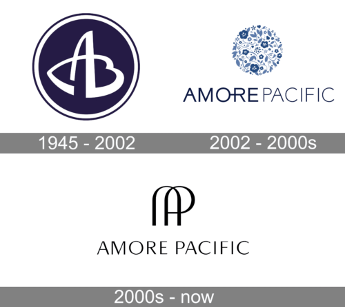
1945 – 2002
The emblem, signifying the Essence of Asian Beauty Craftsmanship, mirrors both AmorePacific’s deep-rooted legacy and its trailblazing ethos. The heart’s silhouette not only embodies elegance and affection but also stands as a testament to the architects of Asian allure. The shade “Oceanic Azure” draws inspiration from the vastness and adventurous spirit of the Pacific waters, highlighting its historical significance and undying zeal for exploration. This fusion of symbols encapsulates the brand’s dedication to beauty, innovation, and its unwavering commitment to pushing boundaries in the realm of cosmetics and skincare. The colors and shapes converge, telling a story of passion, tradition, and a future-facing vision.
2002 – 2000s
The fusion of diverse artistic visuals embodies Amore Pacific’s blossoming universe, enriched by the timeless tale of the camellia, the forward-thinking essence of green tea, and a vision crafted for tomorrow. The intricate designs, which incorporate motifs of camellia, green tea, legumes, and ginseng, stand as a testament to AmorePacific’s steadfast mission: to enhance the world’s beauty and bounty. Each element carries a story – from the age-old grace of camellia to the invigorating spirit of green tea. They weave together, showcasing AmorePacific’s commitment to both preserving tradition and fostering innovation. This rich tapestry of symbols eloquently communicates the brand’s profound respect for nature and its ceaseless aspiration to bring forth a more vibrant and enriched global community.
2000s – Today
The visual showcases a minimalist yet distinctive emblem. At the top, two elongated, sleek black arches intertwine, forming a shape reminiscent of the letters “A” and “P.” This design exudes a contemporary feel while maintaining a hint of classic elegance. Directly below the emblem, “AMORE PACIFIC” is spelled out in bold, capital letters, offering a stark contrast in terms of design density. The typography is clean and straightforward, emphasizing clarity and sophistication. The entire design is set against a pristine white background, underscoring its simplicity and modernity.


