ACE Hardware is the cooperative of hardware distributors, which was established in 1924 in the United States. Today the corporation operates in 60 countries all over the world, through more than 5 thousand locations, and is considered to be the largest hardware cooperative in the world.
Meaning and history
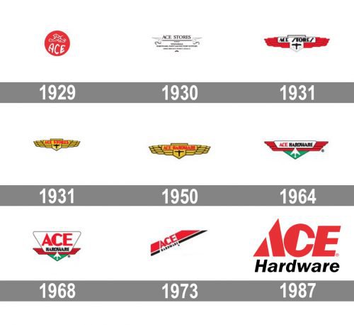
The visual identity of the famous American cooperative is bright and sharp. The first logo was created in the 1929s and the company still uses its original color palette. For the first twenty years, the name of the corporation was “ACE Stores”, so all the logos from that period were built around this wordmark.
1924 — 1930
The very first logo of the cooperative was designed in 1924 and consisted of a solid red circle with a white image and a wordmark “ACE” under it. The lettering was executed in a bold rounded sans-serif font, with the letters slightly arched at their bottom line, and looking not very neat.
1930 — 1931
In 1939 the logo was completely changed. Now it was a monochrome inscription in a serif font, underlined and having two winged creatures on both sides of the line. It was a strict and elegant visual identity, which only stayed with the corporation for one year.
1931
The bright red color came back to the ACE Hardware visual identity in 1931, however in a completely different design. The new concept was based on a horizontally stretched geometric winded badge with the name of the company written in black capitals on top of the central segment of the badge, accompanied by a laconic image of a plane flying up.
1931 — 1950
The new period of the logo design started in 1931. Originally it was a red aviation badge, with the bold nameplate in black, located in the middle of it in a white background, with an aircraft image under it. The plane was drawn vertically with abstract clouds on the bottom.
In 1931 the color palette was changed to yellow and red, which was a reflection of energy, dynamic and positive approach. The plane was now in black, which symbolizes power and confidence. White clouds were placed under the plane as a reflection of loyalty and transparency.
1950 — 1964
The name of the cooperative was changed to “ACE Hardware” in 1950, so the logo was redesigned according to the new name. The composition remained untouched, as well as the color palette, with the only difference — white clouds were gone, now it was only a thin black contour on a yellow background.
1964 — 1968
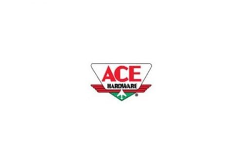
The completely new color scheme was brought to the company’s logo in 1964. Red was the main color, it had a white horizontally stretched trapezoid with rounded angles where the wordmark in red and black was located. Under the red badge there was a free triangle with its peak down placed, and the white modified aircraft, pointing in the nameplate like an arrow.
The new color palette was a reflection of the strength and progress of the cooperative, showing it a man a growing and developing one.
1968 — 1973
Another redesign was held in 1968. The color palette and main concept remained the same, but the trapezoid was enlarged and now the nameplate was the main part of the whole logo, with “ACE” in red extra-bold sans-serif and a more delicate black “Hardware” under it.
1973 — 1987
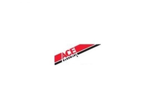
In 1973 the concept of the logo was changed and the aviation badge was gone. Now the logo was composed of a diagonally located geometric figure, composed of two parts, red and black, with the wordmark placed in its middle, also diagonally. The style and color scheme of the wordmark was repeating the previous version.
1987 — Today
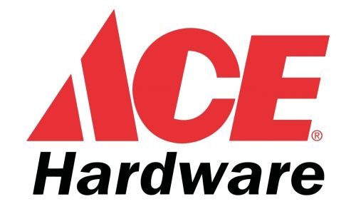
The logo we all know today was designed in 1987 and now it is composed of a bold red “ACE” inscription executed in a custom sans-serif typeface with the letter “A” drawn as a triangle with a sharp peach and a diagonal white line, replacing the horizontal bar.
As for the “Hardware”, it is still written in black sans-serif and is slightly italicized, adding a sense of progress and motion to a strict and professional logo.
Font
The “ACE” in all capitals is written in a custom typeface, resembling an Old Miami Beach Nights JNL font, while the “Hardware” part is executed in a traditional sans-serif, the one similar to Franklin Gothic.


