

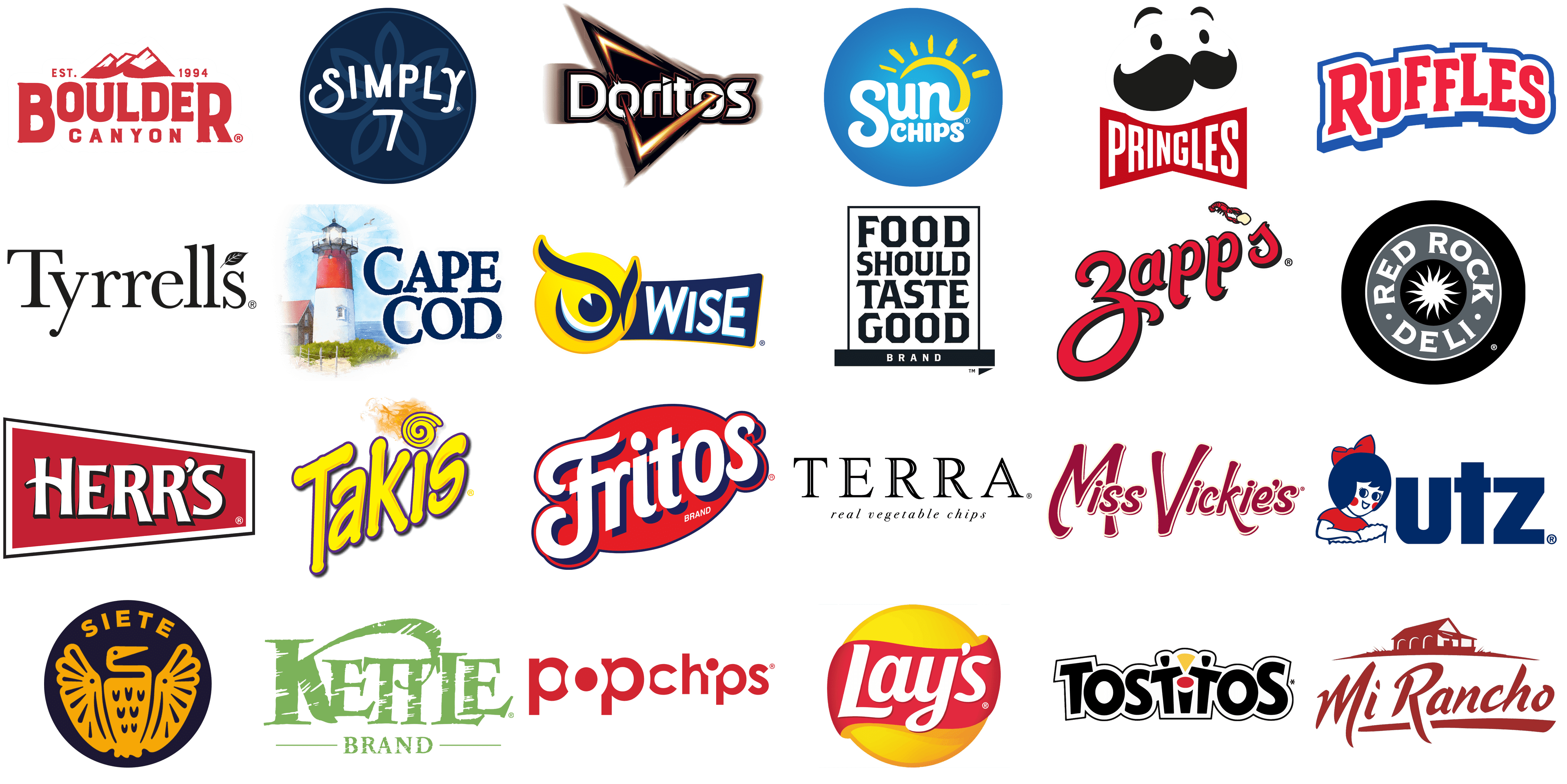
In the dynamic world of snack foods, the visual identity of a brand plays a crucial role in shaping consumer perceptions and preferences. Among the myriad snack options available, chips stand out as a universal favorite, offering a range of flavors and textures to suit every palate. The logos and branding of chip manufacturers are not just markers of identity, they are intricate tales woven into the fabric of culinary culture, each symbolizing a unique story of taste, tradition, and innovation.
As we delve into the logos of various chip brands, we embark on a journey through a landscape rich in color, shape, and symbolism. These brands masterfully combine elements of design to communicate their core values and product offerings, engaging consumers at a glance and inviting them into a world of flavorful experiences. From the rustic elegance of kettle-cooked artisan chips to the vibrant zest of spicy tortilla chips, each logo serves as a portal to the unique sensory experiences that lie within each bag.
The importance of a well-crafted logo cannot be overstated in the competitive snack food industry. It acts as the silent ambassador of the brand, conveying messages of quality, taste, and heritage without a word. Through the strategic use of colors, fonts, and imagery, chip manufacturers capture the essence of their products, differentiating themselves in a crowded marketplace and forging a connection with consumers.
This exploration of chip brand logos reveals the art and science behind these deceptively simple designs. It highlights how, through creativity and strategic thinking, these symbols transcend their commercial function to become icons of popular culture.
Boulder Canyon
![]()
The Boulder Canyon logo features a schematic image of the famous Colorado mountains, drawn in a red and white color palette above a bold lettering, which makes up the main part of the composition. The image with the three mountain peaks is enclosed between the “Est. 1994” datemark parts and makes up a great accompaniment for the wordmark. The inscription is set in two levels, with the enlarged “Boulder” written in a bold serif typeface boasting the first and last characters in a larger size, and the “Canyon” in small capes with a lot of air between the letters.
Boulder Canyon takes pride in its kettle-cooked chips made from premium American-grown potatoes and a variety of unique flavors, all crafted with a commitment to sustainability and all-natural ingredients. The brand’s name appears in block capital letters colored in deep red on the logo, evoking the earthy tones of the canyon it’s named after, complemented by an underline that features a rugged mountain range silhouette, symbolizing the natural and adventurous spirit of the brand.
Cape Cod
![]()
The Cape Cod visual identity is very traditional and detailed. The logo of the brand is based on a pretty realistic graphical element and a bold handwritten wordmark, which only enhances the old-style concept of the insignia. An old red and white lighthouse is drawn on a background with green grass and a blue sea, in the left part of the composition, followed by a bold two-leveled lettering in dark-blue, with the blueish shades of the sky and the water dissolving and turning white.
In Hyannis, Massachusetts, Cape Cod Chips produces chips known for their distinctive kettle-cooked texture and taste, emphasizing simple ingredients and a traditional cooking method. The brand’s logo features a scenic watercolor painting of a lighthouse next to a cozy cottage, with the brand’s name arching above in deep ocean blue, bringing to mind serenity and the fresh, salty breezes of the New England coastline.
Doritos
![]()
The logo of the famous Doritos brand is known in every corner of the world. The badge is based on a stylized white lettering, set in a solid black banner, which repeats the shapes of the characters on the sides and turns into a sharp slanted triangle in the center. This triangular element has a glossy gradient outline in white, yellow, and orange shades, which create volume and a kind of burning surface. The geometric figure here is not just for edginess and strength, but it also shows the shape of the brand’s chips.
Since their debut at Disneyland in the 1960s, Doritos have become famous for their bold flavors and distinctive triangular shape, continuously introducing new varieties. The logo features a dynamic triangular design with sharp angles in vibrant colors, embodying an ignited flame or lightning bolt, with the brand’s name in bold white letters outlined in orange and yellow, symbolizing energy and boldness.
Food Should Taste Good
![]()
The Food Should Taste Good logo stands out from the list of the competitors, as is executed in a minimalistic black-and-white color palette, and has the lettering as the main graphical element of the composition. The four-leveled inscription is set in the uppercase of a custom font with sharp cuts of the lines and diagonal cuts of some bars, plus flared ends, which create a very interesting edgy geometry. The wordmark is enclosed into a thin rectangular frame and accompanied by a narrow black banner at the bottom, with the white sans-serif “Brand” written on it in small capitals.
Food Should Taste Good celebrates its variety of non-GMO, gluten-free, and wholesome chips that meet a wide range of dietary needs without sacrificing flavor. The logo boasts a simple, elegant design in black and white, with tall, block lettering contained within a rectangular border, representing the brand’s straightforward commitment to wholesome and tasty snacks.
Fritos
![]()
The visual identity of the Fritos brand is bright and lively. The badge, executed in a white, red, yellow, and blue color palette evokes a sense of friendliness, enjoyment, and warmth. The composition is built around a diagonally oriented title case wordmark with elongated curved tails of the characters, looking playful and fun. The inscription is set in white and outlined in blue, placed against a stretched oval crest in solid red with an outline made of white and yellow orbits with sharp ends.
Since its inception in 1932, Fritos has become an iconic American corn chip, cherished for its unique twist and satisfying crunch. The logo of Fritos, set against a bold red oval, showcases the brand name in large, sweeping white letters edged with navy blue, embodying the classic and comforting essence of this American snack favorite.
Herr’s
![]()
The logo of Herr’s is stable and strong, with distinctive contours of the elements and contrasting colors. The edgy geometric lettering is written on a trapezoid banner with its narrowest side on the right, which creates the impression of a cut arrow, pointing into tomorrow. The inscription is set in white capital letters, with a thin black shadow, some of the bars elongated and the “H” enlarged. As for the banner itself, its main part is set in a dark shade of reddish burgundy, with a thick white and a thin black outline.
Herr’s, a family-owned snack food giant since 1946, offers a wide array of flavorful snacks. Its logo, a vivid red rectangle, features the brand name in a bold, angular white font outlined in black, conveying a blend of intense flavor and enduring tradition.
Kettle Brand
![]()
The Kettle Brand’s visual identity looks cool and vivid due to the use of an interesting light shade of green as the basis of its color palette. The badge is composed of stylized bold lettering in a custom serif typeface with straight cuts and long triangular serifs on the ends of the bars. The light green wordmark has the surface of its characters decorated by white strokes, creating a sense of erasing. The main logotype is accompanied by the small uppercase “Brand” enclosed between the two thin horizontal lines and placed at the bottom of the composition.
Kettle Brand distinguishes itself with a dedication to natural ingredients and a variety of kettle-cooked chips flavors, promoting environmental sustainability since 1982. The logo employs a rugged, textured green font for a natural, artisanal feel, with “Brand” in a clean, contemporary style below, highlighting the company’s focus on quality and environmental responsibility.
Lay’s
![]()
Another super popular logo on our list is the Lay’s insignia. The badge, set in a delightful yellow, red, and white color palette, depicts an abstract circular sun, which also represents the shape of the brand’s chips, and a wide red ribbon, overlapping it in the center and drawn with smooth wavy borders, which create a sense of motion and tenderness. The name of the brand is written over the red ribbon in bold yet elegant title case characters of a custom cursive font with softened angles and an elongated horizontal bar of the “L”.
Lay’s, leading the global market in potato chips, has been synonymous with light, crispy chips and a wide flavor selection since 1932. The Lay’s logo radiates joy, featuring the brand’s name in a white, flowing script over a bright red swoosh, set against a sunny yellow backdrop, capturing the crisp and airy essence of their chips.
Mi Rancho
![]()
The Mi Rancho logo is set in a warm and elegant burgundy color palette, which looks very stylish in combination with white. The badge is composed of a graphical part, depicting a traditional ranch with a triangular roof and arched windows, drawn on a long line above the stylized title case lettering. The inscription is executed in a bold designer typeface with sharp contours of the characters yet all the angles here are softened, which makes a nice balance and adds a touch of friendliness to the logo. The wordmark has a thick underline in the same shade of burgundy.
Specializing in organic and traditional Mexican foods, Mi Rancho preserves a family legacy spanning three generations, offering authentic tortillas and chips. Its logo captures rustic elegance with a rich, earthen red script and a silhouette of a traditional ranch house above the brand name, evoking a deep sense of heritage and homegrown quality.
Miss Vickie’s
![]()
TheMiss Vickie’s visual identity is based solely on the lettering, which represents the brand’s traditional approach, and evokes a sense of warmth and coziness. The inscription is written against a plain white background in a stylized sans-serif typeface with softened contours and curved elongated bars of the capital letters. The main shade of the wordmark is burgundy, and each character has a double outline — smooth cream and thin burgundy. The only non-standard thing about this badge is the first word, where the right vertical bar of the capital “M” is overlapped by the following lowercase characters.
Starting in a small farm kitchen in 1987, Miss Vickie’s now excites taste buds with kettle-cooked potato chips known for their homemade taste and satisfying crunch. The brand’s logo, in elegant, flowing deep maroon script, embodies homemade sophistication and a commitment to the art of kettle-cooked chips.
Popchips
![]()
The Popchips brand features a very cool and modern visual identity, executed in a bright red and white color palette. The main star here is the lettering, which is set in the lowercase of a geometric sans-serif typeface with the enlarged “Pop” followed by a smaller “Chips”. The letter “O” in the “Pop” is drawn in white with a red negative space and the white contour overlapping parts of the neighboring characters. In the “Chips” part of the wordmark, the same trick is used in a smaller size — with the invisible vertical bar of the “I” accompanied by a small red dot outlined in white, and covering the top corners of the “H” and “P”.
Introduced in 2007, Popchips presents a lighter, popped snack alternative, emphasizing flavorsome options that are lower in fat without ever being fried or baked. The brand’s logo features a minimalist, modern design with the name in a bold, round, lowercase font in bright red, reflecting a fun and lighthearted take on snacking.
Pringles
![]()
The logo of the Pringles brand has already become iconic today, and its mascot, the mustache man is widely recognizable. The badge of the chips manufacturer predicts a stylized face of a man drawn in black lines and figures — two dots representing the eyes, long arched lines of the eyebrows, and the enlarged solid black mustache with curved ends. The image is set on a white background and accompanied by a red bow-tie banner, where the name of the brand is written in white capitals of a slightly narrowed bold sans-serif typeface.
Pringles, known for its distinctive saddle shape and stackability, offers a variety of flavors in resealable containers since the 1960s. The Pringles logo, with its whimsical character featuring a stylized black mustache and eyes over a bold, red banner with the brand name, highlights the playful essence of its stackable chips.
Red Rock Deli
![]()
The visual identity of the Red Rock Deli is all about music and confidence. The dramatic gray, black, and white color palette here is softened by the circular shape of the badge and an interesting stylized white sun image with elongated sharp rays drawn in wavy lines. The sun is set on the smallest, black circle in the center of the composition, which has a wide gray outline where the white capitalized name of the brand is written in a cool serif typeface, and the largest ring is again colored in black, separated from the gray segment by a thin white line, which makes the whole image look like a vinyl record.
Infusing gourmet ingredients into potato chips for a premium snacking experience, Red Rock Deli draws inspiration from Australian flavors and artisanal cooking. The brand’s logo features a sleek black circle with white lettering, centered around a stylized white starburst, symbolizing the explosive flavors at the heart of its gourmet chips.
Ruffles
![]()
The voluminous lettering and intense color palette of the Ruffles brand create an eye-catching composition, that evokes a sense of strength, energy, and motion. The geometric title case lettering in red has the surface of its characters split into segments of different shades, which makes the whole wordmark three-dimensional and adds sharpness. The red inscription is drawn on a white background and accompanied by a thin blue outline set at a slight distance from the red bodies, for more air and a stronger color contrast.
Since 1961, Ruffles has been perfecting thick, ridged potato chips designed for the ultimate dipping experience, capable of withstanding the heartiest dips. The logo of Ruffles stands out with bold, red block letters edged in blue, creating a sense of depth and texture that reflects the brand’s signature ridged chips.
Siete Foods
![]()
The logo of the Siete Foods brand is very interesting and unique. Executed in a stylish dark yellow and navy blue color palette, the badge is based on a circular blue medallion with a yellow image of a bird drawn on it and accompanied by the arched uppercase “Siete” lettering in a geometric sans-serif typeface, also in yellow. The bird on the logo looks very unusual and creative resembling mythological creatures and legends, connected to them. Overall, this logo makes you want to look at its’ every detail, studying and discovering new elements.
Founded by the Garza family, Siete Foods introduces innovative grain-free Mexican-American cuisine, offering non-GMO chips suitable for gluten-free and paleo diets. The brand’s logo boasts a striking circular emblem with a golden Aztec eagle, representing strength and resilience, against a navy backdrop, highlighting its dedication to heritage and quality.
Simply 7 Snacks
![]()
The Simply 7 Snacks visual identity looks very friendly and even tender despite the use of quite a dark and serious color palette, composed of two shades of blue and white. The circular badge in navy-blue has a delicate lighter outline, which supports the stylized flower, drawn in the center of the medallion. The flower has seven equal petals, and the geometry is quite interesting: the two bottom petals are separate, while the ones on the sides are merged into two pairs, and the top petal is all alone, pointing up and creating that “Crown” feel. The badge is overlapped by bold white lettering in a designer sans-serif typeface, with the “7” placed under the “Simply”.
Offering snacks with simple ingredients and sophisticated flavors, Simply 7 Snacks commits to gluten-free, non-GMO, and artificial ingredient-free products since 2011. Its logo exemplifies minimalist elegance, featuring a sleek white font within a dark circle, adorned with a leaf symbol, showcasing the brand’s commitment to clean, simple ingredients and the natural goodness of their offerings.
Sun Chips
![]()
The Sun Chips logo is bright, vivid, and lively. The circular blue badge has light gradients in the center, which makes it look truly sunny. The smooth white lettering in a custom sans-serif typeface with curved lines of some characters is set at the bottom half of the logo and accompanied by a yellow arched line coming out of the “N”s tail and roofing the “Sun” word. This line is accompanied by seven short strokes, making up rays of the Sun. This badge is quite simple, yet it represents everything the brand wants to show to its clients.
Promoting whole-grain goodness, Sun Chips offers wavy, multigrain chips that are both flavorful and hearty, while also embracing solar energy for their production. The brand’s logo radiates with a whimsical script and a half sun graphic set against a blue sky, highlighting its commitment to bright flavors and sustainable energy.
Takis
![]()
The Takis visual identity is probably the brightest from today’s list. And it’s not about the number of elements, as here the lettering is the only hero, it’s about the color combination, which is intense yellow, purple, and orange for small accents. The lettering is set slightly diagonally, in an up-right direction, which always stands for growth and progress. The yellow title case characters in a rounded sans-serif typeface are outlined in thin purple and decorated by sharp and narrow orange strokes. The dot above the “I” is replaced by a yellow and purple swirl, set on a background with a smooth orange smoke.
With their rolled tortilla chips, Takis delivers fiery flavors and intense heat, appealing to those who crave bold and spicy snacks. The brand’s logo vibrates with dynamic energy, featuring an electric yellow font that twists around a fiery swirl, against a backdrop that suggests a sensationally spicy taste experience.
Terra Chips
![]()
The Terra Chips logo is super simple and elegant, it evokes a sense of excellence and high quality, which the brand tends to give to its clients through the product. The black and white composition is based on an enlarged uppercase “Terra” lettering in a sleek outlined serif typeface with medium-weight lines, distinctive contours, and long thin serifs. The main wordmark is set against a transparent background and accompanied by a lowercase “Real Vegetable Chips” tagline in a delicate cursive font.
Elevating vegetable chips to a gourmet level, Terra Chips uses exotic root vegetables to create snacks that are as visually appealing as they are flavorful. The sophisticated logo of Terra features elegant black lettering with “real vegetable chips” gracefully italicized below, reflecting the brand’s focus on authentic, high-quality vegetable snacks.
Tostitos
![]()
At first glance, the Tostitos logo might seem to me just a black wordmark with two bright geometric accents, and of course, it is, but look better and you will see, that the two lowercase “T”s are drawn as stylized human figures, the red dot and the vertical bar of the “I” make up a table, and the yellow triangles with the arched top line is a Tostitos chip. As for the whole inscription, it is written in a bold geometric sans-serif typeface, with stable and heavy black characters set on a white banner with a thin black outline, repeating the contour of the inscription.
Tostitos brings people together with its array of tortilla chips and salsas, perfect for any social event or celebration. The logo is designed to be playful and festive, incorporating bold, black letters with splashes of color that resemble a person enjoying a party, symbolizing the brand’s connection to sharing and social enjoyment.
Tyrrell’s Chips
![]()
Another super elegant visual identity is the one of the Tyrrell’s brand. This logo, set in the minimalistic black and white color palette, is based on a flat black title case lettering in a super elegant serif typeface with distinctive contours and traditional serifs, and some of the lines finish with smooth rounded tails. The inscription is placed on a plain background with no framing and taglines, but with a small graphical element, replacing the apostrophe — a fancy black leaf with thin white lines for details.
Hand-cooked crisps that capture the essence of traditional English flavors and the elegance of the countryside are what Tyrrell’s Chips delivers, using locally sourced ingredients. The logo of Tyrrell’s, a masterpiece in classic typography, features a sleek, refined black serif font adorned with a subtle green leaf, underscoring the brand’s dedication to natural ingredients and the time-honored craft of making English crisps.
UTZ
![]()
The UTZ logo is somewhat very tender and even touching, despite the massive characters of the wordmark. The logo is composed of a graphical part on the left, and the solid blue lettering on the right. The emblem of the famous American brand depicts a little girl, drawn in white and blue with bright red cheeks, in a red dress, and with a large red bow on her head. The girl is holding an open pack of chips and smiling, silently saying how much she enjoys eating this snack. As for the lettering, it is written in the lowercase of a heavy geometric sans-serif typeface with straight lines and cuts.
Established in 1921, UTZ has grown into a beloved American snack brand, known for its extensive variety of quality snack foods that highlight a commitment to quality and tradition. The logo of UTZ brings to life the brand’s warmth and family-oriented nature, featuring a captivating little girl in red fascinated by a chip, alongside the company name in bold, blocky blue letters.
Wise Foods
![]()
The logo of the Wise Foods brand is based on a stylized image of, as believed, the most wise bird — an Owl. The creature is drawn as a bright yellow circle with smooth blue lines and circles drawing its face. The emblem is placed on the left part of a solid blue horizontal banner in a thin yellow outline. The uppercase “W” in a softened sans-serif typeface is written on a blue background and has a thin light-blue outline, which makes the badge more lively and lightweight.
Since 1921, Wise Foods has delighted consumers with its classic American snack offerings, including crispy, flavorful potato chips and a host of other cherished snacks. The logo showcases a stylized yellow owl’s head with its eyes forming part of the swirl, adding a playful and wise persona to the design. This icon is juxtaposed with the brand name “WISE” in sturdy, light blue lettering against a navy blue background, creating a memorable image.
Zapp’s
![]()
The bright red logo of the Zapp’s chips brand looks classy and has an old-style touch, which you can see in the interesting shape of the “Z” in the wordmark. The lettering is set in the lowercase of a fancy designer typeface, with the solid red characters in thin black outlines having the tiles elongated and slightly curved. The apostrophe is replaced by a tiny image of a red crab holding a smooth yellow chip between its claws. All elements of the logo are set on a plain white background with no framing.
Bringing the bold flavors of Louisiana to the snack world, Zapp’s kettle-cooked chips stand out for their intense tastes, like Voodoo and Cajun Crawtator, embodying the distinct flair of New Orleans cuisine. The Zapp’s logo, a lively red script, captures the brand’s vibrant and spirited essence, complemented by a detailed illustration of a crawfish, nodding to the brand’s roots in Louisiana and its spicy selection of products.
Conclusion
In the diverse world of snacking, the exploration of the best chip brands and their iconic logos presents a tantalizing journey through flavors that cater to every palate. From the sharp zest of cheese to the creamy delight of sour cream, each brand brings its unique twist to beloved classics. The crispness of sea salt, the sweet undertone of onion, and the smoky depth of barbecue invite us into a world where every crunch tells a story. Venture further, and you’ll find corn chips that echo the authentic taste of cheddar & sour, while the tang of vinegar and the richness of peanut oil offer a sophisticated snack experience.
Lime-infused varieties refresh the senses, as pepper and jalapeño ignite a fiery dance of heat and flavor. Sunflower oil, a staple in crafting lighter, yet irresistibly crunchy chips, ensures a guilt-free indulgence. Whole grain offerings speak to the health-conscious, offering a wholesome twist to snacking. When it comes to potato chip flavors, the palette is vast, incorporating everything from the daring heat of hot sauce to the novel zing of ketchup, and the unique blend of spices found in spicy Cajun rotators.
Amidst this flavorful tapestry, Frito-Lay stands out as a beacon of innovation and tradition, continuously evolving to meet the ever-changing tastes of consumers worldwide. As we savor each bite, we’re not just enjoying a snack; we’re embarking on a global flavor expedition. The best chip brands and logos not only represent the pinnacle of snacking excellence but also invite us to explore the rich diversity of flavors that our world has to offer. With each chip, we’re reminded of the simple joy found in a bag of our favorite treat, a universal pleasure that brings us all a little closer, one crunch at a time.


