UnitedHealthCare Logo PNG
UnitedHealthCare is an American insurance company, focused on medicine. It is one of the biggest and most popular insurance services providers in the country. The group offering healthcare products and insurance services works through a wide network of subsidiaries. UnitedHealth Group is the parent company of UnitedHealthcare.
Meaning and history
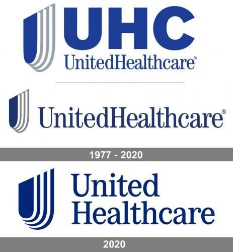
The visual identity of the United HealthCare company hasn’t changed much since its first logo was created in 1977. The emblem, designed according to the principles of elegance, professionalism, and high quality, was only refined and modernized by today, reflecting the stability of the company and its authority.
What is United Healthcare?
United Healthcare is the name of an American company, focused on medical insurance services. The company, established in the United States in the 1970s, offers a wide range of medical-oriented insurance products and is considered to be one of the most reliable providers in the country.
1977 – 2020
The original logo, created for the company in 1977, stayed untouched for more than forty years. It was a composition, where the delicate and sophisticated emblem was placed in the left from the lettering, set in one line. The wordmark in a traditional serif typeface was written without any space between the two parts and had its letters “U” and “H” capitalized.
As for the emblem, it was a rounded four-layered shield in bright blue and white, placed in ¾. The layers of the crest featured a light gray shade, which added lightness and freshness to the whole image.
2020 – Today
The redesign of 2020 simplified the color palette of the United Healthcare logo to just two shades, blue and white, replacing the gray lines with the blue ones. The lettering in the new logo version is set in two levels and has its typeface wider and more stable. The crest of the company’s emblem is now enlarged and featured thicker lines of the blue and white layers, looking stronger and contemporary.
Symbol
United Healthcare logo is based on a wordmark in a serif font. There’s an emblem to the left, which can be explained as a variation of a shield shape.
Emblem
UnitedHealth uses a simple wordmark logo in dark blue on the white background. The wordmark features a minimalistic sans serif font. What makes the logo somewhat unusual is that although all the letters are capitals, some of them are bigger in size than the others. This is done so as to identify the initials in the “United” and “Group,” as well as to emphasize the beginning of the “Health” part. Without this, the word “UnitedHealth” would look too long and monolithic and lack legibility, as the result.
The UnitedHealthCare emblem is modest and fine, it is composed of a U-shaped figure, resembling a shield, which is placed half-turn and has three grey curves as its outline. Due to the outline, the emblem looks three-dimensional and dynamic. It is a very elegant minimalist emblem that says much more about the company, than any ornate picture.
The group’s icon as seen on its official web resource is perfectly simple. It is based on the letter “U,” which appears to be given in the same font as on the main logo. The “U” is placed in a square with rounded corners. The color scheme is the same as in the primary wordmark, dark blue for the letter and the frame, white for the background.
Font
The traditional serif type looks very much like the Century Std-Book Condensed font created by Tony Stan. (logo 1997-2020).
The blue and white color palette of the UnitedHealthCare logo is a reflection of a trustworthy company, with huge experience and influence. The UnitedHealthCare logo represents a powerful brand with a value of traditions and a human-centric approach.


