

![]() Vancouver Warriors Logo PNG
Vancouver Warriors Logo PNG
Vancouver, British Columbia has been home to the Warriors since 2014. Its vibrant and energetic atmosphere was a perfect place for growing a large lacrosse fan base. The team management has been actively promoting the team among families and younger audience in addition to the lacrosse fans already looking forward to the games. The Vancouver Warriors are home to several talented local lacrosse players as well as players from throughout North America.
Meaning and History
Although the lacrosse sport itself is one of the oldest sports in the country, the Vancouver Warriors started their history relatively recently. They got their current name in 2014. Earlier, they played as Albany Attack, San Jose Stealth, and Washington Stealth. The new name was chosen to better reflect the legacy of this exciting and dynamic game that requires one to be determined and strong. At the same time, it honors the location that the team would call its home.
What is Vancouver Warriors?
The National Lacrosse League has a team in BC called the Vancouver Warriors. There are many supporters who love to see the world’s best lacrosse players. The action and fun heat the excitement as the games get better each time.
2018/19 – Today
![]()
The logo of the team consists of a black shield, which is a symbol of protection, with a monogram and a star on it. The monogram not only has the initials of the name but also represents the protection, athleticism, and strength of the traditional warriors. The North Star in the logo serves as a guidance to the warriors. This star, a symbol of hope, can be seen in the night sky of Vancouver. This further strengthens the deep symbolism of this grand and impressive logo.
Font and Color
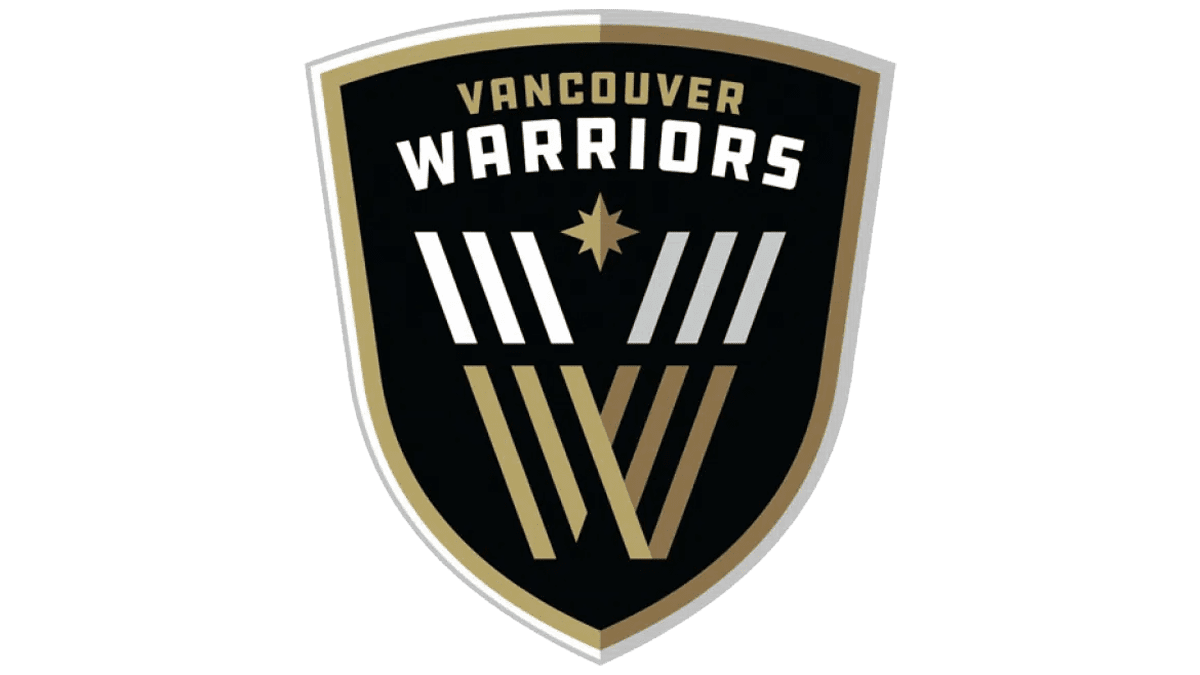
The logo features a monogram that is formed from multiple straight lines placed on a diagonal. Accordingly, there is no particular font. Rather, the team used a custom font design to create a unique look. A three-dimensional effect makes the letters look grander.
When it comes to colors, the team went for a very sophisticated and grand color palette. The main color is a classic black that stands as a symbol of strength, power, and formality. There are white and golden accents that add elegance and richness and create an impressive appearance.


