 University of Minnesota Logo PNG
University of Minnesota is an educational organization, which was established in America, 1851. This is the flagship institution in the system of Minnesota higher education. With its main campus comprising the ground of the two cities of Minneapolis and St. Paul, U of M offers 150+ programs of study, which explore the most modern disciplines using high-tech methodologies and equipment. These programs are lectured by the highly trained professors in 19 colleges, spread across the state. The university also grants land areas to its students.
Meaning and history
The institution, now known as University of Minnesota, dates back to the middle of the 19th century. That time, the preparatory school of Minnesota was established to prepare young students for admission into college. The main specialization of this school was related to natural arts, philosophy, history, et cetera. During its early years, the institution had financial troubles and lived on donations from the rich men. In 1867, the school was restructured into a land-grant organization. 11 years later, John S. Pillsbury made a huge donation to the school, which allowed it to become a university. Since then, Pillsbury has been nicknamed as ‘Father of the University’.
What is University of Minnesota?
University of Minnesota is a public open organization from Minneapolis, United States. It provides people with knowledge in various offshoots of science, touching such subjects as history, agriculture, engineering, medicine, and others. The 150 university programs, which offer its participants multiple researching activities, are studied in 19 colleges and schools, which supervise numerous laboratories exploring particular directions of each science in the university’s catalog. Also, the students who propose groundbreaking solutions and ideas can request the university’s special land grants.
1876 – today
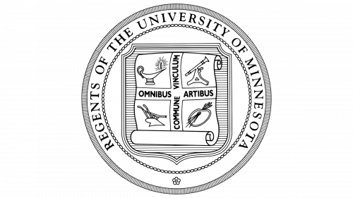
The seal insignia of the university has been compiled of an internal circle with a shield, having a many lines on it. Over the shield, a papyrus is shown. It has four items, supposed to reflect the university’s nucleus directions of study: a cup with an elongated nose, a telescope, a painter’s plate with paintbrushes, and a plow. The items are placed in four different corners. On the papyrus, they’ve also written the motto of the university – ‘Commune vinculum omnibus artibus’, which sounds in English as ‘A common bond for all the arts’.
1876 – today
The logotype of the brand features an inscription with the name of the brand, written in one line. Above it, we can see a large ‘M’ character.
Font
The font combinations of the two logotypes feature two similar styles. The logotype version of the brand’s name depicts us slim letters with sharp serifs. The whole inscription is capitalized, but the first letters are bigger than the following ones. Above the name, the brand designers have drawn a large ‘M’, having a bold script with prominent serifs looking like rectangles. The seal features a bold serif inscription with capitalized letters and small gaps between them. The motto at the center is written with a semibold sans-serif typeface.
Color
The graphical style of the university’s brand marks consist of black and white shades. In the seal, the designers decided to feature black words and lines on the white background. The logotype happened to have the black inscription and bold black ‘M’ symbol above.


