

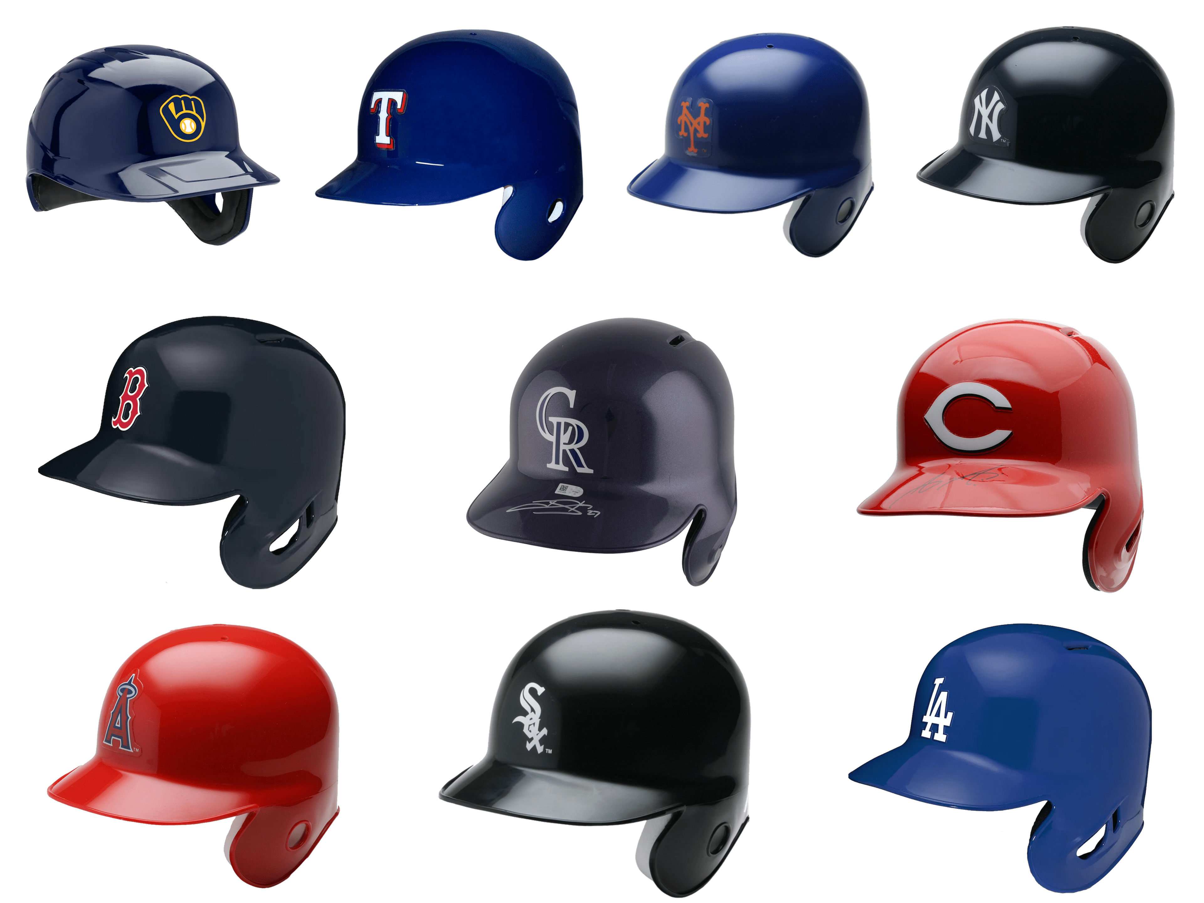
As with any other sports league, the logos and visual identity of MLB teams are known far beyond the playing field. Major r League Baseball is America’s premier baseball league, which currently consists of 30 teams. And each of these teams competes not only in the game but also in recognizability and popularity, which very much depends on logos as well. Today, we take a closer look at what we think are the top 10 MLB team logos on players’ helmets.
Chicago White Sox
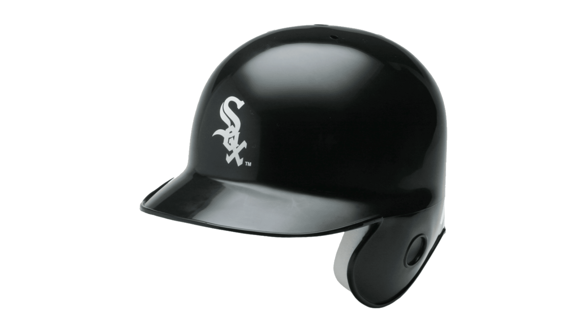
The Chicago White Sox logo can definitely be called one of the most iconic emblems in the MLB, as you can meet it literally in any country, on the baseball caps of people on the streets or the beach. The logo features a gothic-style “Sox” lettering, placed diagonally over a plain black background of the team’s helmets, in bold white lines with sharpened ends. The inscription has its three letters overlapping each other, going down right from the top left corner. The strict and simple color palette of the players’ helmets only makes them look modern and stylish, and definitely makes the club stand out in the list of its league competitors.
Cincinnati Reds

Another quite minimalistic logo on our list is the badge of the Cincinnati Reds. The logo you can see on the helmets of the players is, to our mind, much more interesting than the one they have on their jerseys. The solid red color of the helms makes a perfect background for the simple yet elegant white letter “C” in a wishbone style, withers contour horizontally stretched. And nothing else. The red and white palette elevates the modest composition and makes you wanna look more attentively, distinguishing the contours of the white “C”.
Los Angeles Angels

The logo from the helmets of Los Angeles Angels reminds us of cartoons and evokes childish happy feelings, although it is executed in a pretty traditional red, blue and white color palette, the small yellow halo changes everything. It is a tiny gold ring on the very top of the bold and tall capital letter “A” in a modern geometric sans-serif typeface. The letter is executed in red, outlined in white, and set on a solid blue background. Simple as it is, and a great example of how a super minimalistic decor can turn something traditional into a modern and iconic image.
Texas Rangers
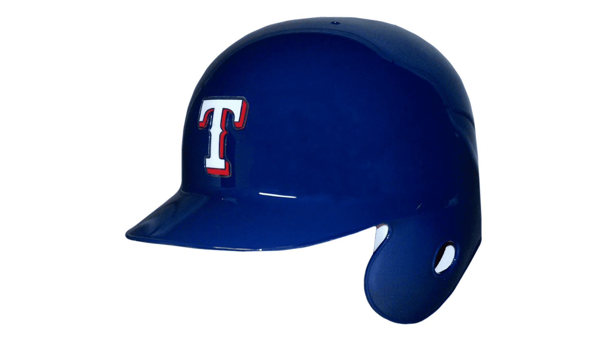
Unlike the uniform of the baseball team from Texas, their helmets use just a simple white letter as the logo, and it does look unique and cool due to the color palette. Although the helmets of the club are executed in a traditional blue, red, and white combination, the shade of blue, used as the main color, is very bright and lively, and the white letter “T” is drawn on them in bold and smooth lines, which only get frighted due to the wide red shadow. There is not much of a design in this logo, but the juiciness and intensity of its color scheme.
New York Mets

The famous Mets do actually have two options for their helmet logos — the iconic orange monogram, set on the front part of the bright blue helm, with the curved and arched lines of the bars, and rounded angles, and the enlarged outlined script “Mets” lettering, set on the side of the helmet, with the dark blue body of the bold sans-serif letters, and a double white and orange outline. This is almost a traditional tricolor, but with the classic red replace by the orange, which turns the boring and usual image into a unique one.
Colorado Rockies
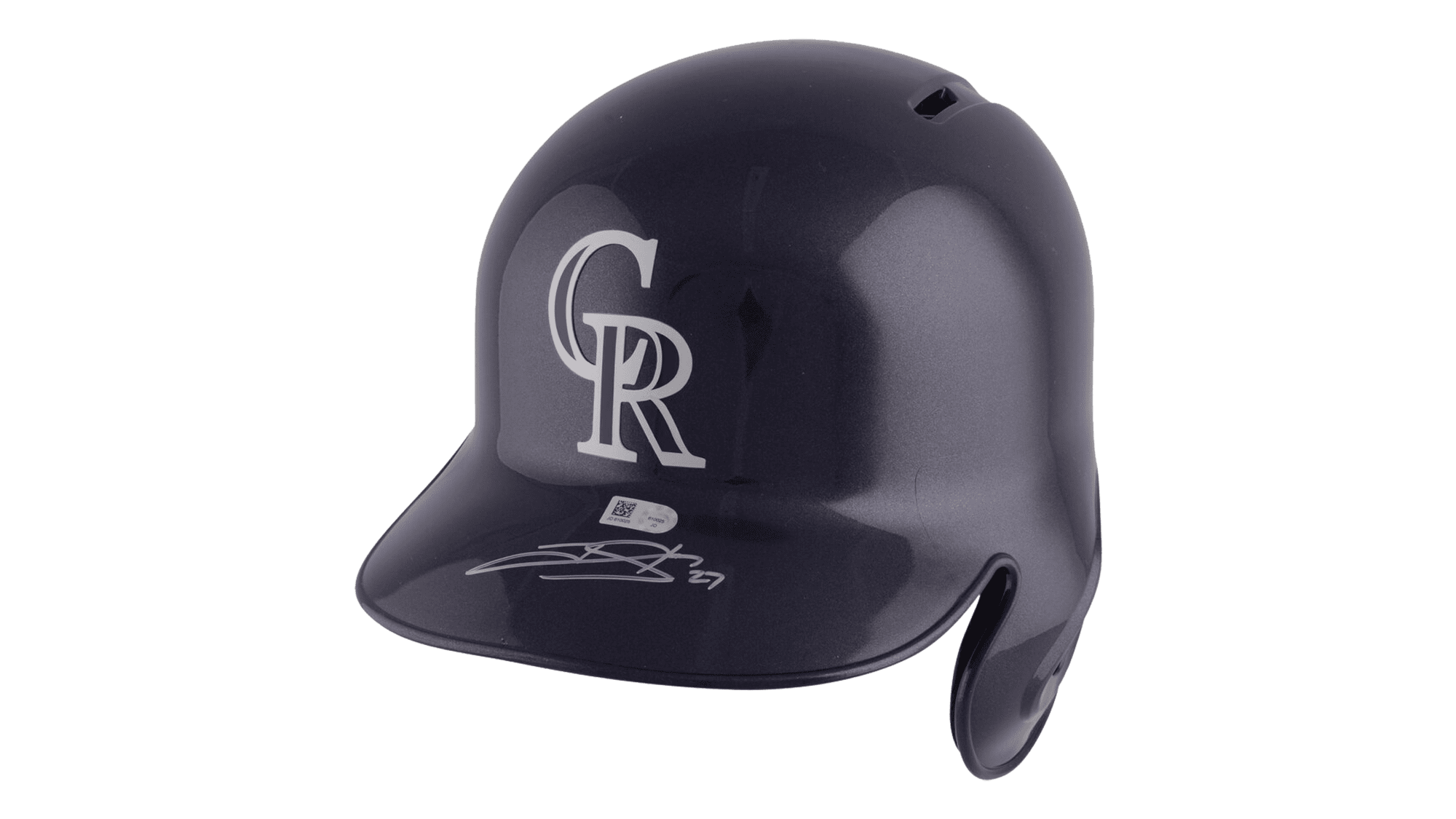
We like the Colorado Rockies helmet logo for its brutality and power. It is strict, it is strong, and it is very confident. The blue letters, outlined in white and placed on a matte black background evoke a sense of determination and danger, showing the baseball cub from Colorado as a super-strong competitor. The capital “CR” letters are executed in a traditional and elegant serif font, with the “R” overlapping the “C” in its bottom right part. The white outline of the letters can sometimes turn silver, for more brightness, but also a bit softer look.
Boston Red Sox
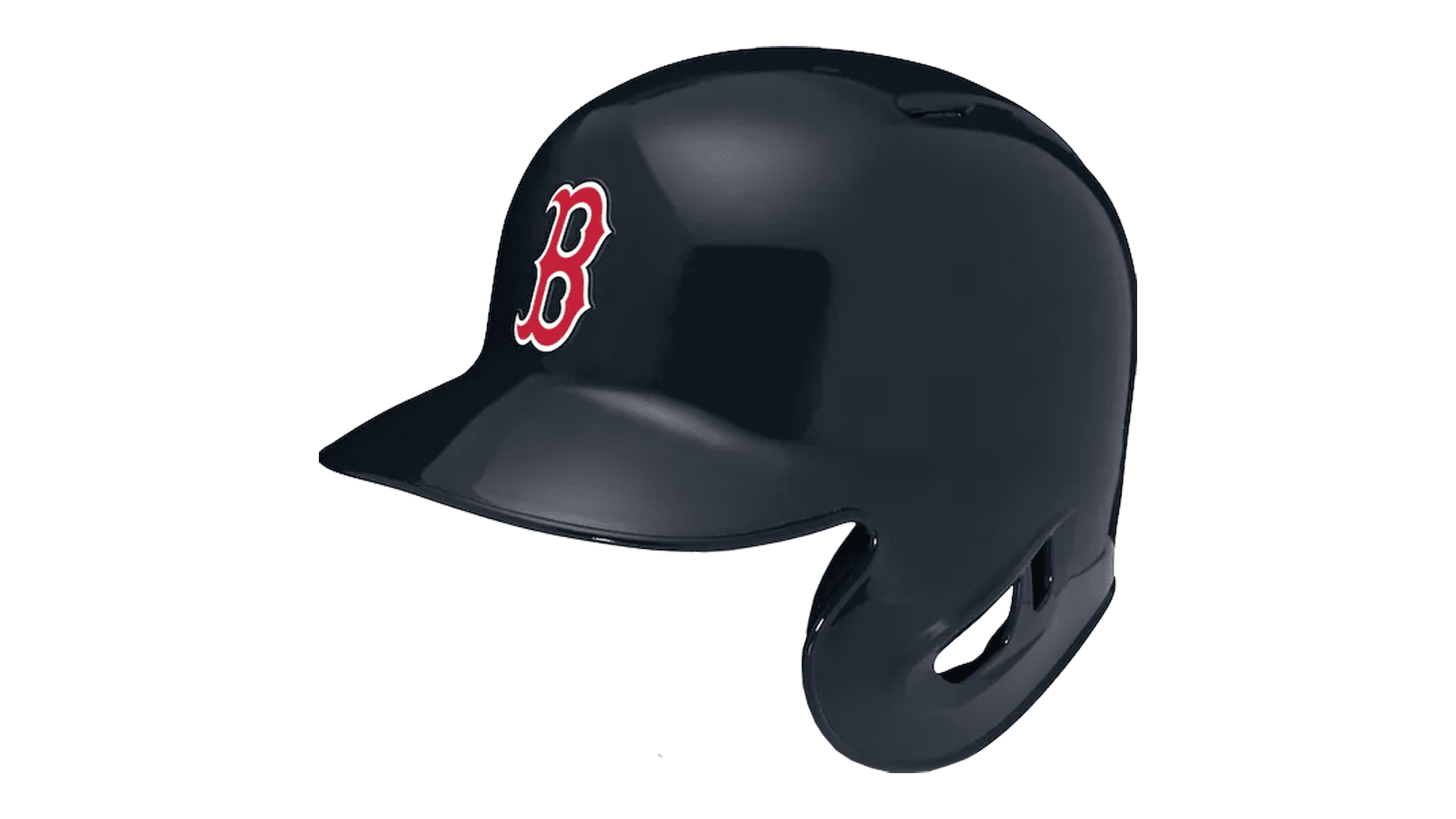
The logo from the helmets of the Boston Red Sox baseball club is probably one of the most recognizable emblems, which is loved by street fashion brands from all over the world, and this is for a reason. The proportions and color palette of the single element on the helmet, the wishbone letter “B” are just perfect. The solid red letter with the elongated lines of the bus, arched and pointed ends, and a bold white outline, is placed on a plain black background, creating a strong contrast and evoking a sense of professionalism and excellence.
Milwaukee Brewers
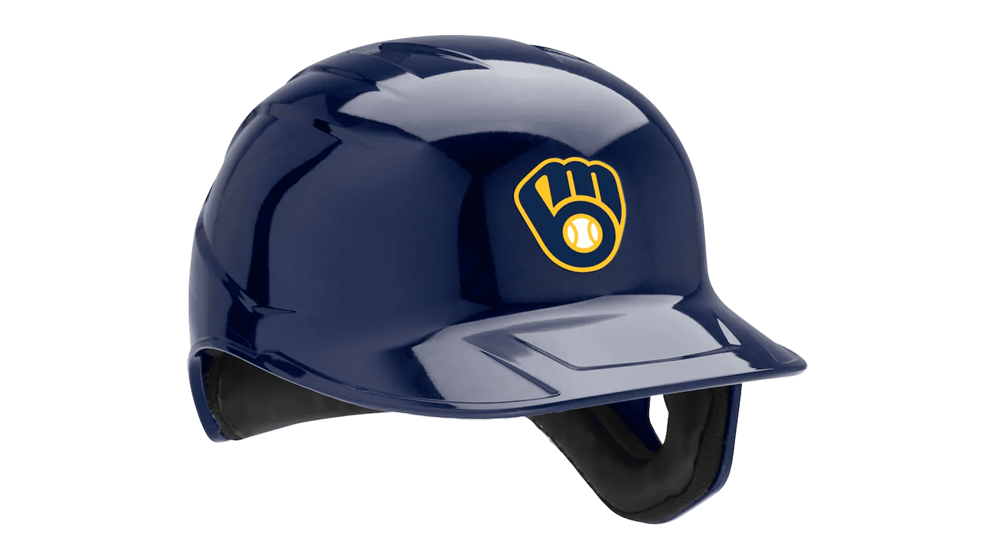
The Milwaukee Brewers logo is super cool, and it’s different from all the badges in the MLB line-up. It is a lowercase “MB” monogram stylized as a baseball glove, with the negative space of the “B” filled with the white and yellow baseball image. The monogram itself features the same dark blue shade as the helmet itself but boasts a bold yellow outline of all elements. It is a very memorable and unique badge, that looks modern and custom on both the helmets and the jerseys of the team’s players. There is also a very simple design option for the Milwaukee Brewers helmets — the solid blue background with the sophisticated capital “M” in white with a soft gold outline.
New York Yankees
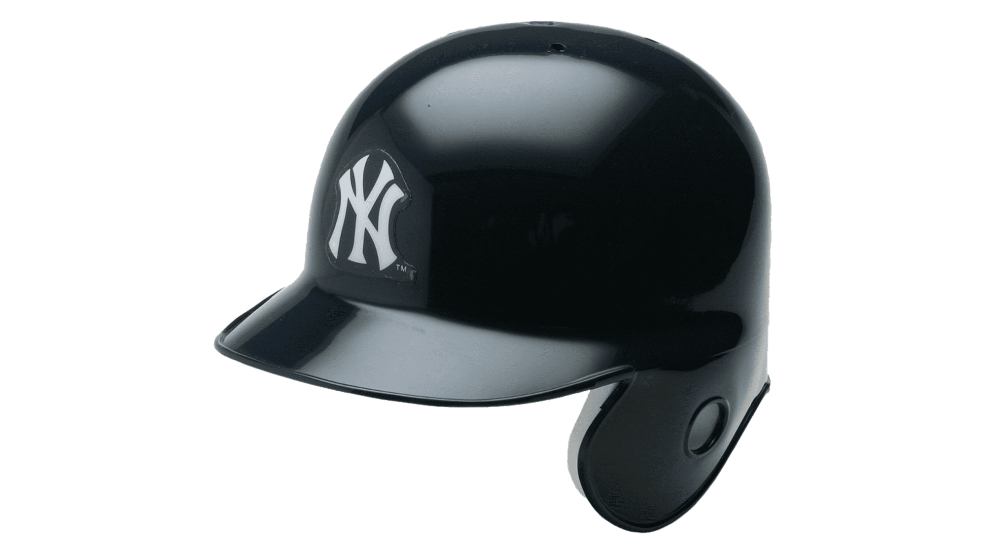
The New York Yankees monogram in a dark blue and white color palette is without a doubt the most famous baseball logo in the history of MLB. For decades this simple badge has been decorating caps and t-shirts of completely different people from all over the globe. You can see it on the babies’ beanies, and the long sleeves of contemporary rappers. It is something, that has become more than a baseball logo, but a symbol of the new culture. The secret is in a minimalistic approach and perfectly balanced clean lines, which leave no questions about proportions and harmony.
Los Angeles Dodgers
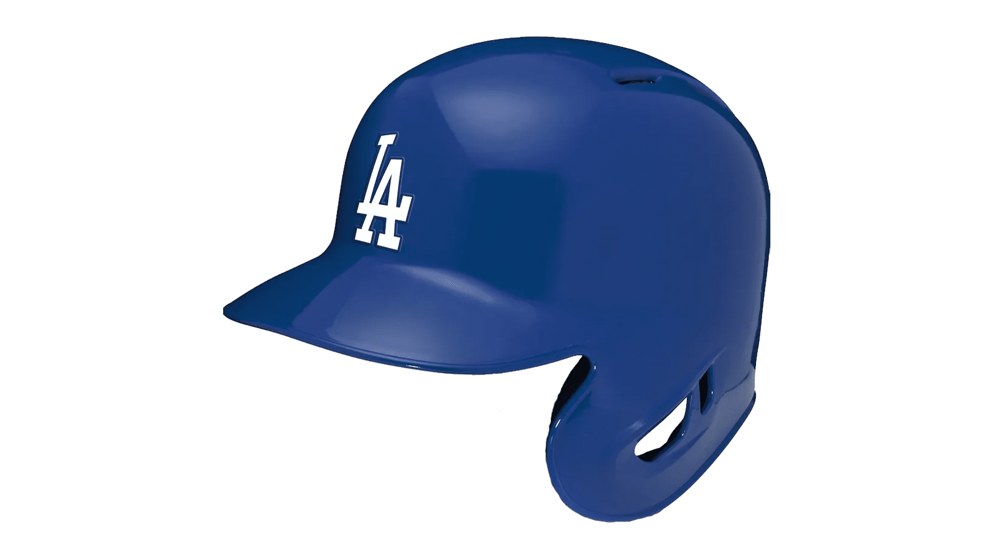
The first line of our today’s list goes to Los Angeles Dodgers. They are the main competitors of the New York Yankees in terms of the logo recognisability, and that eternal race between the East and the West Coast…As for us, we like the LA Dodgers logo more, just because it is brighter, and has better visibility when placed on the helmets of the players — the bold white letters of the “LA” monogram use thicker and stronger lines, and the blue of the background is set in a more vivid and intense hue, which evokes a sense of motion and energy, while the NY Yankees logo is all about stability and confidence.


