 Regardless of their geographical location, universities around the world strive to create, strengthen and maintain their own authority. This concerns longevity, the quality of education and the creation of valuable social connections, as well as certain external factors. University logo plays a key role in all these things.
10. University of Michigan logo
 The University of Michigan logo is simple and concise. The basis is made of a rectangle filled with blue with the large yellow letter “M” and a white name of the educational institution below.
The main features of the logo are its modernity and restrained symmetry.
9. University of Kentucky logo
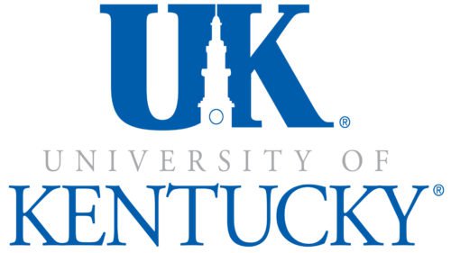
At first glance, the new logo of University of Kentucky is fairly simple: the abbreviation of the name and its full writing with an emphasis on “Kentucky”. However, this is one of the logos, where on closer inspection you can find hidden images and meanings. For instance, attentive viewer can notice the tower hidden between the letters of the abbreviation, which is familiar to graduates, current students, and even to ordinary Kentucky residents.
However, this is not the only version of the university logo. In some cases, they use another logo consisting of the abbreviation where the stylized letters are arranged diagonally towards each other. However, in terms of the design, the second option is less attractive than the “full version” presented above.
8. Indiana University
The logo of Indiana University was quite controversial. However, its minimalism helped to achieve recognition of the font (specially developed for the university) and the image. The image itself is not a “candlestick” at all, but the interlaced letters of the abbreviation “I” and “U”. The use of crimson color – the corporate color of the university – and their combination is made in strict accordance with the requirements of a “golden ratio”.
7. Dartmouth College
Many consider the Dartmouth’s logo too cumbersome. However, every detail here is filled with many meanings. For instance, the shape of the shield and the date of the foundation (1769) emphasize the faithfulness to traditions, the tree on the left side of the shield symbolizes its countryside location, the book in the upper left corner with sharp beams illuminating the school building emphasizes the light of knowledge.
The motto is a quote from the Bible. The phrase “Vox Clamantis in Deserto” translates as “The voice of a crying man in a desert” and refers to St. John the Baptist, who went to a secluded place before each sermon. The location in the countryside highlights the demand of full concentration from students, which is a key to success.
6. University of San Carlos
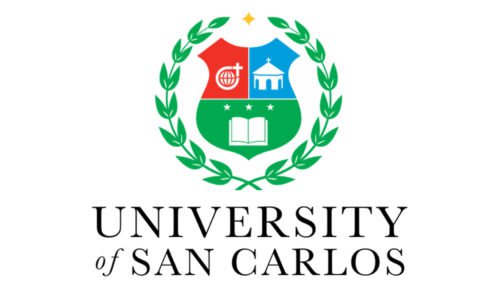
The University of San Carlos is the fourth oldest in the world, the oldest university in Guatemala and the largest one in Central America. Considering heraldry, the logo looks almost perfect. The base is made of the crest, divided into three fields – each with a separate symbol. The crest is decorated with a stylized laurel wreath (the symbol of victory), the inner contour contains the name (the lower semicircle) and the Latin expression: Scientia. Virtus. Devotio (Science, Power, Selflessness).
The university’s motto can be found on the ribbon at the bottom of the logo. Witness to the world – this phrase from the Bible refers to the Christian mission, but at the same time, it emphasizes that the university expects its graduates to be the witnesses of the scientific knowledge acquired within these walls.
5. Howard University
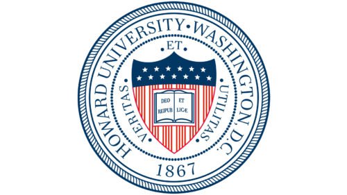
The Howard University logo has an interesting design. This is a round “seal”, painted in three colors – red, blue and white (the colors of the US national flag). The elements referring to the national flag (stars and stripes) were used in the design of the crest (resembling the one represented on the Princeton University logo).
The motto of Howard University sounds like “Veritas and Utilitas”, and is translated from Latin as “Truth and Service”. However, the book located in the center of the crest has one more Latin phrase – “Deo et reipublicae” (“God and country”), indicating those who we should serve. And if we consider that Howard University was the first US university for African Americans, the phrases acquire another, hidden, meaning.
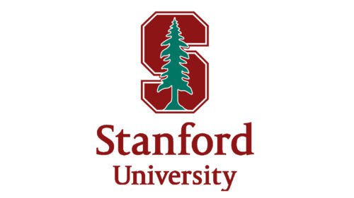
4. Stanford University logo
The basis of the modern Stanford University logo is formed out of the letter “S”. The tree can be found in the logos of other educational institutions: among others, this symbol was used by Dartmouth University. The meaning of this symbol is in solitude for concentration in the name of science. Indeed, at the beginning of its existence, Stanford University was famous for its strictness towards students – they were not allowed to go outside the university territory, except for special cases. The founders believed that such seclusion contributes to concentration and constant improvement. Today, the “spruce” is more a symbol of the university’s centuries-old history.
3. Washington State University
Washington State University, or Wazzu, as graduates jokingly call it, is the owner of a modern logo consisting of two elements – a text name and a graphic image made in the style of a crest. The crest depicts a roaring jaguar – the symbol of this university. However, if you look more closely at the beast, you will notice that in fact it is a stylized abbreviation of the same university’s name – WSU.
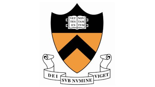
2. Princeton University
Surprisingly, the logo of the University of Princeton is based on the symbol of another educational institution – Yale. The explanation is simple: Princeton was created by Yale graduates. Therefore, it repeats the shape of the crest (although Yale has a different configuration), and an open book with a text. However, Princeton was originally the training center for priests which is why the ribbon under the crest is decorated with a Latin aphorism, translated as “Under the Protection of God She Flourishes.” By the way, last year this university was listed fourth best in the Forbes rating.
1. Yale University
Being the oldest university in the United States, Yale used the logo in the form of a crest. According to the rules of heraldry, this means the adherence to traditions which are centuries old.
The blue background makes the background for an open book with a Hebrew phrase, which translates as “the Light and the Truth”. The same phrase is duplicated in Latin on the ribbon below the crest. Both of these languages were initially included in the list of compulsory languages for students to study. Today, Latin and Hebrew are still present in the program, but only as faculty courses.
Each university has its own history, and their logos eventually reflect and embody these stories.
Conclusion
In the exploration of the Top 10 American University Logos, we’ve journeyed through an array of designs that serve not just as core logos, but as vital components of university branding. These symbols, ranging from the revered university seal to the adaptable secondary logos, encapsulate the essence and ambitions of their institutions. The intricate relationship between these logos and university communications is unmistakable, as each one is meticulously crafted to resonate with the target audience—be it prospective students, alumni, or the academic community at large.
The university masterbrand logos, which include both the signature mark and the secondary mark, are more than mere emblems; they are a testament to the institution’s heritage and its forward-looking vision. These approved logos, when employed on official documents, university stationery, and diplomas, imbue them with an air of credibility and prestige. The appropriate license and guidelines ensure that the use of the university seal and other university trademarks is preserved for contexts that uphold the dignity and respect the identity of the united university.
Moreover, the strategic deployment of university masterbrand logos across various platforms reinforces the institution’s image, fostering a sense of unity and pride among all stakeholders. From the campus to the wider community, these visual identities help in crafting a coherent narrative about the university’s values, goals, and achievements.
In summary, the significance of American university logos extends far beyond their aesthetic appeal. They are emblematic of the university’s legacy, a beacon for its future, and a crucial tool in effective university communications. As we admire these designs, let us also appreciate the thoughtful strategy and profound meaning embedded within each, showcasing the university’s commitment to excellence, tradition, and innovation.


